Dot Plot
Bior_DotPlot.RdCreate a dot plot.
Bior_DotPlot(
  data,
  x,
  y,
  group = NULL,
  combine = FALSE,
  color = "black",
  palette = NULL,
  shape = 19,
  size = NULL,
  dot.size = size,
  sorting = c("ascending", "descending", "none"),
  x.text.col = TRUE,
  rotate = FALSE,
  title = NULL,
  xlab = NULL,
  ylab = NULL,
  facet.by = NULL,
  panel.labs = NULL,
  short.panel.labs = TRUE,
  select = NULL,
  remove = NULL,
  order = NULL,
  label = NULL,
  font.label = list(size = 11, color = "black"),
  label.select = NULL,
  repel = FALSE,
  label.rectangle = FALSE,
  position = "identity",
  ggtheme = theme_pubr(),
  ...
)
Arguments
- data
a data frame
- x, y
x and y variables for drawing.
- group
an optional column name indicating how the elements of x are grouped.
- combine
logical value. Default is FALSE. Used only when y is a vector containing multiple variables to plot. If TRUE, create a multi-panel plot by combining the plot of y variables.
- color, size
points color and size.
- palette
the color palette to be used for coloring or filling by groups. Allowed values include "grey" for grey color palettes; brewer palettes e.g. "RdBu", "Blues", ...; or custom color palette e.g. c("blue", "red"); and scientific journal palettes from ggsci R package, e.g.: "npg", "aaas", "lancet", "jco", "ucscgb", "uchicago", "simpsons" and "rickandmorty".
- shape
point shape. See
show_point_shapes.- dot.size
numeric value specifying the dot size.
- sorting
a character vector for sorting into ascending or descending order. Allowed values are one of "descending", "ascending" and "none". Partial match are allowed (e.g. sorting = "desc" or "asc"). Default is "descending".
- x.text.col
logical. If TRUE (default), x axis texts are colored by groups.
- rotate
logical value. If TRUE, rotate the graph by setting the plot orientation to horizontal.
- title
plot main title.
- xlab
character vector specifying x axis labels. Use xlab = FALSE to hide xlab.
- ylab
character vector specifying y axis labels. Use ylab = FALSE to hide ylab.
- facet.by
character vector, of length 1 or 2, specifying grouping variables for faceting the plot into multiple panels. Should be in the data.
- panel.labs
a list of one or two character vectors to modify facet panel labels. For example, panel.labs = list(sex = c("Male", "Female")) specifies the labels for the "sex" variable. For two grouping variables, you can use for example panel.labs = list(sex = c("Male", "Female"), rx = c("Obs", "Lev", "Lev2") ).
- short.panel.labs
logical value. Default is TRUE. If TRUE, create short labels for panels by omitting variable names; in other words panels will be labelled only by variable grouping levels.
- select
character vector specifying which items to display.
- remove
character vector specifying which items to remove from the plot.
- order
character vector specifying the order of items.
- label
the name of the column containing point labels.
- font.label
a list which can contain the combination of the following elements: the size (e.g.: 14), the style (e.g.: "plain", "bold", "italic", "bold.italic") and the color (e.g.: "red") of labels. For example font.label = list(size = 14, face = "bold", color ="red"). To specify only the size and the style, use font.label = list(size = 14, face = "plain").
- label.select
can be of two formats:
a character vector specifying some labels to show.
a list containing one or the combination of the following components:
top.upandtop.down: to display the labels of the top up/down points. For example,label.select = list(top.up = 10, top.down = 4).criteria: to filter, for example, by x and y variabes values, use this:label.select = list(criteria = "`y` > 2 & `y` < 5 & `x` %in% c('A', 'B')").
- repel
a logical value, whether to use ggrepel to avoid overplotting text labels or not.
- label.rectangle
logical value. If TRUE, add rectangle underneath the text, making it easier to read.
- position
Position adjustment, either as a string, or the result of a call to a position adjustment function.
- ggtheme
function, ggplot2 theme name. Default value is theme_pubr(). Allowed values include ggplot2 official themes: theme_gray(), theme_bw(), theme_minimal(), theme_classic(), theme_void(), ....
- ...
other arguments to be passed to
geom_pointandggpar.
Value
A ggplot object
Examples
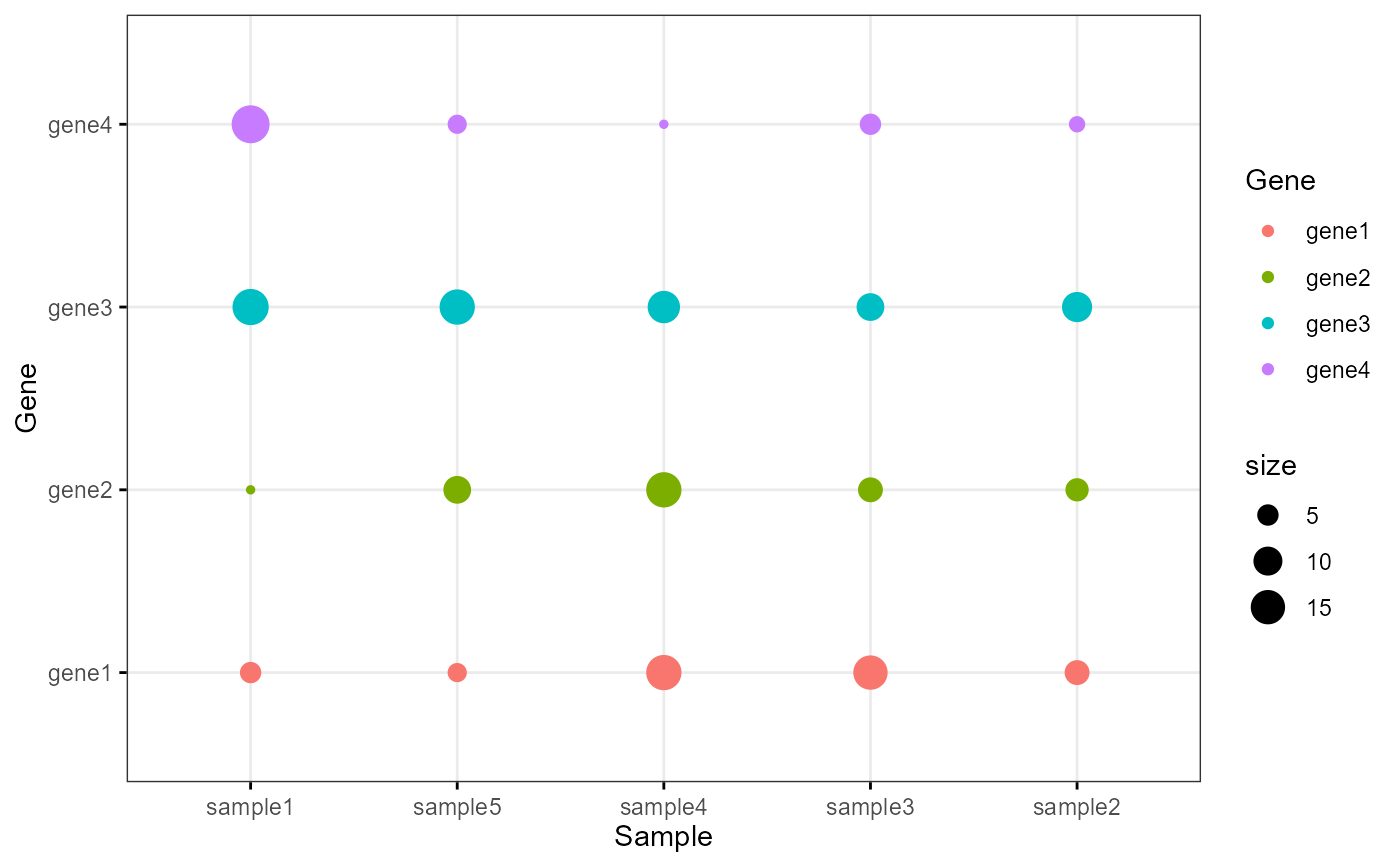
# Examples 1
df <- data.frame(
  Sample = rep(paste('sample', 1:5, sep=''), 4),
  Gene = rep(paste('gene', 1:4, sep=''), 5),
  size = round(rnorm(20, mean = 10, sd = 5))
  )
colour <- c("#1F77B4FF","#FF7F0EFF","#2CA02CFF","#D62728FF","#9467BDFF")
Bior_DotPlot(data = df, x = "Sample", y = "Gene", size = "size", color = "Gene",
             x.text.col = FALSE, ggtheme = theme_bw()) +
  theme(axis.text.x = element_text(angle = 0, hjust = 0.5))


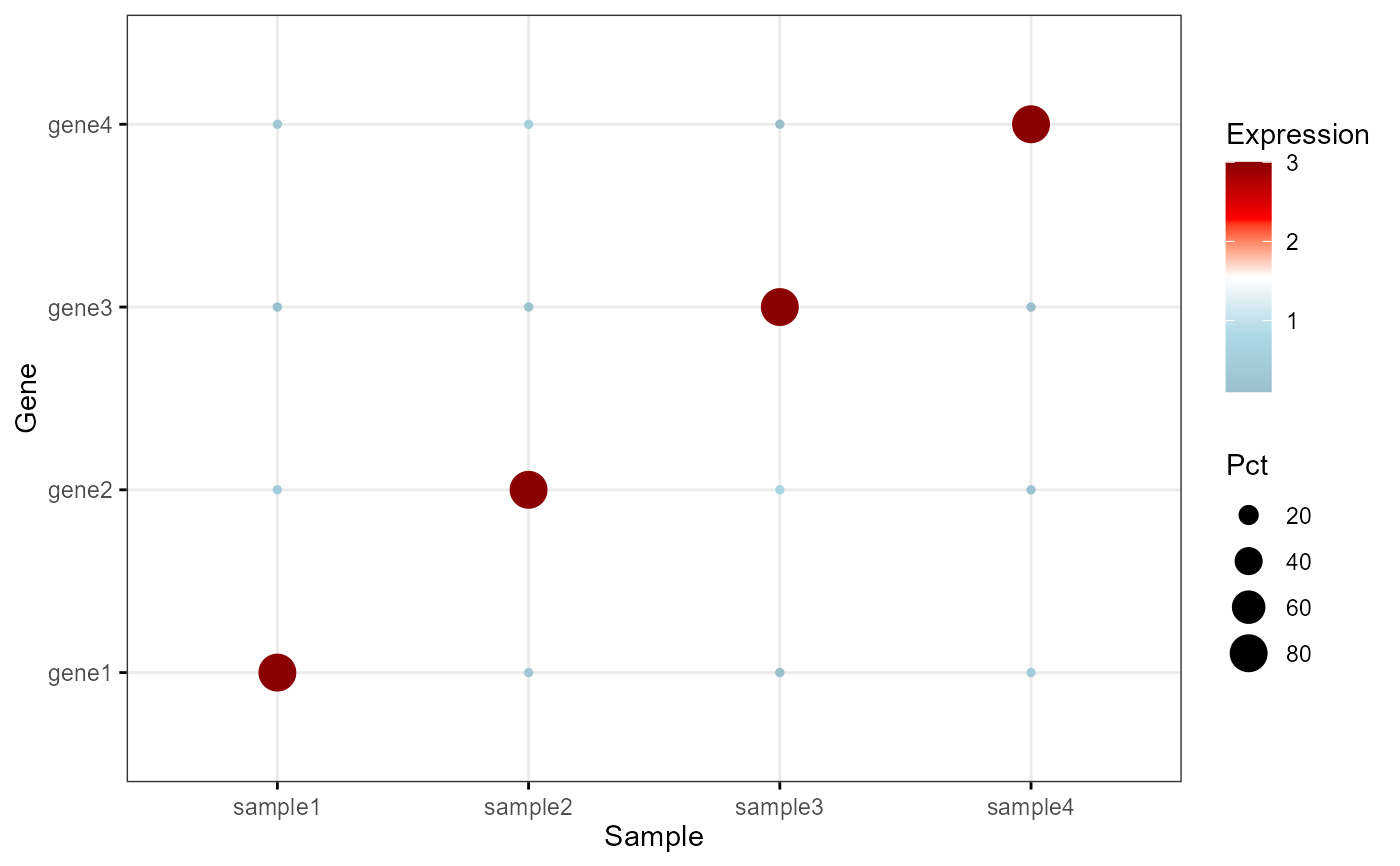
# Examples 2
df <- data.frame(
  Sample = rep(paste('sample', 1:4, sep=''), each=4),
  Gene = rep(paste('gene', 1:4, sep=''), 4),
  Pct = c(80,10,10,10,10,80,10,10,10,10,80,10,10,10,10,80),
  Expression = c(3,0.5,0.1,0.3,0.3,3,0.2,0.6,0.1,0.7,3,0.1,0.5,0.2,0.1,3)
  )

 Bior_DotPlot(data = df, x = "Sample", y = "Gene", size="Pct", color = "Expression",
              x.text.col = FALSE, ggtheme = theme_bw()) +
  theme(axis.text.x = element_text(angle = 0, hjust = 0.5)) +
  scale_color_gradientn(colours = c("lightblue3", "lightblue", "white", "red", "red4"))
