library(tidyverse)
#> Warning: package 'tidyverse' was built under R version 4.2.3
#> Warning: package 'ggplot2' was built under R version 4.2.3
#> Warning: package 'tibble' was built under R version 4.2.3
#> Warning: package 'tidyr' was built under R version 4.2.3
#> Warning: package 'readr' was built under R version 4.2.3
#> Warning: package 'purrr' was built under R version 4.2.3
#> Warning: package 'dplyr' was built under R version 4.2.3
#> Warning: package 'stringr' was built under R version 4.2.2
#> Warning: package 'forcats' was built under R version 4.2.3
#> Warning: package 'lubridate' was built under R version 4.2.310 Layers
You are reading the work-in-progress second edition of R for Data Science. This chapter is largely complete and just needs final proof reading. You can find the complete first edition at https://r4ds.had.co.nz.
10.1 Introduction
在 ?sec-data-visualization 中,您学到的不仅仅是如何制作 scatterplots、bar charts、boxplots。 您学习了一个基础知识,可用于使用 ggplot2 绘制任何类型的绘图。
在本章中,当您学习图形的分层语法时,您将在此基础上进行扩展。 我们将从更深入地研究美学映射(aesthetic mappings)、几何对象(geometric objects)和分面(facets)开始。 然后,您将了解 ggplot2 在创建绘图时在幕后进行的统计转换。 这些转换用于计算要绘制的新值,例如条形图中的条形高度或箱形图中的中位数。 您还将了解位置调整,这会修改几何图形在绘图中的显示方式。 最后,我们将简要介绍一下坐标系。
我们不会涵盖每个层的每个功能和选项,但我们将引导您了解 ggplot2 提供的最重要和最常用的功能,并向您介绍扩展 ggplot2 的包。
10.1.1 Prerequisites
本章重点介绍 ggplot2。 要访问本章中使用的数据集、帮助页面和函数,请通过运行以下代码加载 tidyverse:
10.2 Aesthetic mappings
“The greatest value of a picture is when it forces us to notice what we never expected to see.” — John Tukey
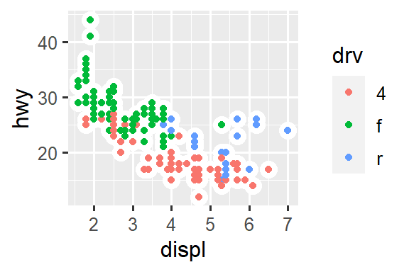
请记住,与 ggplot2 包捆绑在一起的 mpg 数据框包含 38 种汽车模型的 234 个观察值。
mpg
#> # A tibble: 234 × 11
#>   manufacturer model displ  year   cyl trans      drv     cty   hwy fl
#>   <chr>        <chr> <dbl> <int> <int> <chr>      <chr> <int> <int> <chr>
#> 1 audi         a4      1.8  1999     4 auto(l5)   f        18    29 p
#> 2 audi         a4      1.8  1999     4 manual(m5) f        21    29 p
#> 3 audi         a4      2    2008     4 manual(m6) f        20    31 p
#> 4 audi         a4      2    2008     4 auto(av)   f        21    30 p
#> 5 audi         a4      2.8  1999     6 auto(l5)   f        16    26 p
#> 6 audi         a4      2.8  1999     6 manual(m5) f        18    26 p
#> # ℹ 228 more rows
#> # ℹ 1 more variable: class <chr>
mpg 中的变量包括:
displ:汽车的发动机尺寸,以升为单位。 数值变量。hwy:汽车在高速公路上的燃油效率,以英里/加仑 (mpg) 为单位。 行驶相同距离时,燃油效率低的汽车比燃油效率高的汽车消耗更多的燃油。 数值变量。class:汽车类型。 一个分类变量。
让我们首先可视化各类汽车的 displ 和 hwy 之间的关系。 我们可以使用散点图来做到这一点,其中数值变量 mapped 到 x 和 y aesthetics,分类变量 mapped 到 color 或 shape 等 aesthetic。
# Left
ggplot(mpg, aes(x = displ, y = hwy, color = class)) +
  geom_point()

# Right
ggplot(mpg, aes(x = displ, y = hwy, shape = class)) +
  geom_point()
#> Warning: The shape palette can deal with a maximum of 6 discrete values
#> because more than 6 becomes difficult to discriminate; you have 7.
#> Consider specifying shapes manually if you must have them.
#> Warning: Removed 62 rows containing missing values (`geom_point()`).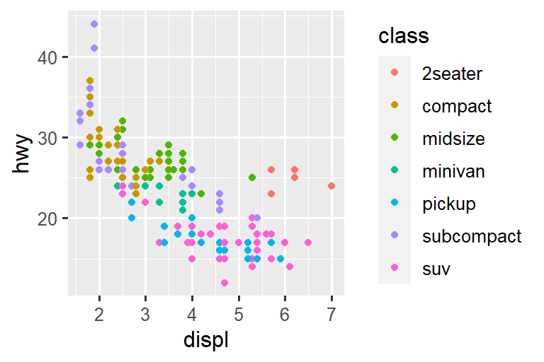
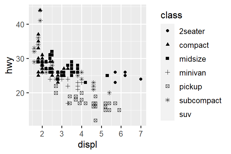
当 class mapped 到 shape 时,我们收到两个 warnings:
1: The shape palette can deal with a maximum of 6 discrete values because more than 6 becomes difficult to discriminate; you have 7. Consider specifying shapes manually if you must have them.
2: Removed 62 rows containing missing values (
geom_point()).
由于 ggplot2 同时只能使用六个 shapes,因此默认情况下,当您使用 shape aesthetic 时,其他组将不会绘制。 第二个 warning 是相关的 – 数据集中有 62 辆 SUVs,但它们没有被绘制出来。
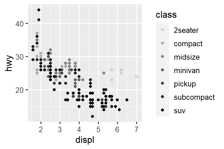
类似地,我们也可以将 class map 到 size 或 alpha aesthetics,它们分别控制 points 的 大小和透明度。
# Left
ggplot(mpg, aes(x = displ, y = hwy, size = class)) +
  geom_point()
#> Warning: Using size for a discrete variable is not advised.

# Right
ggplot(mpg, aes(x = displ, y = hwy, alpha = class)) +
  geom_point()
#> Warning: Using alpha for a discrete variable is not advised.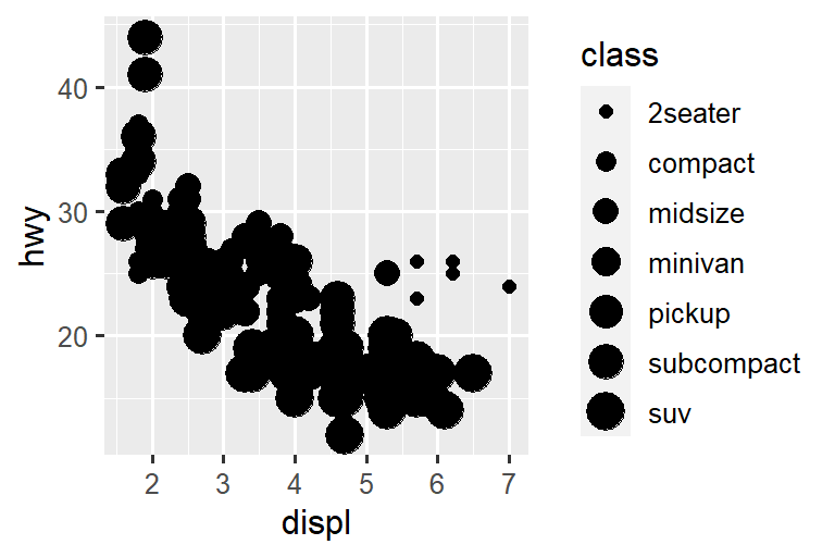
这两者也会产生 warnings:
Using alpha for a discrete variable is not advised.
将无序离散(分类)变量(class)Mapping 到有序 aesthetic(size or alpha)通常不是一个好主意,因为它意味着实际上不存在的排名。
一旦你 map 一个 aesthetic,ggplot2 就会处理剩下的事情。 它选择合理的尺度来符合 aesthetic,并构建一个图例(legend)来解释 levels 和 values 之间的映射。 对于 x 和 y aesthetics,ggplot2 不会创建 legend,但会创建带有刻度线(tick marks)和标签(label)的轴线(axis line)。 轴线(axis line)提供与图例(legend)相同的信息;它解释了位置(locations)和值(values)之间的映射(mapping)。
您还可以手动将 geom 的视觉属性设置为 geom 函数的参数(outside of aes()),而不是依赖变量映射来确定外观。 例如,我们可以将图中的所有 points 设为蓝色:
ggplot(mpg, aes(x = displ, y = hwy)) +
  geom_point(color = "blue")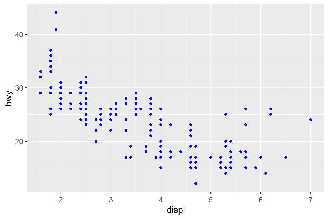
在这里,颜色并不传达有关变量的信息,而仅改变绘图的外观。 您需要选择一个对该 aesthetic 有意义的值:
- 字符串形式的颜色名称,例如
color = "blue" - point 的大小(以毫米为单位),例如
size = 1 - point 的 shape 作为数字,例如,
shape = 1,如 Figure 10.1 所示。

color 和 fill aesthetics 的相互作用。空心形状 (0–14) 的边框由 color 决定;实心形状(15–20)通过 color 填充;填充形状 (21–24) 具有 color 边框并通过 fill 填充。形状的排列使相似的形状彼此相邻。到目前为止,我们已经讨论了使用 point geom 时可以在散点图中映射或设置的 aesthetics。 您可以在 aesthetic specifications vignette 中了解有关所有可能的 aesthetic mappings 的更多信息:https://ggplot2.tidyverse.org/articles/ggplot2-specs.html。
您可以用于绘图的具体美观效果取决于您用来表示数据的几何图形。 在下一节中,我们将更深入地研究 geoms。
10.2.1 Exercises
创建
hwy与displ的散点图,其中点用粉红色填充三角形。-
为什么以下代码没有生成带有蓝点的图?
ggplot(mpg) + geom_point(aes(x = displ, y = hwy, color = "blue")) strokeaesthetic 有什么作用? 它适用于什么形状? (提示:使用?geom_point)如果将 aesthetic map 到变量名称以外的其他内容,例如
aes(color = displ < 5)会发生什么? 请注意,您还需要指定 x 和 y。
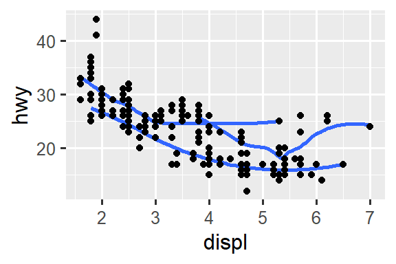
10.3 Geometric objects
这两个图有何相似之处?
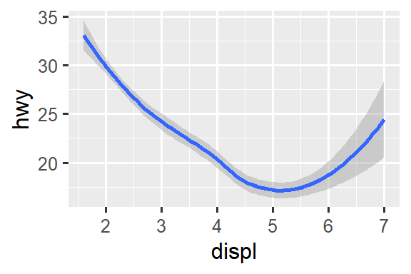
两个图都包含相同的 x 变量、相同的 y 变量,并且都描述相同的数据。 但图并不相同。 每个图使用不同的几何对象(geometric object),geom,来表示数据。 左侧的图使用 point geom,右侧的图使用 smooth geom,一条平滑线拟合数据。
要更改绘图中的 geom,请更改添加到 ggplot() 的 geom 函数。 例如,要绘制上面的图,您可以使用以下代码:
# Left
ggplot(mpg, aes(x = displ, y = hwy)) +
  geom_point()

# Right
ggplot(mpg, aes(x = displ, y = hwy)) +
  geom_smooth()
#> `geom_smooth()` using method = 'loess' and formula = 'y ~ x'
ggplot2 中的每个 geom 函数都带有一个 mapping 参数,该参数可以在 geom layer 中本地定义,也可以在 ggplot() layer 中全局定义。 然而,并非每种美学(aesthetic)都适用于每种几何(geom)。 您可以设置点(point)的形状(shape),但无法设置线(line)的形状(shape)。 如果您尝试,ggplot2 将默默地忽略该美学映射(aesthetic mapping)。 另一方面,您可以设置线条(line)的线型(linetype)。 geom_smooth() 将为映射(map)到线型(linetype)的变量的每个唯一值绘制一条具有不同线型(linetype)的不同线(line)。
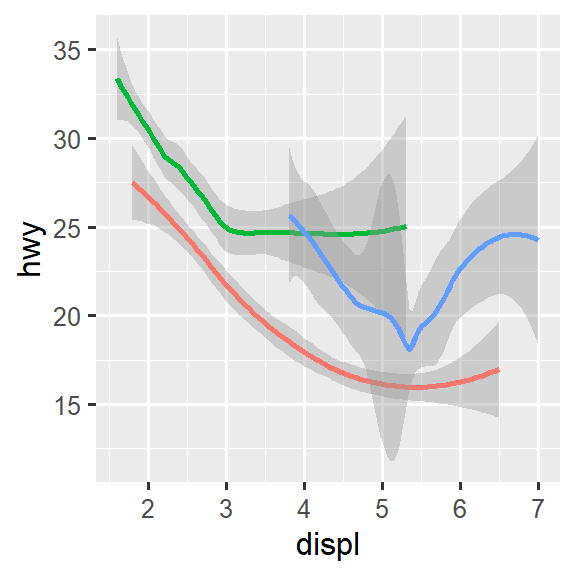
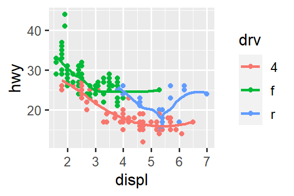
# Left
ggplot(mpg, aes(x = displ, y = hwy, shape = drv)) +
  geom_smooth()

# Right
ggplot(mpg, aes(x = displ, y = hwy, linetype = drv)) +
  geom_smooth()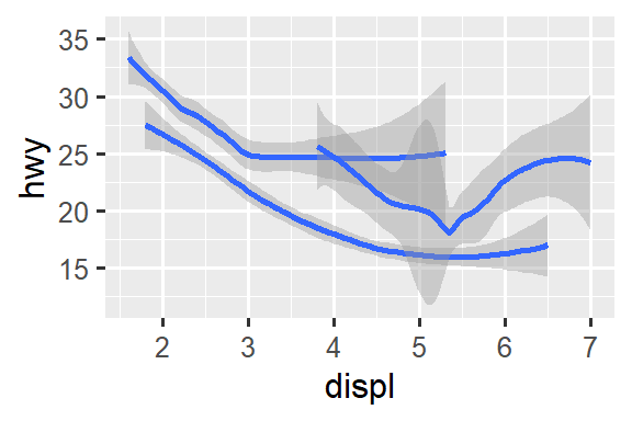
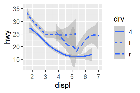
在这里,geom_smooth() 将汽车分成三条线(lines)根据它们的 drv 值,该值描述了汽车的传动系统。 一条线描述具有 4 值的所有点,一条线描述具有 f 值的所有点,一条线描述具有 r 值的所有点。 这里,4 代表四轮驱动,f 代表前轮驱动,r 代表后轮驱动。
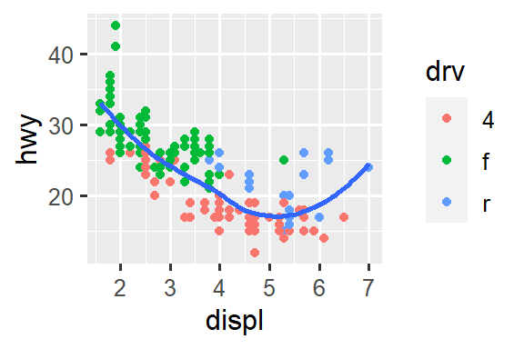
如果这听起来很奇怪,我们可以通过将线条叠加在原始数据上,然后根据 drv 对所有内容进行着色来使其更清晰。
ggplot(mpg, aes(x = displ, y = hwy, color = drv)) +
  geom_point() +
  geom_smooth(aes(linetype = drv))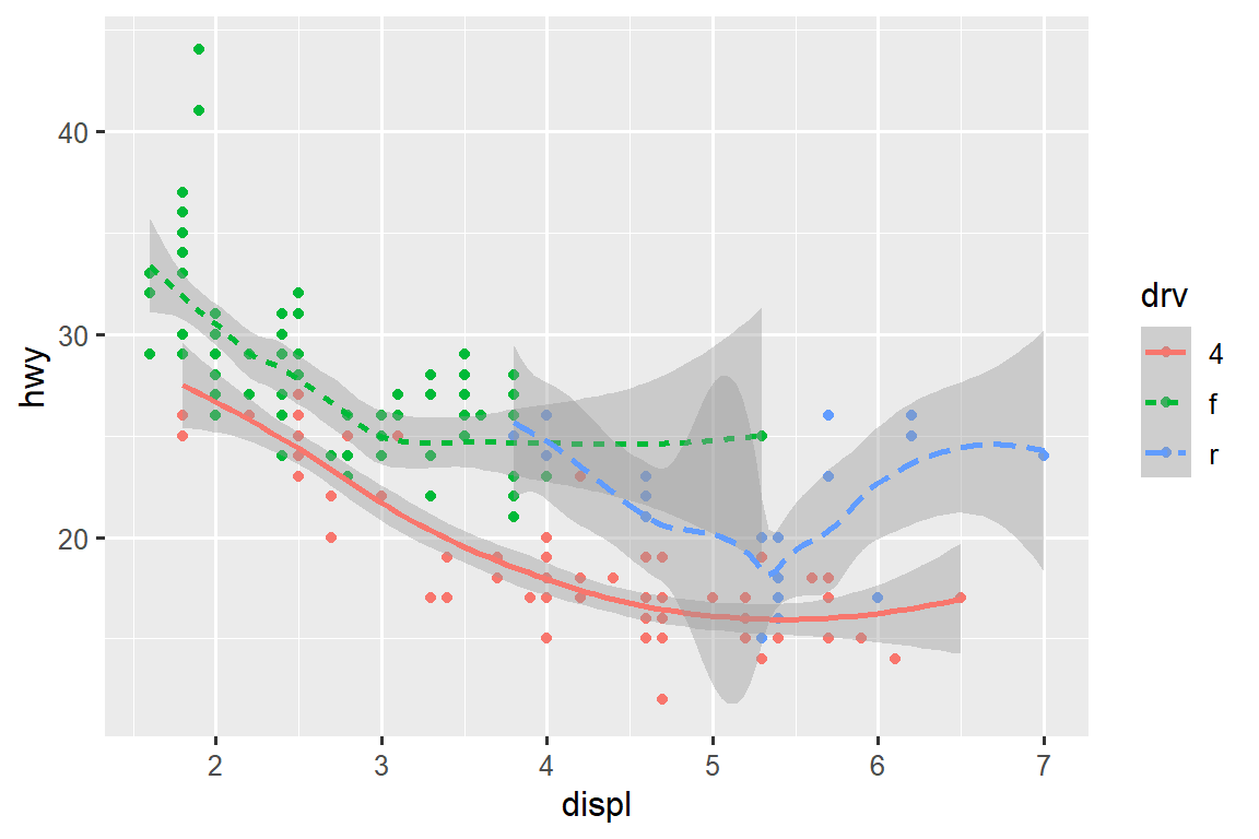
请注意,该图在同一图中包含两个 geoms。
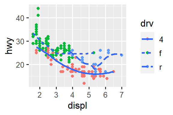
许多 geoms,像 geom_smooth(),使用单个几何对象(geometric object)来显示多行数据。 对于这些 geoms,您可以将 group aesthetic 设置为分类变量以绘制多个对象。 ggplot2 将为分组变量的每个唯一值绘制一个单独的对象。 实际上,每当您将 aesthetic 映射到离散变量(如 linetype 示例中)时,ggplot2 都会自动对这些 geoms 的数据进行分组。 依赖此功能很方便,因为 group aesthetic 本身不会向 geoms 添加图例或显着特征。
# Left
ggplot(mpg, aes(x = displ, y = hwy)) +
  geom_smooth()

# Middle
ggplot(mpg, aes(x = displ, y = hwy)) +
  geom_smooth(aes(group = drv))

# Right
ggplot(mpg, aes(x = displ, y = hwy)) +
  geom_smooth(aes(color = drv), show.legend = FALSE)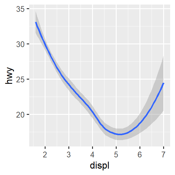
如果将 mappings 放置在 geom 函数中,ggplot2 会将它们视为图层的本地映射(local mappings)。 它将使用这些 mappings 来扩展或覆盖仅该层的全局映射(global mappings)。 这使得在不同图层上展现不同的 aesthetics 成为可能。
ggplot(mpg, aes(x = displ, y = hwy)) +
  geom_point(aes(color = class)) +
  geom_smooth()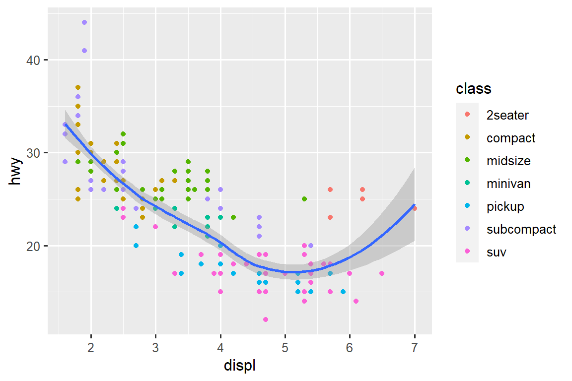
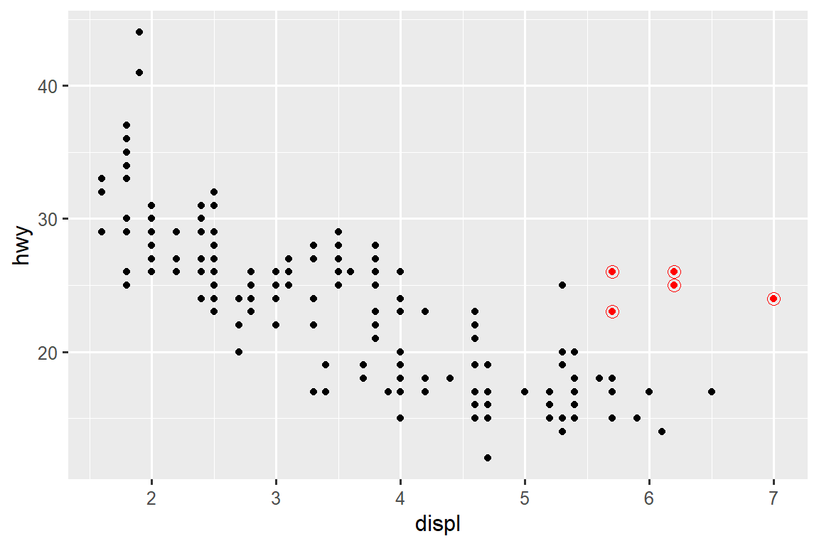
您可以使用相同的想法为每一图层指定不同的 data 。 在这里,我们使用红点和空心圆圈来突出显示 two-seater cars。 geom_point() 中的本地数据参数仅覆盖该图层的 ggplot() 中的全局数据参数。
ggplot(mpg, aes(x = displ, y = hwy)) +
  geom_point() +
  geom_point(
    data = mpg |> filter(class == "2seater"),
    color = "red"
  ) +
  geom_point(
    data = mpg |> filter(class == "2seater"),
    shape = "circle open", size = 3, color = "red"
  )
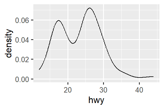
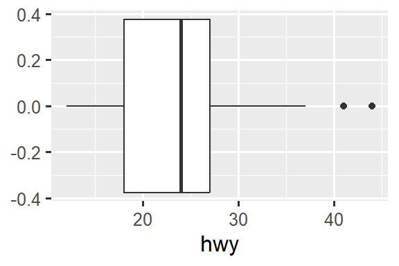
Geoms 是 ggplot2 的基本构建块。 您可以通过更改绘图的 geom 来彻底改变绘图的外观,并且不同的 geoms 可以揭示数据的不同特征。 例如,下面的直方图和密度图显示高速公路里程的分布是双峰且右偏的,而箱线图则显示两个潜在的异常值。
# Left
ggplot(mpg, aes(x = hwy)) +
  geom_histogram(binwidth = 2)

# Middle
ggplot(mpg, aes(x = hwy)) +
  geom_density()

# Right
ggplot(mpg, aes(x = hwy)) +
  geom_boxplot()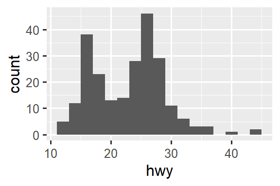
ggplot2 提供了 40 多种几何图形(geoms),但这些并没有涵盖人们可以绘制的所有可能的绘图。 如果您需要不同的 geom,我们建议首先查看扩展包,看看其他人是否已经实现了它(请参阅 https://exts.ggplot2.tidyverse.org/gallery/)。 例如,ggridges 包 (https://wilkelab.org/ggridges) 对于制作山脊线图(ridgeline plots)非常有用,这对于可视化不同级别的分类变量的数值变量的密度非常有用。 在下图中,我们不仅使用了新的 geom(geom_density_ridges()),而且还将相同的变量映射到多种 aesthetics(drv to y, fill, and color)并设置 aesthetic(alpha = 0.5)使密度曲线透明。
library(ggridges)
#> Warning: package 'ggridges' was built under R version 4.2.1

ggplot(mpg, aes(x = hwy, y = drv, fill = drv, color = drv)) +
  geom_density_ridges(alpha = 0.5, show.legend = FALSE)
#> Picking joint bandwidth of 1.28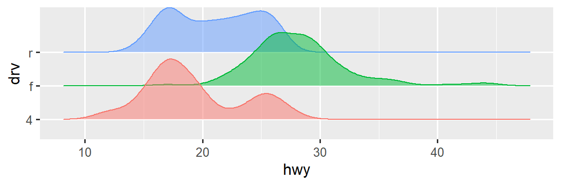
全面概述 ggplot2 提供的所有 geoms 以及包中所有功能的最佳位置是参考页面:https://ggplot2.tidyverse.org/reference。 要了解有关任何单个 geom 的更多信息,请使用帮助(例如?geom_smooth)。
10.3.1 Exercises
您会使用什么 geom 来绘制 line chart?b oxplot?h istogram?a rea chart?
-
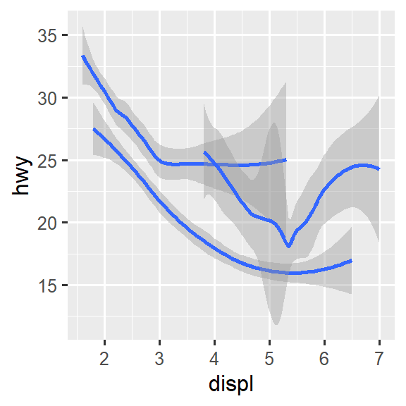
在本章前面我们使用了
show.legend,但没有解释它:ggplot(mpg, aes(x = displ, y = hwy)) + geom_smooth(aes(color = drv), show.legend = FALSE)show.legend = FALSE在这里做什么? 如果删除它会发生什么? 您认为我们为什么之前使用它? geom_smooth()的se参数有什么作用?-
重新创建生成以下图表所需的 R 代码。 请注意,图中只要使用分类变量,它就是
drv。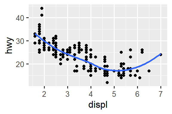
10.4 Facets
在 ?sec-data-visualization 中,您了解了如何使用 facet_wrap() 进行分面(faceting),它将图分割成子图,每个子图基于分类变量显示数据的一个子集。
ggplot(mpg, aes(x = displ, y = hwy)) +
  geom_point() +
  facet_wrap(~cyl)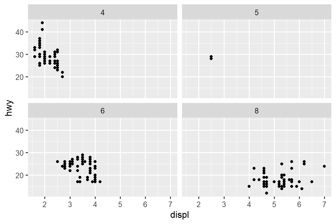
要使用两个变量的组合对图进行分面(facet),请从 facet_wrap() 切换到 facet_grid()。 facet_grid() 的第一个参数也是一个公式,但现在它是一个双面公式:rows ~ cols。
ggplot(mpg, aes(x = displ, y = hwy)) +
  geom_point() +
  facet_grid(drv ~ cyl)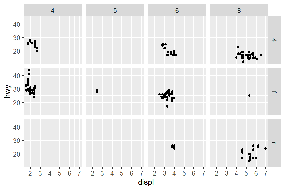
默认情况下,每个 facets 的 x 轴和 y 轴共享相同的比例和范围。 当您想要跨 facets 比较数据时,这很有用,但当您想要更好地可视化每个 facet 内的关系时,它可能会受到限制。 将 faceting 函数中的 scales 参数设置为 "free" 将允许跨行和列使用不同的轴比例, "free_x" 将允许跨行使用不同的比例,"free_y" 将允许跨列使用不同的比例。
ggplot(mpg, aes(x = displ, y = hwy)) +
  geom_point() +
  facet_grid(drv ~ cyl, scales = "free_y")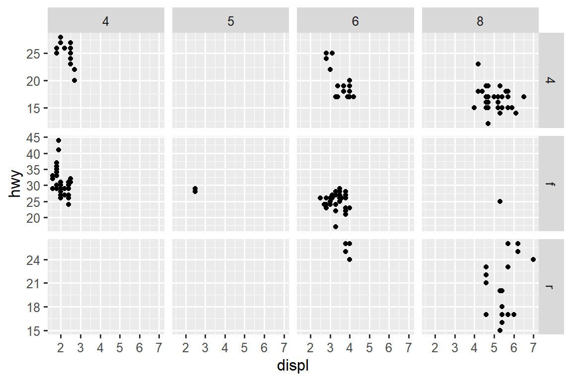
10.4.1 Exercises
如果对连续变量进行分面(facet)会发生什么?
-
facet_grid(drv ~ cyl)图中的空单元格是什么意思? 运行以下代码。 它们与最终的绘图有什么关系?ggplot(mpg) + geom_point(aes(x = drv, y = cyl)) -
下面的代码会绘制什么图?
.的作用是什么?ggplot(mpg) + geom_point(aes(x = displ, y = hwy)) + facet_grid(drv ~ .) ggplot(mpg) + geom_point(aes(x = displ, y = hwy)) + facet_grid(. ~ cyl) -
以本节中的第一个 faceted plot 为例:
ggplot(mpg) +
  geom_point(aes(x = displ, y = hwy)) +
  facet_wrap(~ class, nrow = 2)
使用 faceting 代替 color aesthetic 有什么优点? 有什么缺点? 如果您有更大的数据集,平衡会如何变化?
阅读
?facet_wrap。nrow的作用是什么?ncol的作用是什么? 还有哪些其他选项控制各个面板的布局? 为什么facet_grid()没有nrow和ncol参数?-
以下哪幅图可以更轻松地比较具有不同传动系统的汽车的发动机尺寸 (
displ)? 这对于何时跨行或列放置 faceting 变量意味着什么?ggplot(mpg, aes(x = displ)) + geom_histogram() + facet_grid(drv ~ .) ggplot(mpg, aes(x = displ)) + geom_histogram() + facet_grid(. ~ drv) -
使用
facet_wrap()而不是facet_grid()重新创建以下图。 facet 标签的位置如何变化?ggplot(mpg) + geom_point(aes(x = displ, y = hwy)) + facet_grid(drv ~ .)
10.5 Statistical transformations
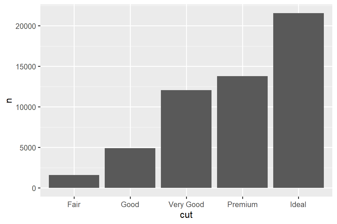
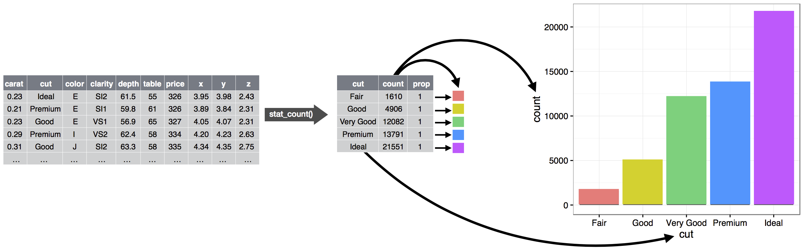
考虑使用 geom_bar() 或 geom_col() 绘制的基本条形图(bar chart)。 下图显示了 diamonds 数据集中的钻石(diamonds)总数,按 cut 分组。 diamonds 数据集位于 ggplot2 包中,包含 ~54,000 颗钻石的信息,包括每颗钻石的 price, carat, color, clarity, and cut。 该图表显示,高质量 cuts 的钻石数量多于低质量 cuts 的钻石。
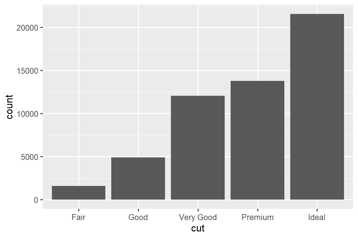
在 x-axis,图表显示 cut,这是 diamonds 的一个变量。 在 y-axis,它显示 count,但 count 不是 diamonds 中的变量! count 从何而来? 许多图表,例如 scatterplots,都会绘制数据集的原始值。 其他图表,例如 bar charts,会计算要绘制的新值:
Bar charts, histograms, and frequency polygons 对数据进行分 bin,然后绘制 bin counts,即每个 bin 中的点数。
Smoothers 将模型拟合到您的数据,然后根据模型绘制预测。
Boxplots 计算分布的 five-number summary,然后将该 summary 显示为特殊格式的 box。
用于计算图形新值的算法称为 stat,是统计变换(statistical transformation)的缩写。 Figure 10.2 显示了此过程如何与 geom_bar() 配合使用。
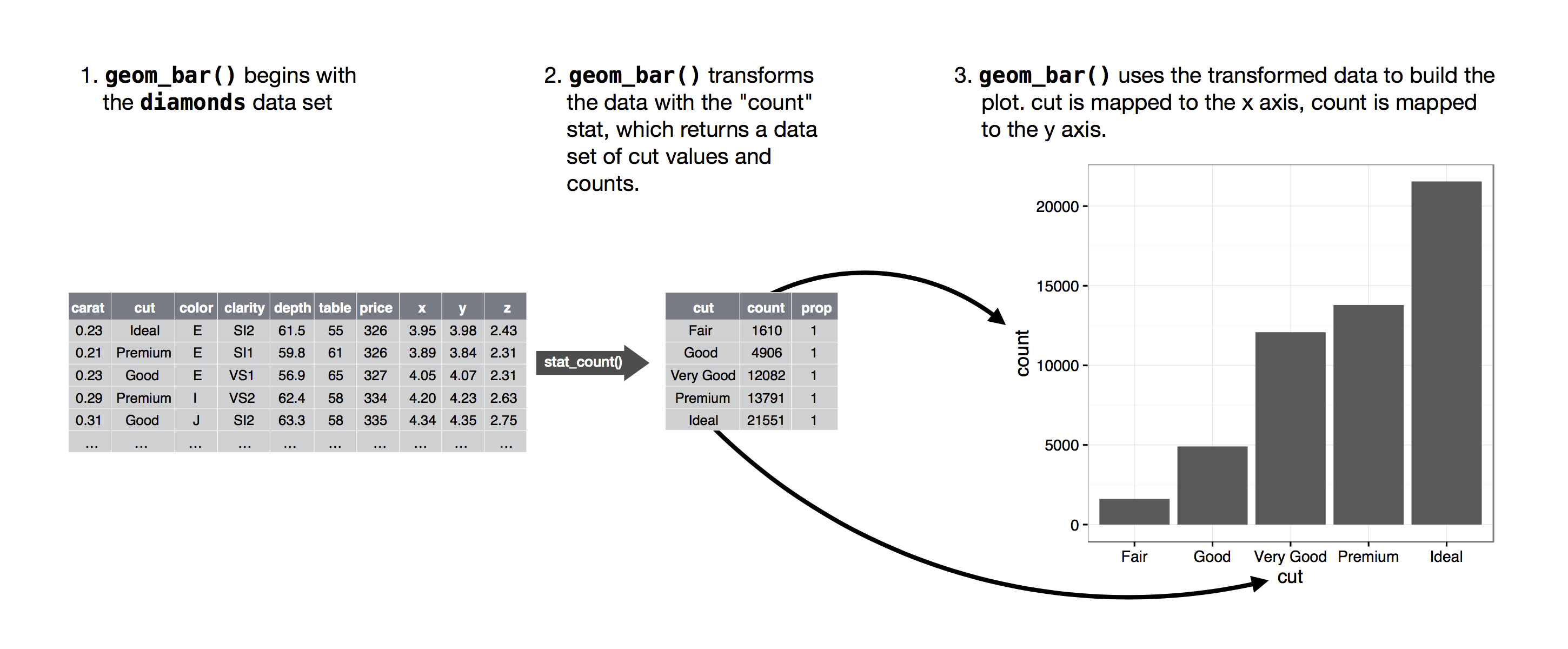
您可以通过检查 stat 参数的默认值来了解 geom 使用哪个 stat。 例如,?geom_bar 显示 stat 的默认值为 “count”,这意味着 geom_bar() 使用 stat_count()。 stat_count() 与 geom_bar() 记录在同一页面上。 如果向下滚动,名为 “Computed variables” 的部分会解释它计算两个新变量:count 和 prop。
每个 geom 都有一个默认的 stat;每个 stat 都有一个默认的 geom。 这意味着您通常可以使用 geoms,而不必担心底层的统计转换。 但是,您可能需要显式使用 stat 的三个原因如下:
-
您可能想要覆盖默认 stat。 在下面的代码中,我们将
geom_bar()的 stat 从 count (默认)更改为 identity。 这让我们可以将条形的高度映射到 y 变量的原始值。 -
您可能想要覆盖从转换变量到美学的默认映射。 例如,您可能想要显示比例条形图,而不是计数:
ggplot(diamonds, aes(x = cut, y = after_stat(prop), group = 1)) +
  geom_bar()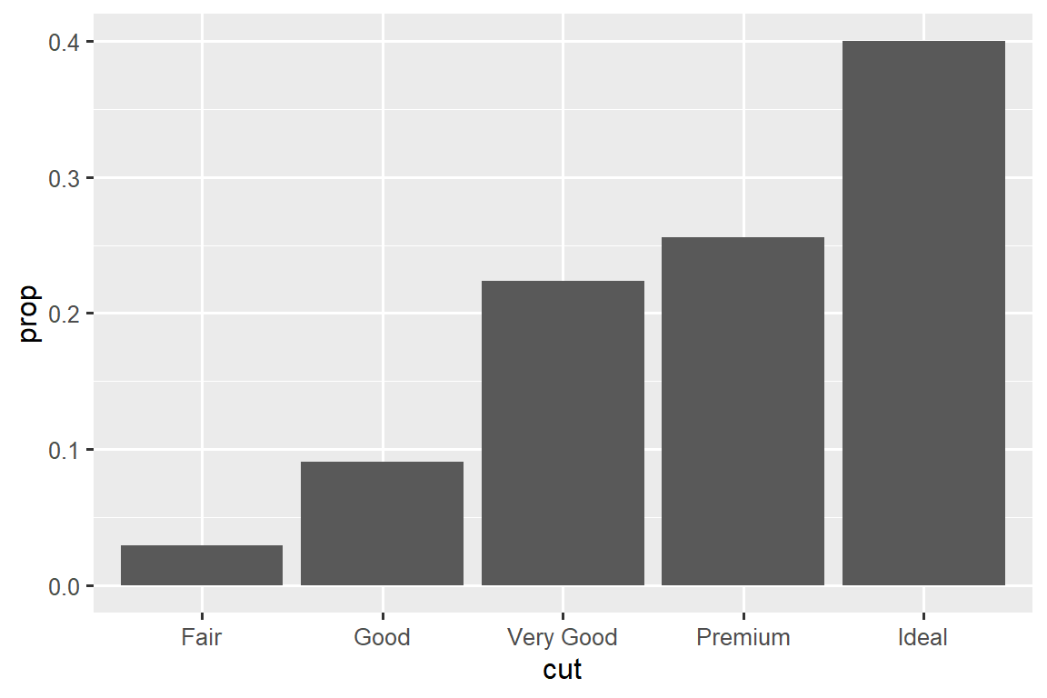
要查找可由 stat 计算的可能变量,请在
geom_bar()的帮助中查找标题为 “computed variables” 的部分。 -
您可能希望更加关注代码中的统计转换。 例如,您可以使用
stat_summary(),它总结每个唯一 x 值的 y 值,以引起人们对您正在计算的 summary 的注意:ggplot(diamonds) + stat_summary( aes(x = cut, y = depth), fun.min = min, fun.max = max, fun = median )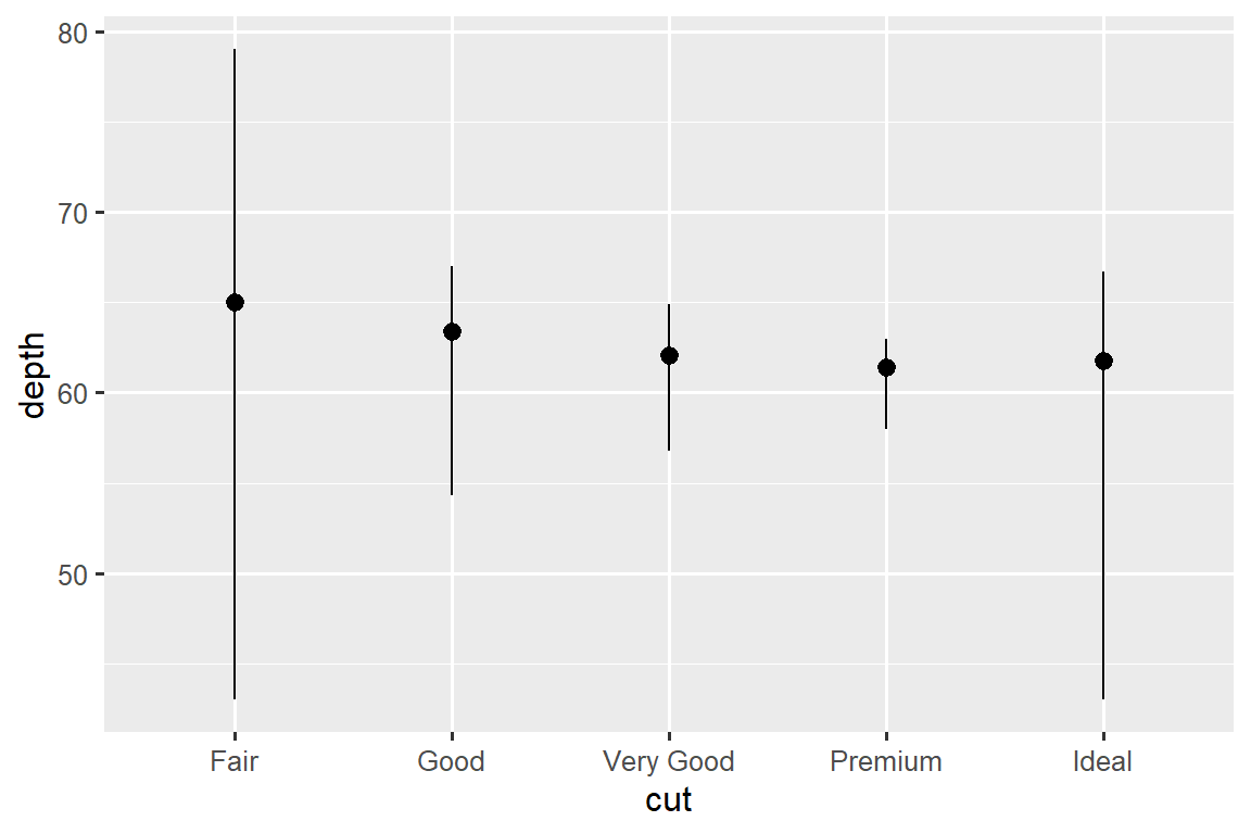
ggplot2 提供了 20 多种 stats 供您使用。 每个 stat 都是一个函数,因此您可以通过通常的方式获得帮助,例如 ?stat_bin。
10.5.1 Exercises
与
stat_summary()关联的默认 geom 是什么? 如何重写前面的绘图以使用 geom 函数而不是 stat 函数?geom_col()的作用是什么? 它与geom_bar()有什么不同?大多数 geoms 和 stats 都是成对出现的,几乎总是一起使用。 列出所有配对的列表。 他们有什么共同点? (提示:通读文档。)
stat_smooth()计算哪些变量? 什么参数控制其行为?-
在我们的比例条形图中,我们需要设置
group = 1。 为什么呢?换 句话说,这两张图有什么问题呢?ggplot(diamonds, aes(x = cut, y = after_stat(prop))) + geom_bar() ggplot(diamonds, aes(x = cut, fill = color, y = after_stat(prop))) + geom_bar()
10.6 Position adjustments
条形图还有一个神奇之处。 您可以使用 color aesthetic 或更有用的 fill aesthetic 来为条形图着色:
# Left
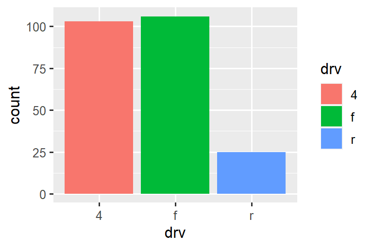
ggplot(mpg, aes(x = drv, color = drv)) +
geom_bar()
# Right
ggplot(mpg, aes(x = drv, fill = drv)) +
geom_bar()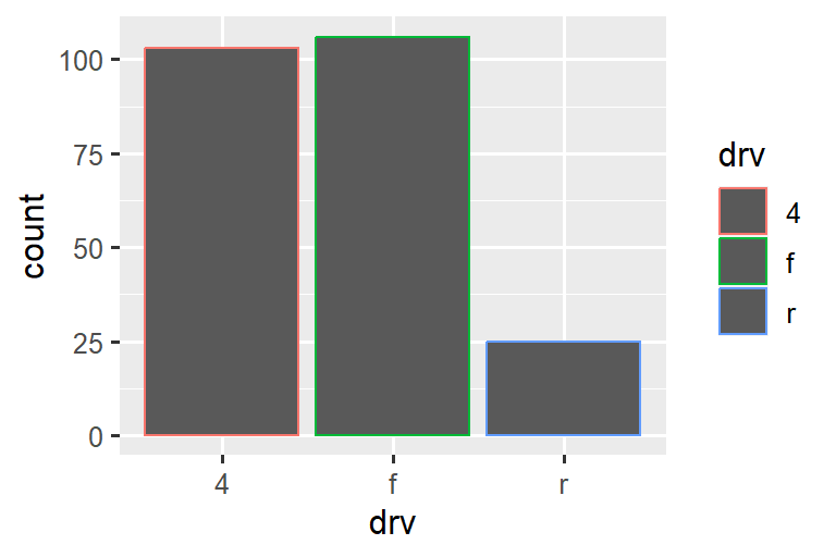
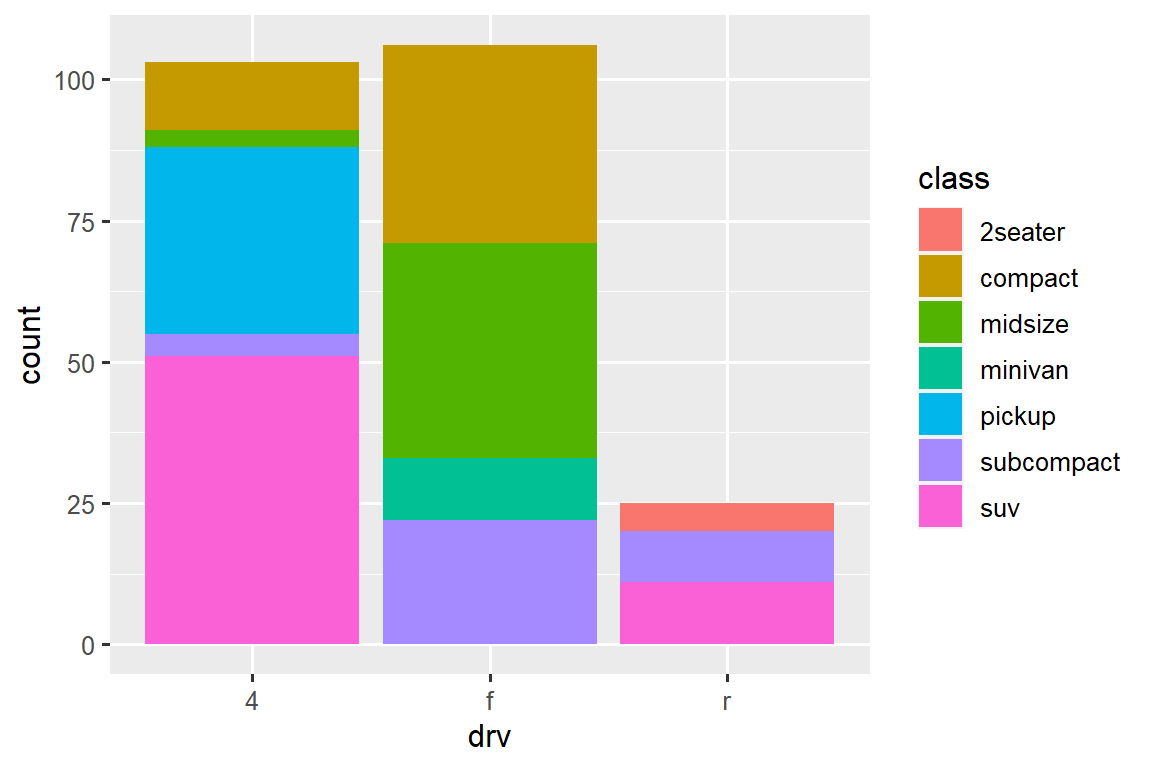
请注意,如果将 fill aesthetic 映射到另一个变量(例如 class),会发生什么:条形图会自动堆叠(stacked)。 每个彩色矩形代表 drv 和 class 的组合。
使用 position 参数指定的位置调整(position adjustment)自动执行堆叠。 如果您不需要堆叠条形图,可以使用其他三个选项之一:"identity", "dodge" or "fill"。
-
position = "identity"将把每个对象准确地放置在图表上下文中的位置。 这对于条形图来说不是很有用,因为它会导致重叠。 要看到重叠,我们需要通过将alpha设置为较小的值来使条形稍微透明,或者通过设置fill = NA使条形完全透明。# Left ggplot(mpg, aes(x = drv, fill = class)) + geom_bar(alpha = 1/5, position = "identity") # Right ggplot(mpg, aes(x = drv, color = class)) + geom_bar(fill = NA, position = "identity")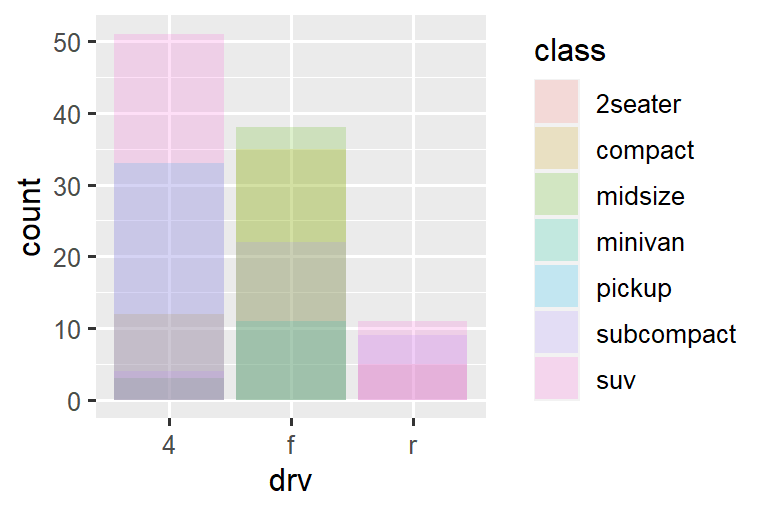
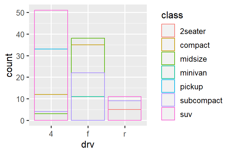
identity position 调整对于 2d geoms 更有用,例如 points,它是默认值。
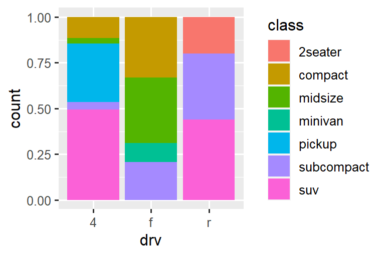
position = "fill"的工作方式类似于堆叠(stacking),但使每组堆叠的条形高度相同。 这使得比较不同组之间的比例变得更加容易。-
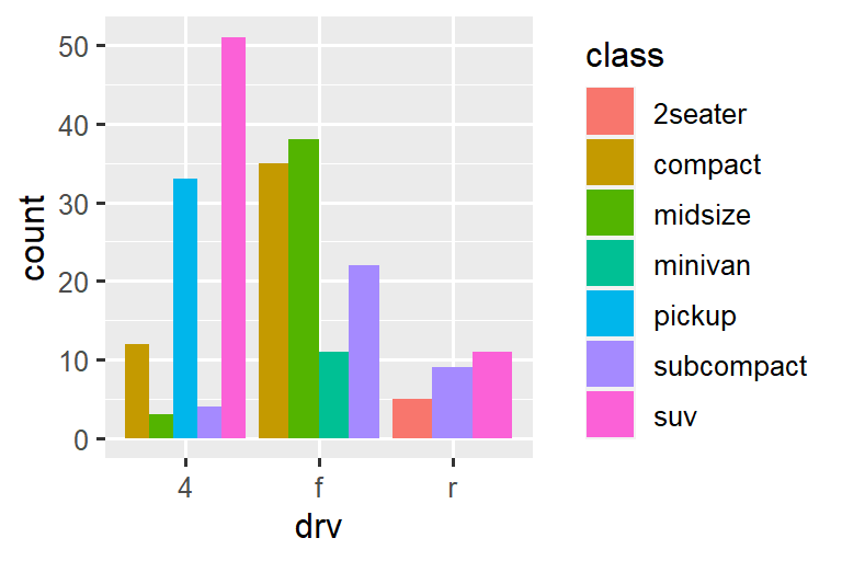
position = "dodge"将重叠的对象直接放在一起。 这使得比较各个值变得更容易。
还有另一种类型的调整对于条形图没有用,但对于散点图非常有用。 回想一下我们的第一个散点图。 您是否注意到该图仅显示 126 个点,即使数据集中有 234 个观测值?
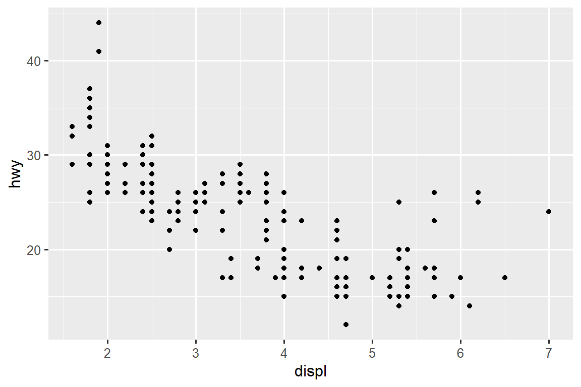
hwy 和 displ 的基础值是四舍五入的,因此这些点出现在网格上,并且许多点彼此重叠。 此问题称为过度绘图(overplotting)。这 种安排使得很难看到数据的分布。 数据点是否均匀分布在整个图表中,或者是否存在包含 109 个值的 hwy 和 displ 的一种特殊组合?
您可以通过将位置调整设置为 “jitter” 来避免这种网格化。 position = "jitter" 为每个点添加少量随机噪声。 这会将点分散开,因为没有两个点可能接收到相同数量的随机噪声。
ggplot(mpg, aes(x = displ, y = hwy)) +
  geom_point(position = "jitter")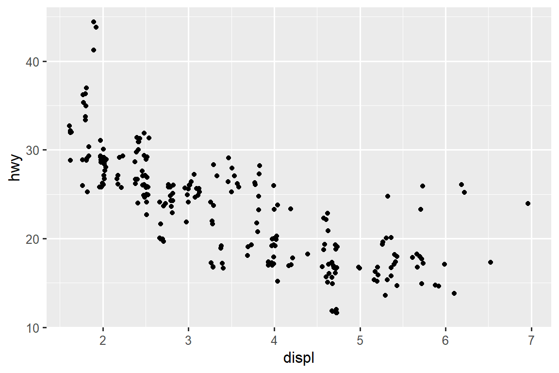
添加随机性似乎是改善绘图的一种奇怪方法,但虽然它会使您的图表在小尺度上不太准确,但它会使您的图表在大尺度上更具启发性。 因为这是一个非常有用的操作,所以 ggplot2 附带了 geom_point(position = "jitter") 的简写形式:geom_jitter()。
要了解有关 position adjustment 的更多信息,请查找与每个调整相关的帮助页面:?position_dodge, ?position_fill, ?position_identity, ?position_jitter, and ?position_stack。
10.6.1 Exercises
-
下面的绘图有什么问题吗? 你可以如何改进它?
ggplot(mpg, aes(x = cty, y = hwy)) + geom_point() -
两个图之间有什么区别(如果有的话)?为 什么?
ggplot(mpg, aes(x = displ, y = hwy)) + geom_point() ggplot(mpg, aes(x = displ, y = hwy)) + geom_point(position = "identity") geom_jitter()的哪些参数控制抖动量?将
geom_jitter()与geom_count()进行比较和对比。geom_boxplot()的默认位置调整是多少? 创建mpg数据集的可视化来演示它。
10.7 Coordinate systems
坐标系统(Coordinate systems)可能是 ggplot2 中最复杂的部分。 默认坐标系是笛卡尔坐标系,其中 x 和 y 位置独立作用以确定每个点的位置。 还有另外两个坐标系偶尔会有帮助。
-
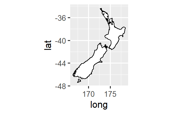
coord_quickmap()正确设置地理地图的纵横比。 如果您使用 ggplot2 绘制空间数据,这一点非常重要。 本书没有足够的篇幅来讨论地图,但您可以在 ggplot2: Elegant graphics for data analysis 的 Maps chapter 了解更多信息。nz <- map_data("nz") ggplot(nz, aes(x = long, y = lat, group = group)) + geom_polygon(fill = "white", color = "black") ggplot(nz, aes(x = long, y = lat, group = group)) + geom_polygon(fill = "white", color = "black") + coord_quickmap()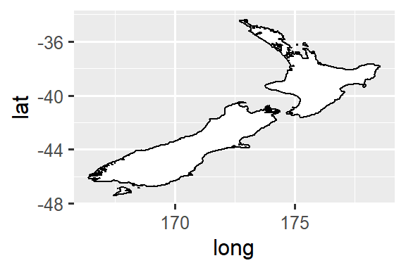
-
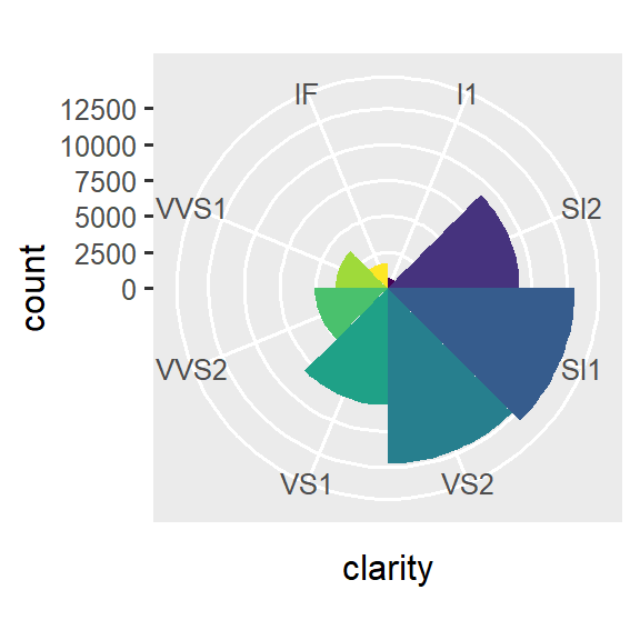
coord_polar()使用极坐标。 极坐标揭示了 bar chart 和 Coxcomb chart 之间的有趣联系。bar <- ggplot(data = diamonds) + geom_bar( mapping = aes(x = clarity, fill = clarity), show.legend = FALSE, width = 1 ) + theme(aspect.ratio = 1) bar + coord_flip() bar + coord_polar()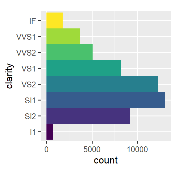
10.7.1 Exercises
使用
coord_polar()将 stacked bar chart 转换为 pie chart。coord_quickmap()和coord_map()有什么区别?-
下图告诉您什么关于城市和高速公路 mpg 之间的关系? 为什么
coord_fixed()很重要?geom_abline()的作用是什么?ggplot(data = mpg, mapping = aes(x = cty, y = hwy)) + geom_point() + geom_abline() + coord_fixed()
10.8 The layered grammar of graphics
我们可以通过添加 position adjustments, stats, coordinate systems, and faceting 来扩展您在 ?sec-ggplot2-calls 中学到的图形模板:
ggplot(data = <DATA>) +
  <GEOM_FUNCTION>(
     mapping = aes(<MAPPINGS>),
     stat = <STAT>,
     position = <POSITION>
  ) +
  <COORDINATE_FUNCTION> +
  <FACET_FUNCTION>
我们的新模板采用七个参数,即模板中出现的括号内的单词。 在实践中,您很少需要提供所有七个参数来制作图表,因为 ggplot2 将为除 data、mappings、 、geom 函数之外的所有内容提供有用的默认值。
模板中的七个参数组成了图形语法,这是一个用于构建绘图的正式系统。 图形语法基于这样的见解:您可以将任何绘图独特地描述为 a dataset、a geom、a set of mappings、a stat、a position adjustment、a coordinate system、a faceting scheme、a theme 的组合。
要了解其工作原理,请考虑如何从头开始构建基本图:您可以从 dataset 开始,然后将其转换为您想要显示的信息(with a stat)。 接下来,您可以选择一个 geometric object 来表示转换数据中的每个观测值。 然后,您可以使用 geoms 的 aesthetic properties 来表示数据中的变量。 您可以将每个变量的值 map 到 aesthetic 水平。 这些步骤如 Figure 10.3 所示。 然后,您可以选择一个 coordinate system 来放置 geoms,使用对象的位置(其本身就是一种美学属性)来显示 x 和 y 变量的值。
此时,您将拥有一个完整的图形,但您可以进一步调整坐标系内 geoms 的位置(a position adjustment)或将图形拆分为子图(faceting)。 您还可以通过添加一个或多个附加图层来扩展绘图,其中每个附加图层都使用 a dataset, a geom, a set of mappings, a stat, and a position adjustment。
您可以使用此方法来构建您想象的任何绘图。 换句话说,您可以使用本章中学到的代码模板来构建数十万个独特的绘图。
如果您想了解更多关于 ggplot2 的理论基础,您可能会喜欢阅读 “The Layered Grammar of Graphics”,这是一篇详细描述 ggplot2 理论的科学论文。
10.9 Summary
在本章中,您学习了图形的分层语法,从 aesthetics 和 geometries 开始构建简单的绘图,将绘图 facets 成子集,了解如何计算 geoms 的 statistics,在 geoms 可能发生变化时控制位置细节以避免重叠的 position adjustments。 coordinate systems 允许您从根本上改变 x 和 y 的含义。 我们还没有触及的一层是 theme,我们将在 ?sec-themes 中介绍它。
ggplot2 cheatsheet (which you can find at https://posit.co/resources/cheatsheets) 和 ggplot2 package website (https://ggplot2.tidyverse.org) 是了解完整 ggplot2 功能的两个非常有用的资源。
从本章中你应该学到的一个重要教训是,当你觉得需要 ggplot2 未提供的 geom 时,最好看看其他人是否已经通过创建一个 ggplot2 扩展包来解决你的问题,该扩展包提供了那个 geom。