# 安装包
if (!requireNamespace("tidyr", quietly = TRUE)) {
  install.packages("tidyr")
}
if (!requireNamespace("gghalves", quietly = TRUE)) {
  install.packages("gghalves")
}
if (!requireNamespace("dplyr", quietly = TRUE)) {
  install.packages("dplyr")
}
if (!requireNamespace("ggplot2", quietly = TRUE)) {
  install.packages("ggplot2")
}
if (!requireNamespace("forcats", quietly = TRUE)) {
  install.packages("forcats")
}
if (!requireNamespace("hrbrthemes", quietly = TRUE)) {
  install.packages("hrbrthemes")
}
if (!requireNamespace("viridis", quietly = TRUE)) {
  install.packages("viridis")
}
if (!requireNamespace("ggstatsplot", quietly = TRUE)) {
  install.packages("ggstatsplot")
}
if (!requireNamespace("palmerpenguins", quietly = TRUE)) {
  install.packages("palmerpenguins")
}

# 加载包
library(tidyr)
library(ggplot2)
library(dplyr)
library(gghalves)
library(forcats)
library(hrbrthemes)
library(viridis)
library(ggstatsplot)
library(palmerpenguins)小提琴图
小提琴图是一种基于密度图和箱线图的可视化方式,它能够展示数据的分布情况,包括中位数、四分位数、最大值、最小值等信息。常用于比较不同组之间的数据分布情况,它的可视化效果比箱线图更加直观,能够更好地展示数据的特点。
- 箱线图: 白点——中位数, 黑色条形图范围——四分位数范围。
- 核密度图: 展示了任意位置点聚集的密度。
示例
依赖
系统:全平台
编程语言:R
依赖包:
data.table;tidyverse;tidyr;ggplot2;dplyr;gghalves;forcats;hrbrthemes;viridis;Rcpp;tibble;ggstatsplot;palmerpenguins
数据
我们使用 R 内置数据集 (iris, penguins) 和来自 UCSC Xena DATASETS 的 TCGA-BRCA.htseq_counts.tsv 数据集。选择选定的基因用于演示目的。
# 从处理后的 CSV 文件加载 TCGA-BRCA 基因表达数据集
data_counts <- read.csv("files/TCGA-BRCA.htseq_counts_processed.csv")

# 加载内置 R 数据集 iris
data_wide <- iris[ , 1:4] # 以iris数据库1-4列数据为例

# 加载内置 R 数据集 penguins
data("penguins", package = "palmerpenguins")
data_penguins <- drop_na(penguins) # 去除缺失值

# 手动创建具有分组值的演示数据集
data <- data.frame(
  name=c( rep("A",500), rep("B",500), rep("B",500), rep("C",20), rep('D', 100)  ),
  value=c( rnorm(500, 10, 5), rnorm(500, 13, 1), rnorm(500, 18, 1), rnorm(20, 25, 4), rnorm(100, 12, 1) )
  )
sample_size <- data %>%
  group_by(name) %>%
  summarize(num=n()) # 创建样本数量列
可视化
1. 基础小提琴图
示例 1: 基础小提琴图使用手动创建的数据集
# 基础小提琴图
p <- ggplot(data, aes(x=name, y=value, fill=name)) +
  geom_violin()

p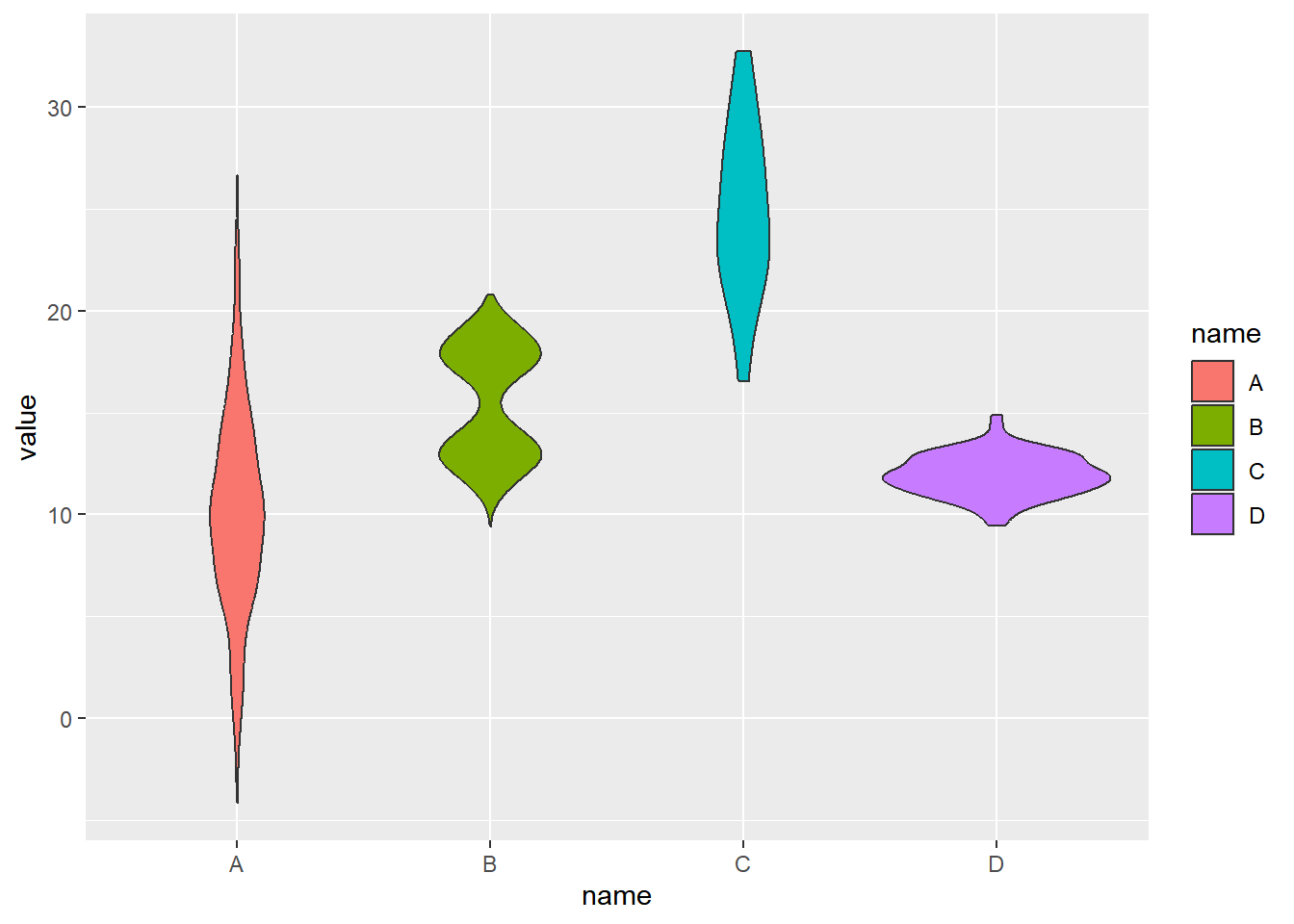
示例 2: 基础小提琴图使用 iris 数据集
# 整理数据,利用gather函数将各列数据收集到名为“MesureType”和“Val”的两个新列中,使一行为一个观测。
data_long_iris <- data_wide %>%
  gather(key = "MeasureType", value = "Value")

ggplot(data_long_iris, aes(x = MeasureType, y = Value, fill = MeasureType)) +
geom_violin() 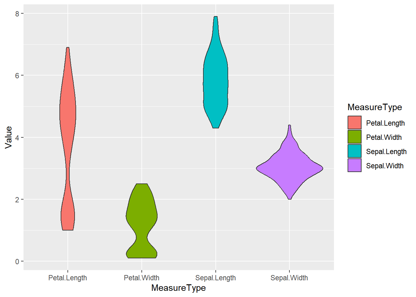
iris 数据集
示例 3: 基础小提琴图使用 TCGA-BRCA 基因表达数据集
example_counts1 <- data_counts[1:5,] %>%
  gather(key = "sample",value = "gene_expression",3:1219) # 选择 5 个示例基因用于可视化: A1BG, A1BG-AS1, A1CF, A2M, and A2M-AS1.

ggplot(example_counts1, aes(x=gene_name, y=gene_expression, fill=gene_name)) +
  geom_violin()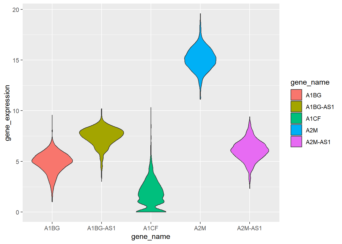
TCGA-BRCA 基因表达数据集
2. 反转小提琴图
我们可以通过 coord_flip() 实现 x、y 轴的翻转。
example_counts2 <- data_counts[1:6,] %>%
  gather(key = "sample",value = "gene_expression",3:1219) %>%
  mutate(gene_name= fct_reorder(gene_name,gene_expression ))

ggplot(example_counts2, aes(x=gene_name, y=gene_expression, fill=gene_name, color=gene_name)) +
  geom_violin() +
  scale_fill_viridis(discrete=TRUE) +
  scale_color_viridis(discrete=TRUE) +
  theme_ipsum() + # Improve plot appearance
  theme(legend.position="none" ) +
  coord_flip() + # flip the x and y axes
  xlab("") +
  ylab("Assigned Probability (%)")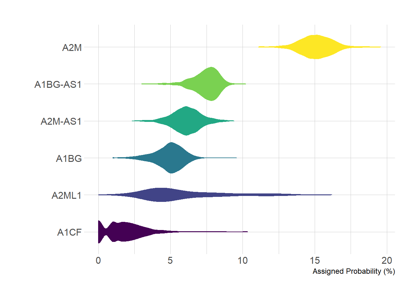
TCGA-BRCA 数据集
3. 箱线小提琴图
在实际可视化应用中,我们可以通过 geom_boxplot() 在小提琴图中添加箱线图,便于更加直观的比较数据。
example_data <- data %>%
  left_join(sample_size) %>%
  mutate(myaxis = paste0(name, "\n", "n=", num)) # The `myaxis` variable is created to display sample size on the x-axis.

ggplot(example_data, aes(x=myaxis, y=value, fill=name)) +
  geom_violin(width=1.4) +
geom_boxplot( width=0.1,color="grey", alpha=0.2) + # Draw a box plot. A small width value makes the box plot inside the violin plot.
scale_fill_viridis(discrete = TRUE) +
  theme_ipsum() + # Beautify the graph
  theme(
   legend.position="none",
   plot.title = element_text(size=11)
  ) +
  ggtitle("A Violin plot wrapping a boxplot") +  # Set the title
  xlab("")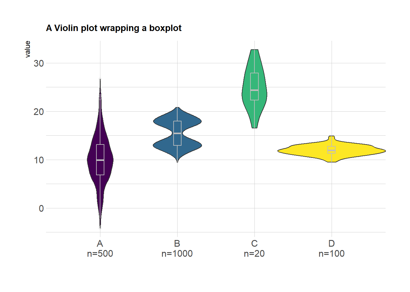
另一个箱线小提琴图使用 TCGA-BRCA 基因表达数据
example_counts3 <- data_counts[1:5,] %>%
  gather(key = "sample", value = "gene_expression",3:1219) %>%
  mutate(gene_name= fct_reorder(gene_name,gene_expression ))

ggplot(example_counts3, aes(x=gene_name, y=gene_expression, fill=gene_name, color=gene_name)) +
  geom_violin() +
  geom_boxplot( width=0.1,color="grey", alpha=0.2)+
  scale_fill_viridis(discrete=TRUE) +
  scale_color_viridis(discrete=TRUE) +
  theme_ipsum() + # Beautify the graph
theme(legend.position="none" ) 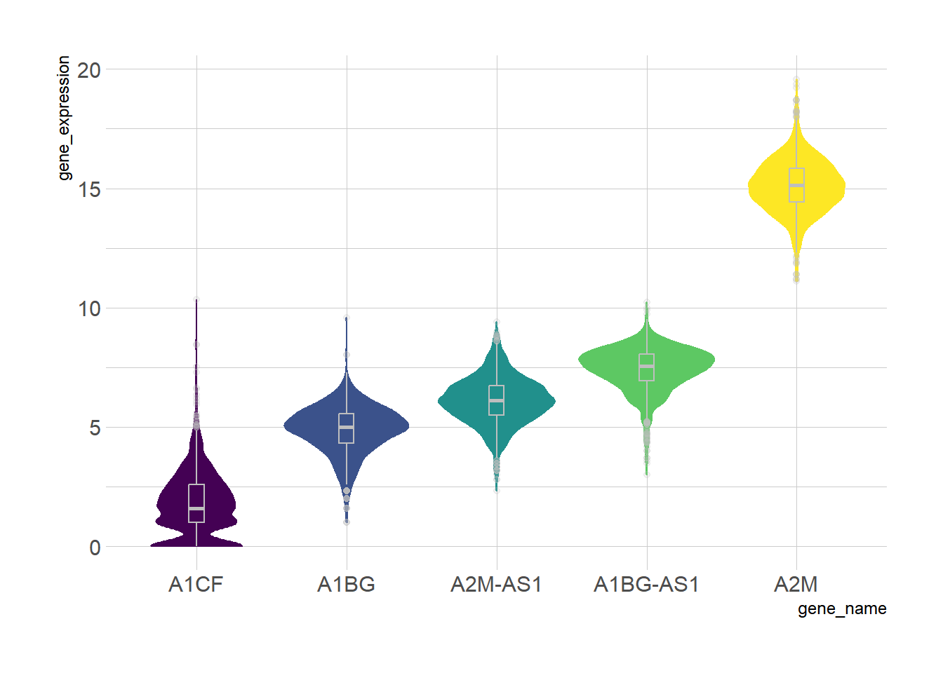
TCGA-BRCA 数据集
4. 分组小提琴图
在基础小提琴图的基础上,我们可以通过设置 fill 值来实现组内比较。
下面的示例将企鹅种类作为 x 变量,fill=sex 将 sex 作为组内比较的分类依据,实现了不同种类、不同性别企鹅脚板长度组间和组内的可视化对比。
ggplot(data_penguins, aes(fill=sex, y=flipper_length_mm, x=species)) + # X作为大分类,fill作为组间分类
  geom_violin(position="dodge", alpha=0.5, outlier.colour="transparent") +
  scale_fill_viridis(discrete=T, name="") +
theme_ipsum() 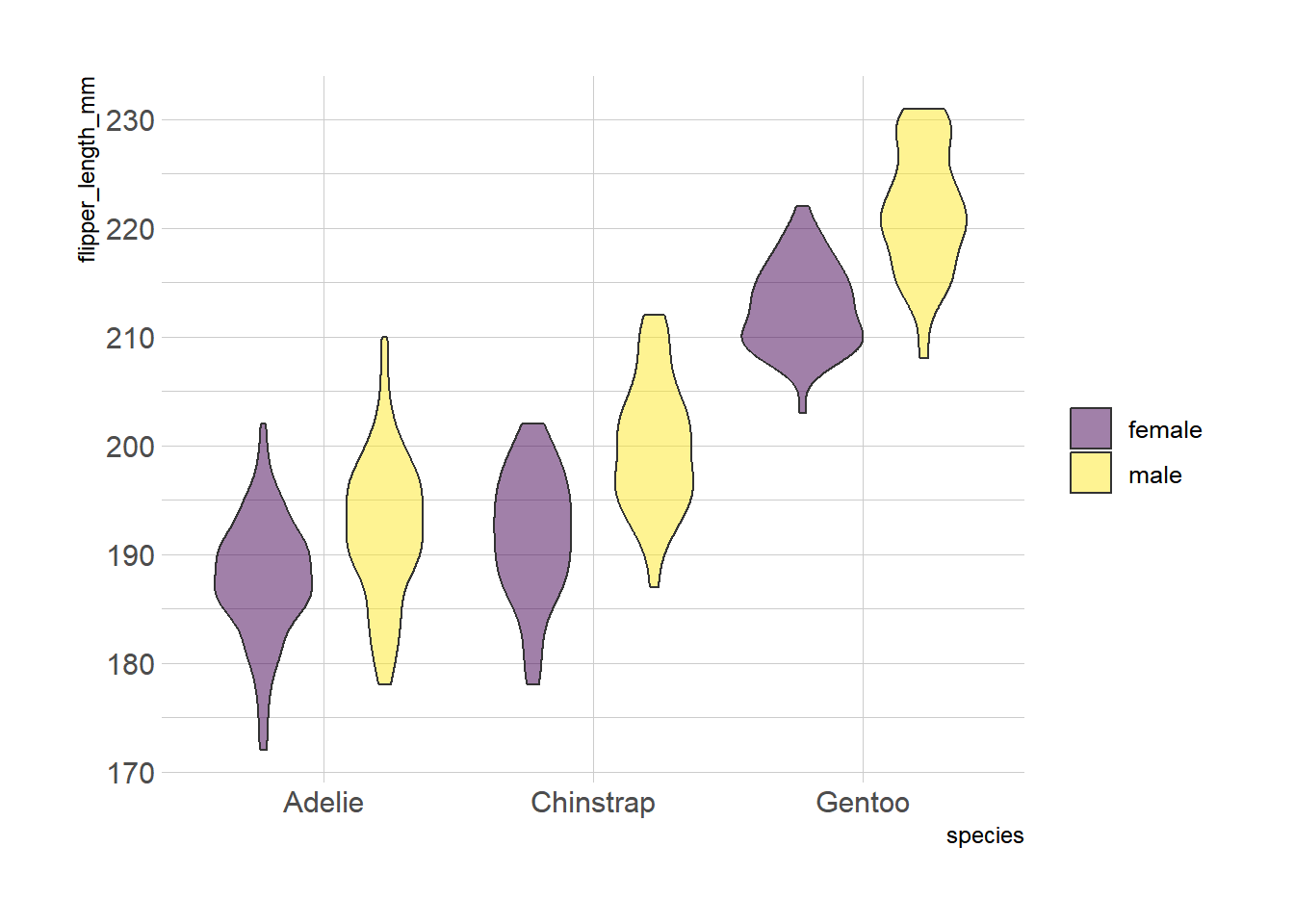
penguins 数据集
5. 半分小提琴图
半分小提琴图可以用简便的方式展现大量信息,我们可以用 geom_half_violin 函数分别绘制两个 group。
在下面的示例种, 我们通过半分小提琴图的形式实现了实现了不同种类、不同性别企鹅脚板长度组间和组内的可视化对比。
# 选出两个group的data,分别添加
data_female <- data_penguins %>% filter(sex == "female")
data_male <- data_penguins %>% filter(sex == "male")

# 分边添加,female的值,放在左边
ggplot() +
  geom_half_violin(
    data = data_female,
    aes(y = flipper_length_mm, x = species),
    position = position_dodge(width = 1),
    scale = 'width',
    colour = NA,
    fill = "#9370DB",
    alpha = 0.8,  ## 设置透明度
    side = "r"
  ) +
  geom_half_violin(
    data = data_male,
    aes(y = flipper_length_mm, x = species),
    position = position_dodge(width = 1),
    scale = 'width',
    colour = NA,
    fill = "#FFFF00",
    alpha = 0.6,
    side = "l"
  )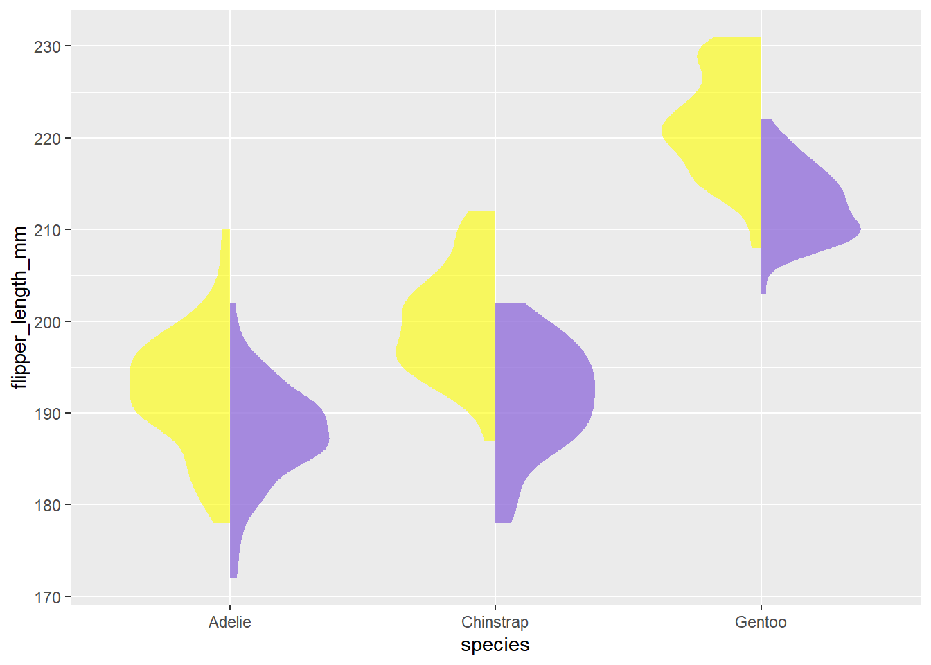
penguins 数据集
6. 使用 ggstatsplot包绘图
ggstatsplot 作为 ggplot2 的拓展包具有强大的可视化功能,我们可以利用它绘制精美的小提琴图。
在下面的示例中, 我们使用 penguins 数据集可视化不同企鹅物种的喙长分布。我们使用 theme() 函数进一步增强绘图的美感。
plt <- ggbetweenstats(
  data = data_penguins,
  x = species,
  y = bill_length_mm
) +
# 美化
  labs(  ## 添加标签和标题
    x = "Penguins Species",
    y = "Bill Length",
    title = "Distribution of bill length across penguins species"
  ) +
  theme(
    axis.ticks = element_blank(),
    axis.line = element_line(colour = "grey50"),
    panel.grid = element_line(color = "#b4aea9"),
    panel.grid.minor = element_blank(),
    panel.grid.major.x = element_blank(),
    panel.grid.major.y = element_line(linetype = "dashed"),
    panel.background = element_rect(fill = "#fbf9f4", color = "#fbf9f4"),
    plot.background = element_rect(fill = "#fbf9f4", color = "#fbf9f4")
  )
Error in validObject(.Object) :
invalid class "ddenseModelMatrix" object: superclass "xMatrix" not defined in the environment of the object's classplt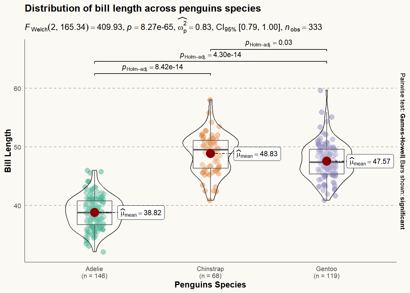
ggstatsplot 包
应用场景
1. 常规小提琴图
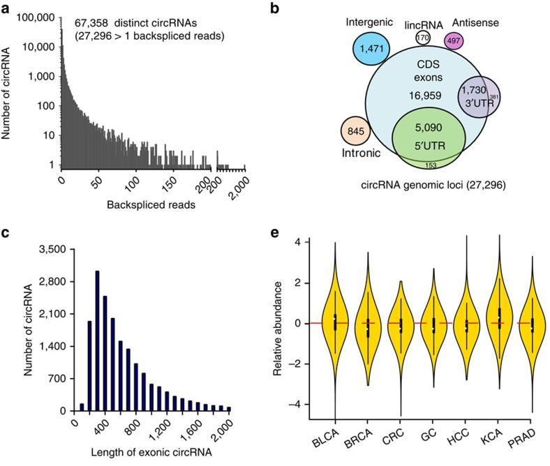
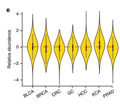
图 10 e图为七种癌症组织与对应正常组织中 circRNA 相对丰度的小提琴图 [1]。
2. 分组小提琴图
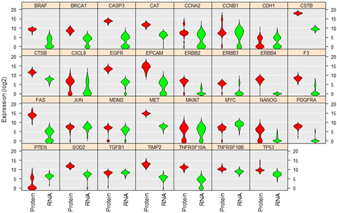
上示小提琴图分析比较了 A549 单细胞中 31 种蛋白质和 mRNA 的水平和分布 [2]。
3. 半分小提琴图
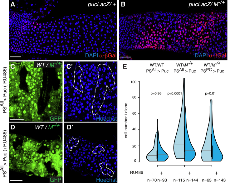
图 12 E 利用半分小提琴图分析 WT 克隆在 WT 肠道(左)或 M−/+ 肠道(中图和右图)中的克隆大小分布 [3]。
4. 箱线小提琴图
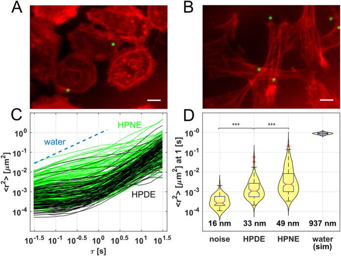
图 13 D 展示附着在基质上 (noise) 和水中 (stimulation ) 的液滴的预期中值 MSD 和分布,以及纳米级的 RMS 位移 [4]。
参考资料
[1] Zheng Q, Bao C, Guo W, Li S, Chen J, Chen B, Luo Y, Lyu D, Li Y, Shi G, Liang L, Gu J, He X, Huang S. Circular RNA profiling reveals an abundant circHIPK3 that regulates cell growth by sponging multiple miRNAs. Nat Commun. 2016 Apr 6;7:11215. doi: 10.1038/ncomms11215. PMID: 27050392; PMCID: PMC4823868.
[2] Gong H, Wang X, Liu B, Boutet S, Holcomb I, Dakshinamoorthy G, Ooi A, Sanada C, Sun G, Ramakrishnan R. Single-cell protein-mRNA correlation analysis enabled by multiplexed dual-analyte co-detection. Sci Rep. 2017 Jun 5;7(1):2776. doi: 10.1038/s41598-017-03057-5. PMID: 28584233; PMCID: PMC5459813.
[3] Kolahgar G, Suijkerbuijk SJ, Kucinski I, Poirier EZ, Mansour S, Simons BD, Piddini E. Cell Competition Modifies Adult Stem Cell and Tissue Population Dynamics in a JAK-STAT-Dependent Manner. Dev Cell. 2015 Aug 10;34(3):297-309. doi: 10.1016/j.devcel.2015.06.010. Epub 2015 Jul 23. PMID: 26212135; PMCID: PMC4537514.
[4] Cribb JA, Osborne LD, Beicker K, Psioda M, Chen J, O’Brien ET, Taylor Ii RM, Vicci L, Hsiao JP, Shao C, Falvo M, Ibrahim JG, Wood KC, Blobe GC, Superfine R. An Automated High-throughput Array Microscope for Cancer Cell Mechanics. Sci Rep. 2016 Jun 6;6:27371. doi: 10.1038/srep27371. PMID: 27265611; PMCID: PMC4893602.
[5] Wickham H, Vaughan D, Girlich M (2024). tidyr: Tidy Messy Data. R package version 1.3.1, https://CRAN.R-project.org/package=tidyr.
[6] H. Wickham. ggplot2: Elegant Graphics for Data Analysis. Springer-Verlag New York, 2016.
[7] Wickham H, François R, Henry L, Müller K, Vaughan D (2023). dplyr: A Grammar of Data Manipulation. R package version 1.1.4, https://CRAN.R-project.org/package=dplyr.
[8] Tiedemann F (2022). gghalves: Compose Half-Half Plots Using Your Favourite Geoms. R package version 0.1.4, https://CRAN.R-project.org/package=gghalves.
[9] Wickham H (2023). forcats: Tools for Working with Categorical Variables (Factors). R package version 1.0.0, https://CRAN.R-project.org/package=forcats.
[10] Rudis B (2024). hrbrthemes: Additional Themes, Theme Components and Utilities for ‘ggplot2’. R package version 0.8.7, https://CRAN.R-project.org/package=hrbrthemes.
[11] Simon Garnier, Noam Ross, Robert Rudis, Antônio P. Camargo, Marco Sciaini, and Cédric Scherer (2024). viridis(Lite) - Colorblind-Friendly Color Maps for R. viridis package version 0.6.5.
[12] Patil, I. (2021). Visualizations with statistical details: The ‘ggstatsplot’ approach. Journal of Open Source Software, 6(61), 3167, doi:10.21105/joss.03167
[13] Horst AM, Hill AP, Gorman KB (2020). palmerpenguins: Palmer Archipelago (Antarctica) penguin data. R package version 0.1.0. https://allisonhorst.github.io/palmerpenguins/. doi: 10.5281/zenodo.3960218.