# 安装包
if (!requireNamespace("plot3D", quietly = TRUE)) {
  install.packages("plot3D")
}
if (!requireNamespace("ggplotify", quietly = TRUE)) {
  install.packages("ggplotify")
}

# 加载包
library(plot3D)
library(ggplotify)三维柱状图
注记
Hiplot 网站
本页面为 Hiplot 3D Barplot 插件的源码版本教程,您也可以使用 Hiplot 网站实现无代码绘图,更多信息请查看以下链接:
三维柱状图用于为数据提供三维外观。第三维通常出于美学原因而使用,但其不能改善数据的读取。仍旨在显示离散类别之间的比较。
环境配置
系统: Cross-platform (Linux/MacOS/Windows)
编程语言: R
依赖包:
plot3D;ggplotify
数据准备
载入数据为不同治疗方案中不同剂量药物作用效果数据。
# 加载数据
data <- read.table("files/Hiplot/003-barplot-3d-data.txt", header = T)

# 将数据向量转换为矩阵
mat <- matrix(rep(1, nrow(data)), nrow = length(unique(data[, 2])))
rownames(mat) <- unique(data[, 2])
colnames(mat) <- unique(data[, 3])
for (i in 1:nrow(mat)) {
  for (j in seq_len(ncol(mat))) {
    mat[i, j] <- data[, 1][data[, 2] == rownames(mat)[i] &
      data[, 3] == colnames(mat)[j]]
  }
}

# 查看数据
mat
high mid low
Group1 13 25 5
Group2 34 8 25
Group3 21 17 12
Group4 43 10 19可视化
# 三维柱状图
p <- as.ggplot(function() {
  hist3D(
    x = 1:nrow(mat), y = seq_len(ncol(mat)), z = mat,
    bty = "g", phi = 20,
    theta = -55,
    xlab = colnames(data)[2],
    ylab = colnames(data)[3], zlab = colnames(data)[1],
    main = "3D Bar Plot", colkey = F,
    border = "black", shade = 0.8, axes = T,
    ticktype = "detailed", space = 0.3, d = 2, cex.axis = 0.3,
    colvar = as.numeric(as.factor(data[, 2])), alpha = 1,
    col = c("#E64B35FF","#4DBBD5FF","#00A087FF","#3C5488FF")
  )

  # 使用 text3D 标记 x 轴
  text3D(
    x = 1:nrow(mat), y = rep(0.5, nrow(mat)), z = rep(3, nrow(mat)),
    labels = rownames(mat),
    add = TRUE, adj = 0, cex = 0.8
  )
  # 使用 text3D 标记 y 轴
  text3D(
    x = rep(1, ncol(mat)), y = seq_len(ncol(mat)), z = rep(0, ncol(mat)),
    labels = colnames(mat), bty = "g",
    add = TRUE, adj = 1, cex = 0.8
  )
})

p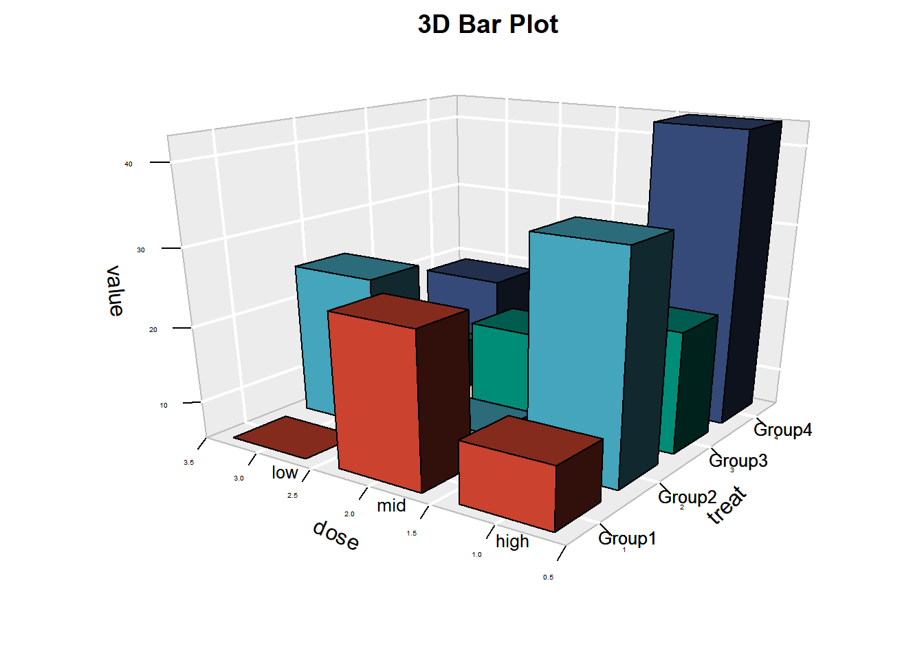
该三维柱状图展示了不同治疗组(组 1 ~ 组 4)分别用低、中、高剂量进行治疗时,不同的治疗效果。组 1 使用中剂量治疗时效果最好,组 2 使用高剂量治疗时效果最好,组3使用剂量治疗时无较大差距,组 4 使用高剂量治疗时效果最好。
提示
特殊参数:
- Phi: 正值越大,表示趋于从三维图形顶端向下观测;负值越大,表示趋于从三维图形底端向上观测。
- Theta: 三维图形水平旋转的角度。