# 安装包
if (!requireNamespace("ggplot2", quietly = TRUE)) {
  install.packages("ggplot2")
}
if (!requireNamespace("stringr", quietly = TRUE)) {
  install.packages("stringr")
}

# 加载包
library(ggplot2)
library(stringr)气泡图
注记
Hiplot 网站
本页面为 Hiplot Bubble 插件的源码版本教程,您也可以使用 Hiplot 网站实现无代码绘图,更多信息请查看以下链接:
气泡图是在散点图的基础上,用气泡的大小来展示第三个变量,从而能够同时对三个变量进行对比分析的统计图表。
环境配置
系统: Cross-platform (Linux/MacOS/Windows)
编程语言: R
依赖包:
ggplot2;stringr
数据准备
载入数据为 GO Term, Gene Ridio,基因数和 P 值。
# 加载数据
data <- read.delim("files/Hiplot/016-bubble-data.txt", header = T)

# 整理数据格式
data[, 1] <- str_to_sentence(str_remove(data[, 1], pattern = "\\w+:\\d+\\W"))
topnum <- 7
data <- data[1:topnum, ]
data[, 1] <- factor(data[, 1], level = rev(unique(data[, 1])))

# 查看数据
head(data)
Term Count Ratio PValue
1 Immune response 20 10.471204 9.61e-08
2 Defense response to bacterium 11 5.759162 3.02e-06
3 Cell chemotaxis 8 4.188482 5.14e-06
4 Cell adhesion 17 8.900524 2.73e-05
5 Complement activation 8 4.188482 3.56e-05
6 Extracellular matrix organization 11 5.759162 4.23e-05可视化
# 气泡图
p <- ggplot(data, aes(Ratio, Term)) +
  geom_point(aes(size = Count, colour = -log10(PValue))) +
  scale_colour_gradient(low = "#00438E", high = "#E43535") +
  labs(colour = "-log10 (PValue)", size = "Count", x = "Ratio", y = "Term",
       title = "Bubble Plot") +
  scale_x_continuous(limits = c(0, max(data$Ratio) * 1.2)) +
  guides(color = guide_colorbar(order = 1), size = guide_legend(order = 2)) +
  scale_y_discrete(labels = function(x) {str_wrap(x, width = 65)}) +
  theme_bw() +
  theme(text = element_text(family = "Arial"),
        plot.title = element_text(size = 12,hjust = 0.5),
        axis.title = element_text(size = 12),
        axis.text = element_text(size = 10),
        axis.text.x = element_text(angle = 0, hjust = 0.5,vjust = 1),
        legend.position = "right",
        legend.direction = "vertical",
        legend.title = element_text(size = 10),
        legend.text = element_text(size = 10))

p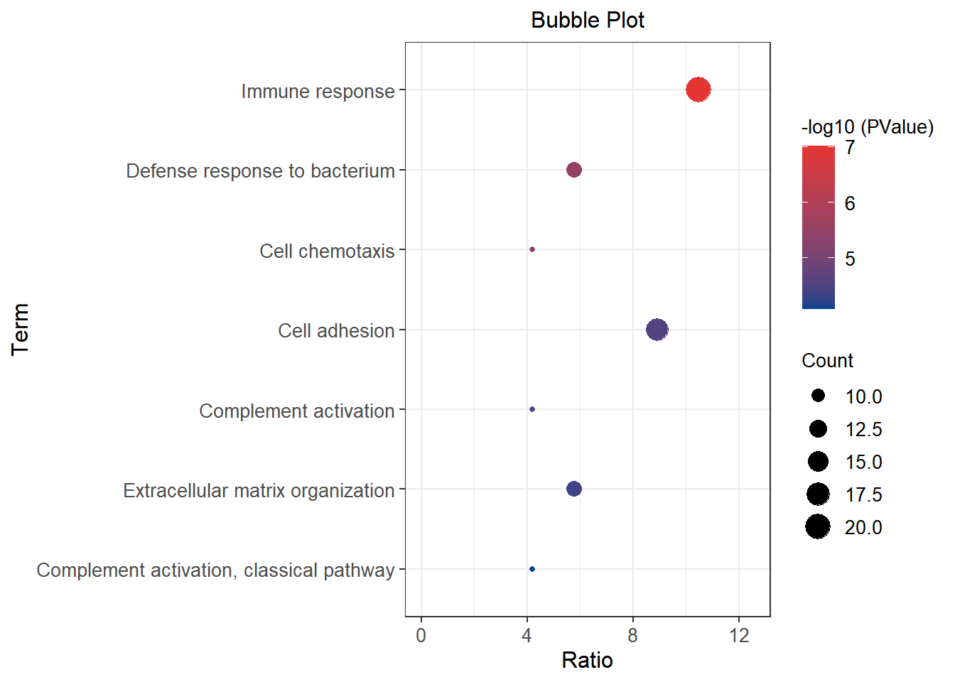
x 轴表示 Gene Ridio,y 轴是 GO Term; 点的大小表示基因数,点的颜色代表 P 值的高低。