# 安装包
if (!requireNamespace("ggplotify", quietly = TRUE)) {
  install.packages("ggplotify")
}
if (!requireNamespace("beanplot", quietly = TRUE)) {
  install.packages("beanplot")
}

# 加载包
library(ggplotify)
library(beanplot)豆荚图
注记
Hiplot 网站
本页面为 Hiplot Beanplot 插件的源码版本教程,您也可以使用 Hiplot 网站实现无代码绘图,更多信息请查看以下链接:
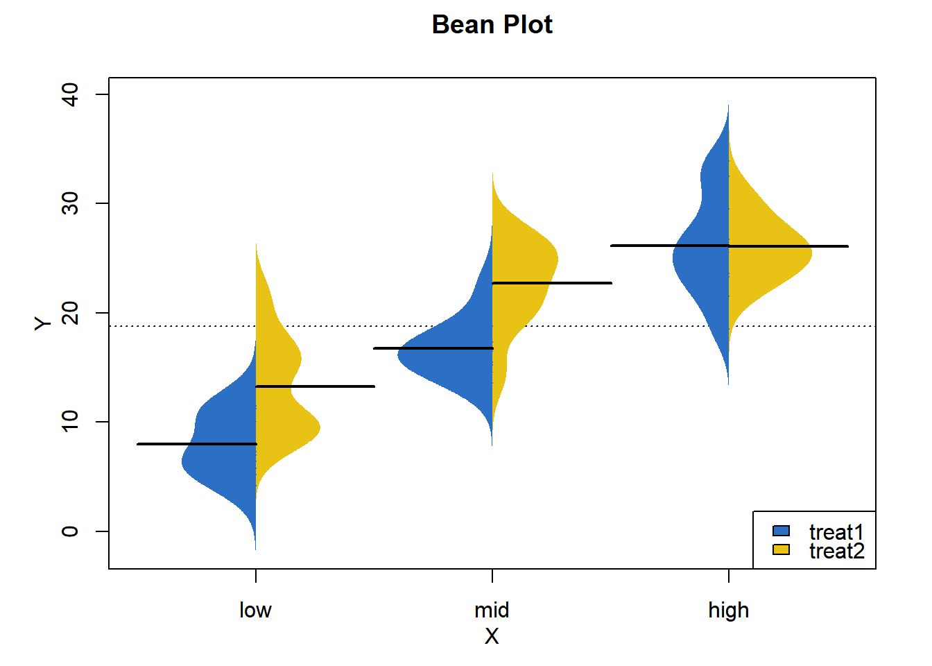
豆荚图是一种描述一组数据分布特征的方法。
环境配置
系统: Cross-platform (Linux/MacOS/Windows)
编程语言: R
依赖包:
ggplotify;beanplot
数据准备
载入数据为数据集 (不同治疗方案的治疗效果数据)。
# 加载数据
data <- read.table("files/Hiplot/011-beanplot-data.txt", header = T)

# 整理数据格式
GroupOrder <- as.numeric(factor(data[, 2], levels = unique(data[, 2])))
data[, 2] <- paste0(data[,2], " ", as.numeric(factor(data[, 3])))
data <- cbind(data, GroupOrder)

# 查看数据
head(data)
Y X Group GroupOrder
1 4.2 low 1 treat1 1
2 11.5 low 1 treat1 1
3 7.3 low 1 treat1 1
4 5.8 low 1 treat1 1
5 6.4 low 1 treat1 1
6 10.0 low 1 treat1 1可视化
# 豆荚图
p <- as.ggplot(function() {
  beanplot(Y ~ reorder(X, GroupOrder, mean), data = data, ll = 0.04,
           main = "Bean Plot", ylab = "Y", xlab = "X", side = "both",
           border = NA, horizontal = F,
           col = list(c("#2b70c4", "#2b70c4"),c("#e9c216", "#e9c216")),
           beanlines = "mean", overallline = "mean", kernel = "gaussian")

  legend("bottomright", fill = c("#2b70c4", "#e9c216"),
         legend = levels(factor(data[, 3])))
})

p