# 安装包
if (!requireNamespace("ggplot2", quietly = TRUE)) {
  install.packages("ggplot2")
}

# 加载包
library(ggplot2)区间条形图
注记
Hiplot 网站
本页面为 Hiplot Interval Bar Chart 插件的源码版本教程,您也可以使用 Hiplot 网站实现无代码绘图,更多信息请查看以下链接:
环境配置
系统: Cross-platform (Linux/MacOS/Windows)
编程语言: R
依赖包:
ggplot2
数据准备
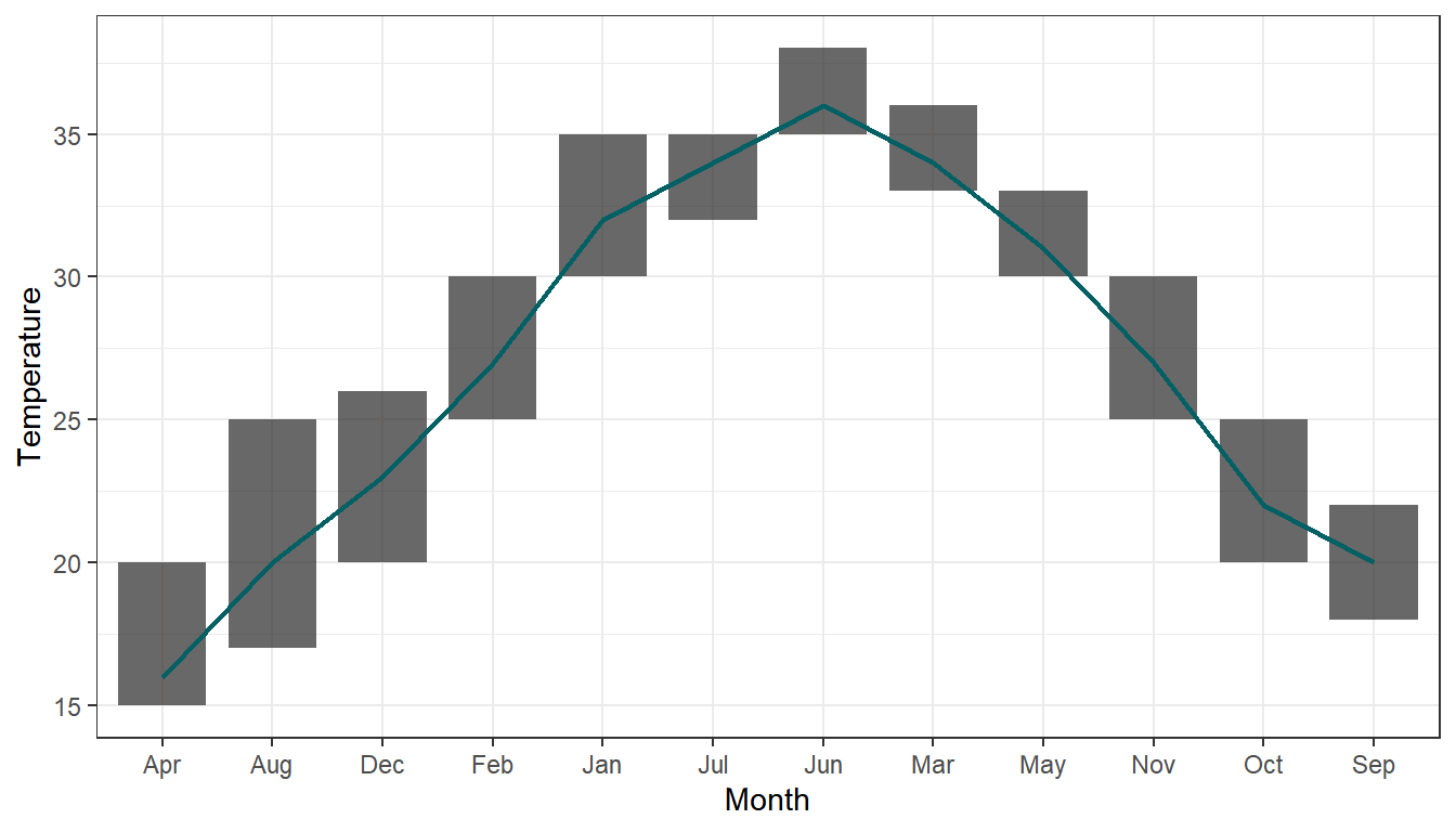
案例数据为一年十二个月份的最高和最低温度和对应的月份简称。通过案例数据绘制了每个月份的温度区间及温度均线。
# 加载数据
data <- read.delim("files/Hiplot/090-interval-bar-chart-data.txt", header = T)

# 整理数据格式
data$name_num <- match(data[["month"]], unique(data[["month"]]))

# 查看数据
head(data)
month min_temperature max_temperature mean name_num
1 Jan 15 20 16 1
2 Feb 17 25 20 2
3 Mar 20 26 23 3
4 Apr 25 30 27 4
5 May 30 35 32 5
6 Jun 32 35 34 6可视化
# 区间条形图
p <- ggplot(data, aes(x = month, y = max_temperature)) +
  geom_rect(aes(xmin = name_num - 0.4, xmax = name_num + 0.4,
                ymin = min_temperature, ymax = max_temperature),
            fill = "#282726", alpha = 0.7) +
  geom_line(aes(x = name_num, y = mean), color = "#006064", size = 0.8) +
  labs(x = "Month", y = "Temperature") +
  scale_x_discrete() +
  theme_bw()

p