# 安装包
if (!requireNamespace("ComplexHeatmap", quietly = TRUE)) {
  install_github("jokergoo/ComplexHeatmap")
}

# 加载包
library(ComplexHeatmap)热图
注记
Hiplot 网站
本页面为 Hiplot Heatmap 插件的源码版本教程,您也可以使用 Hiplot 网站实现无代码绘图,更多信息请查看以下链接:
热图是对实验数据分布情况进行分析的直观可视化方法,可以用来进行实验数据的质量控制和差异数据的具象化展示,还可以对数据和样品进行聚类分析,观测样品质量。
环境配置
系统: Cross-platform (Linux/MacOS/Windows)
编程语言: R
依赖包:
ComplexHeatmap
数据准备
载入数据为 count (基因名称及其对应的基因表达值),样本信息(样本名称,所属组群及其他相关信息,如年龄),基因信息(基因名称及其所属通路,如肿瘤通路和生理状况下通路)。
# 加载数据
data_count <- read.delim("files/Hiplot/086-heatmap-data1.txt", header = T)
data_sample <- read.delim("files/Hiplot/086-heatmap-data2.txt", header = T)
data_gene <- read.delim("files/Hiplot/086-heatmap-data3.txt", header = T)

# 整理数据格式
data_count <- data_count[!is.na(data_count[, 1]), ]
idx <- duplicated(data_count[, 1])
data_count[idx, 1] <- paste0(data_count[idx, 1], "--dup-", cumsum(idx)[idx])
for (i in 2:ncol(data_count)) {
  data_count[, i] <- as.numeric(data_count[, i])
}
data <- as.matrix(data_count[, -1])
rownames(data) <- data_count[, 1]

## 给样本添加标注信息
sample.info <- data_sample[-1]
row.names(sample.info) <- data_sample[, 1]
sample_info_reorder <- as.data.frame(sample.info[match(
  colnames(data), rownames(sample.info)
  ), ])
colnames(sample_info_reorder) <- colnames(sample.info)
rownames(sample_info_reorder) <- colnames(data)

## 给基因添加标注信息
gene_info <- data_gene[-1]
rownames(gene_info) <- data_gene[, 1]
gene_info_reorder <- as.data.frame(gene_info[match(
  rownames(data), rownames(gene_info)
  ), ])
colnames(gene_info_reorder) <- colnames(gene_info)
rownames(gene_info_reorder) <- rownames(data)

# 查看数据
head(data)
M1 M2 M3 M4 M5 M6 M7
GBP4 6.599344 5.226266 3.693288 3.938501 4.527193 9.308119 8.987865
BCAT1 5.760380 4.892783 5.448924 3.485413 3.855669 8.662081 8.793320
CMPK2 9.561905 4.549168 3.998655 5.614384 3.904793 9.790770 7.133188
STOX2 8.396409 8.717055 8.039064 7.643060 9.274649 4.417013 4.725270
PADI2 8.419766 8.268430 8.451181 9.200732 8.598207 4.590033 5.368268
SCARNA5 7.653074 5.780393 10.633550 5.913684 8.805605 5.890120 5.527945
M8 M9 M10
GBP4 7.658312 8.666038 7.419708
BCAT1 8.765915 8.097206 8.262942
CMPK2 7.379591 7.938063 6.154118
STOX2 3.542217 4.305187 6.964710
PADI2 4.136667 4.910986 4.080363
SCARNA5 3.822596 4.041078 7.956589可视化
# 热图
## 设置annotation_col和annotation_row,分别对样本和基因添加附注
top_var <- 100
top_var_genes <- rownames(data)[head(
  order(genefilter::rowVars(data), decreasing = TRUE),
  nrow(data) * top_var / 100
)]
## 设置annotation_colors
col <- colorRampPalette(c("#0060BF","#FFFFFF","#CA1111"))(50)
annotation_colors <- list()
for(i in colnames(sample_info_reorder)) {
  if (is.numeric(sample_info_reorder[,i])) {
    annotation_colors[[i]] <- col
  } else {
    ref <- c("#323232","#1B6393")
    annotation_colors[[i]] <- ref
    names(annotation_colors[[i]]) <- unique(sample_info_reorder[,i])
  }
}
for(i in colnames(gene_info_reorder)) {
  if (is.numeric(gene_info_reorder[,i])) {
    annotation_colors[[i]] <- col
  } else {
    ref <- c("#323232","#1B6393")
    annotation_colors[[i]] <- ref
    names(annotation_colors[[i]]) <- unique(gene_info_reorder[,i])
  }
}

p <-
  ComplexHeatmap::pheatmap(
    data[row.names(data) %in% top_var_genes,],
    color = col,
    border_color = NA,
    fontsize_row = 6, fontsize_col = 6,
    main = "Heatmap Plot",
    cluster_rows = T, cluster_cols = T,
    scale = "none",
    clustering_method = "ward.D2",
    clustering_distance_cols = "euclidean",
    clustering_distance_rows = "euclidean",
    fontfamily = "Arial",
    display_numbers = F,
    number_color = "black",
    annotation_col = sample_info_reorder,
    annotation_row = gene_info_reorder,
    annotation_colors = annotation_colors
  )

p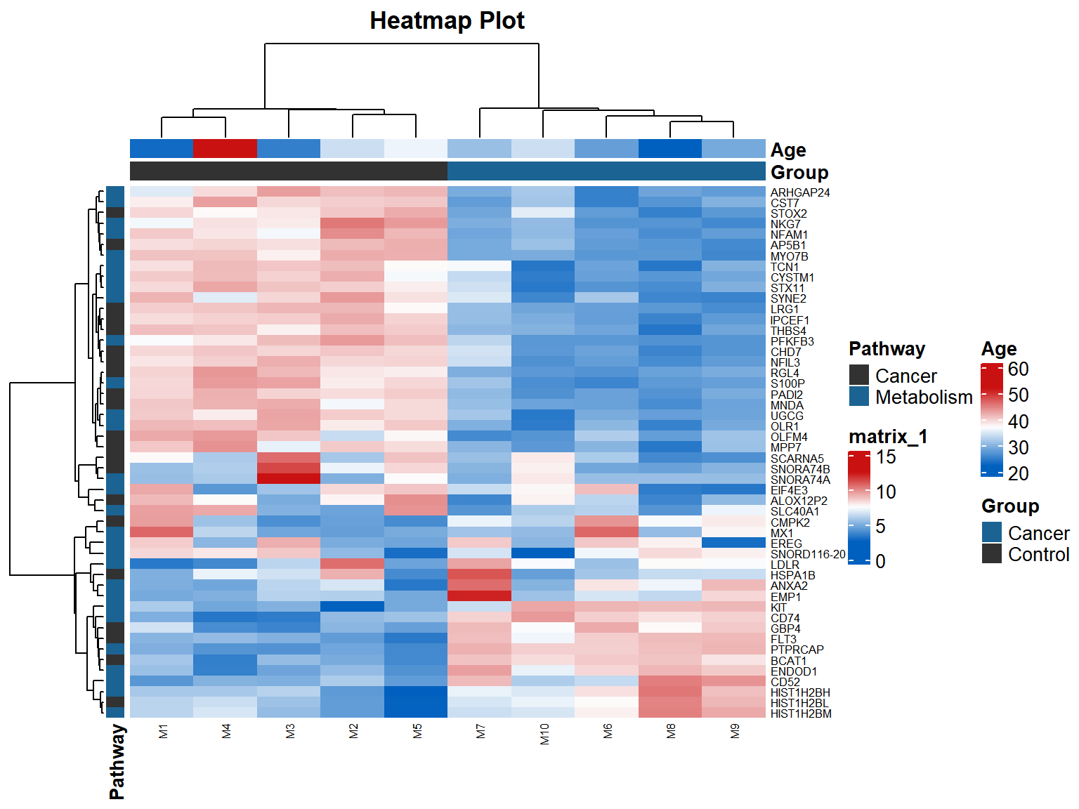
示例图每个小格表示每个基因,颜色深浅表示该基因表达量大小,表达量越大颜色越深(红色为上调,绿色为下调)。每行表示每个基因在不同样本中的表达量状况,每列表示每个样本所有基因的表达量情况。上方树形图表示不同组群和年龄的不同样本的聚类分析结果,左侧树形图表示来自不同样本的不同基因的聚类分析结果。