# 安装包
if (!requireNamespace("ggplot2", quietly = TRUE)) {
  install.packages("ggplot2")
}

# 加载包
library(ggplot2)环形图
注记
Hiplot 网站
本页面为 Hiplot Donut 插件的源码版本教程,您也可以使用 Hiplot 网站实现无代码绘图,更多信息请查看以下链接:
环形图是饼图的一种变体,它有一个允许包含数据整体额外信息的空白中心。且与饼图目的一致,都是用来说明数据比例。
环境配置
系统: Cross-platform (Linux/MacOS/Windows)
编程语言: R
依赖包:
ggplot2
数据准备
载入数据为不同分组及其数据。
# 加载数据
data <- read.delim("files/Hiplot/045-donut-data.txt", header = T)

# 整理数据格式
data$fraction <- data[, 2] / sum(data[, 2])
data$ymax <- cumsum(data$fraction)
data$ymin <- c(0, head(data$ymax, n = -1))
data$labelPosition <- (data$ymax + data$ymin) / 2
data$label <- paste0(data[, 1], "\n",
  "(", data[, 2], ", ", sprintf("%2.2f%%", 100 * data[, 2] / sum(data[, 2])), ")",
  sep = ""
)

# 查看数据
head(data)
group value fraction ymax ymin labelPosition label
1 Group1 13 0.1171171 0.1171171 0.0000000 0.05855856 Group1\n(13, 11.71%)
2 Group2 34 0.3063063 0.4234234 0.1171171 0.27027027 Group2\n(34, 30.63%)
3 Group3 21 0.1891892 0.6126126 0.4234234 0.51801802 Group3\n(21, 18.92%)
4 Group4 43 0.3873874 1.0000000 0.6126126 0.80630631 Group4\n(43, 38.74%)可视化
# 环形图
p <- ggplot(data, aes_(ymax = as.name("ymax"), ymin = as.name("ymin"),
                       xmax = 4, xmin = 3, fill = as.name(colnames(data)[1]))) +
  geom_rect() +
  geom_text(x = 5 + (4 - 5) / 3,
            aes(y = labelPosition, label = label), size = 4) +
  coord_polar(theta = "y") +
  xlim(c(2, 5)) +
  scale_fill_manual(values = c("#00468BCC","#ED0000CC","#42B540CC","#0099B4CC")) +
  ggtitle("Donut Plot") +
  theme_void() +
  theme(plot.title = element_text(hjust = 0.5),
        legend.position = "none")

p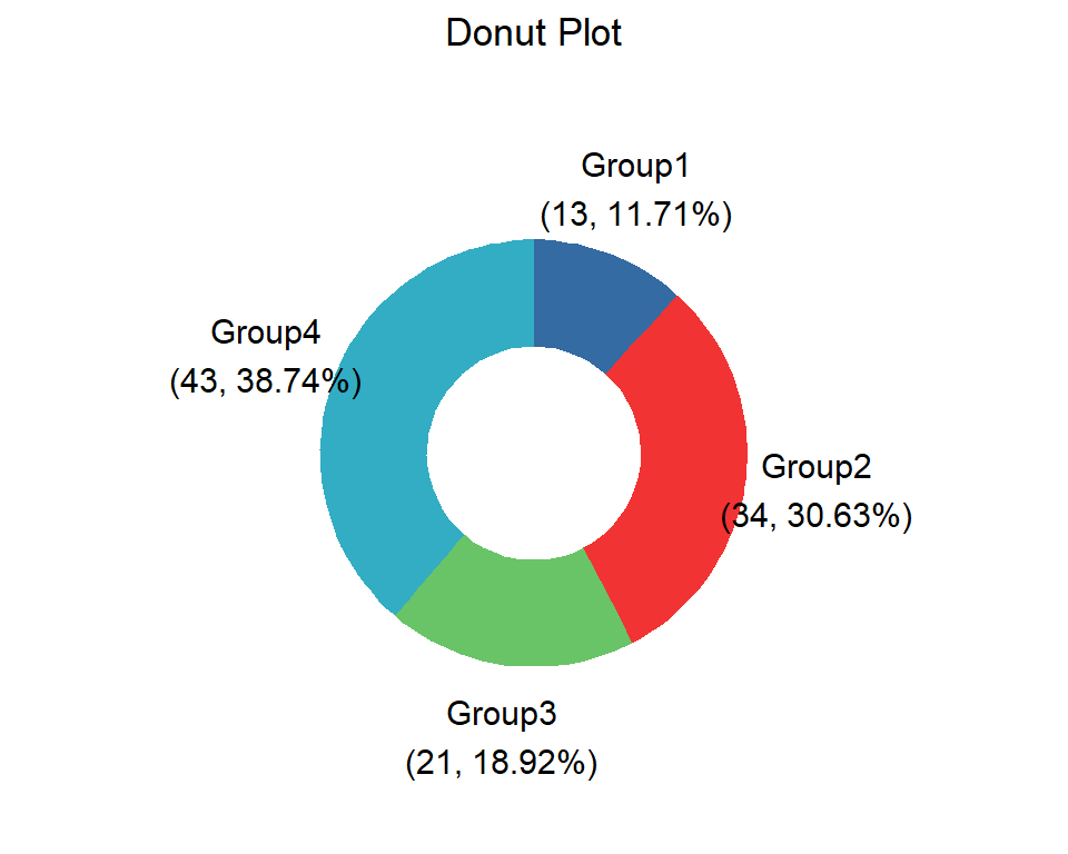
不同颜色表示不同组群,不同面积表示数据及占比。