# 安装包
if (!requireNamespace("Mfuzz", quietly = TRUE)) {
  install_github("MatthiasFutschik/Mfuzz")
}
if (!requireNamespace("ggplotify", quietly = TRUE)) {
  install.packages("ggplotify")
}
if (!requireNamespace("RColorBrewer", quietly = TRUE)) {
  install.packages("RColorBrewer")
}

# 加载包
library(Mfuzz)
library(ggplotify)
library(RColorBrewer)基因聚类趋势图
注记
Hiplot 网站
本页面为 Hiplot Gene Cluster Trend 插件的源码版本教程,您也可以使用 Hiplot 网站实现无代码绘图,更多信息请查看以下链接:
基因聚类趋势图用于显示不同的基因表达趋势,多条线显示了每个类群中相似的表达模式。
环境配置
系统: Cross-platform (Linux/MacOS/Windows)
编程语言: R
依赖包:
Mfuzz;ggplotify;RColorBrewer
数据准备
加载的数据是行为基因列为时间点样本的基因表达矩阵。
# 加载数据
data <- read.delim("files/Hiplot/062-gene-trend-data.txt", header = T)

# 整理数据格式
## 将基因表达矩阵转换为 ExpressionSet 对象
row.names(data) <- data[,1]
data <- data[,-1]
data <- as.matrix(data)
eset <- new("ExpressionSet", exprs = data)
## 过滤缺失值超过 25% 的基因
eset <- filter.NA(eset, thres=0.25)
0 genes excluded.## 根据标准差去除样本间差异太小的基因
eset <- filter.std(eset, min.std=0, visu = F)0 genes excluded.## 数据标准化
eset <- standardise(eset)
## 设定聚类数目
c <- 6
## 评估出最佳的m值
m <- mestimate(eset)
## 进行mfuzz聚类
cl <- mfuzz(eset, c = c, m = m)
# 查看数据
head(data) Time1 Time2 Time3
Gene1 0.1774993 1.6563226 -1.15259948
Gene2 -0.5037254 -0.5207024 0.46416071
Gene3 0.1050310 0.6079246 0.72893247
Gene4 -1.1791537 0.4340085 0.41061745
Gene5 0.8368975 -0.7047414 -1.46114720
Gene6 0.2611762 0.1351524 -0.01890809可视化
# 基因聚类趋势图
p <- as.ggplot(function(){
  mfuzz.plot2(
  eset,
  cl,
  xlab = "Time",
  ylab = "Expression changes",
  mfrow = c(2,(c/2+0.5)),
  colo = "fancy",
  centre = T,
  centre.col = "red",
  time.labels = colnames(eset),
  x11=F)
  })

p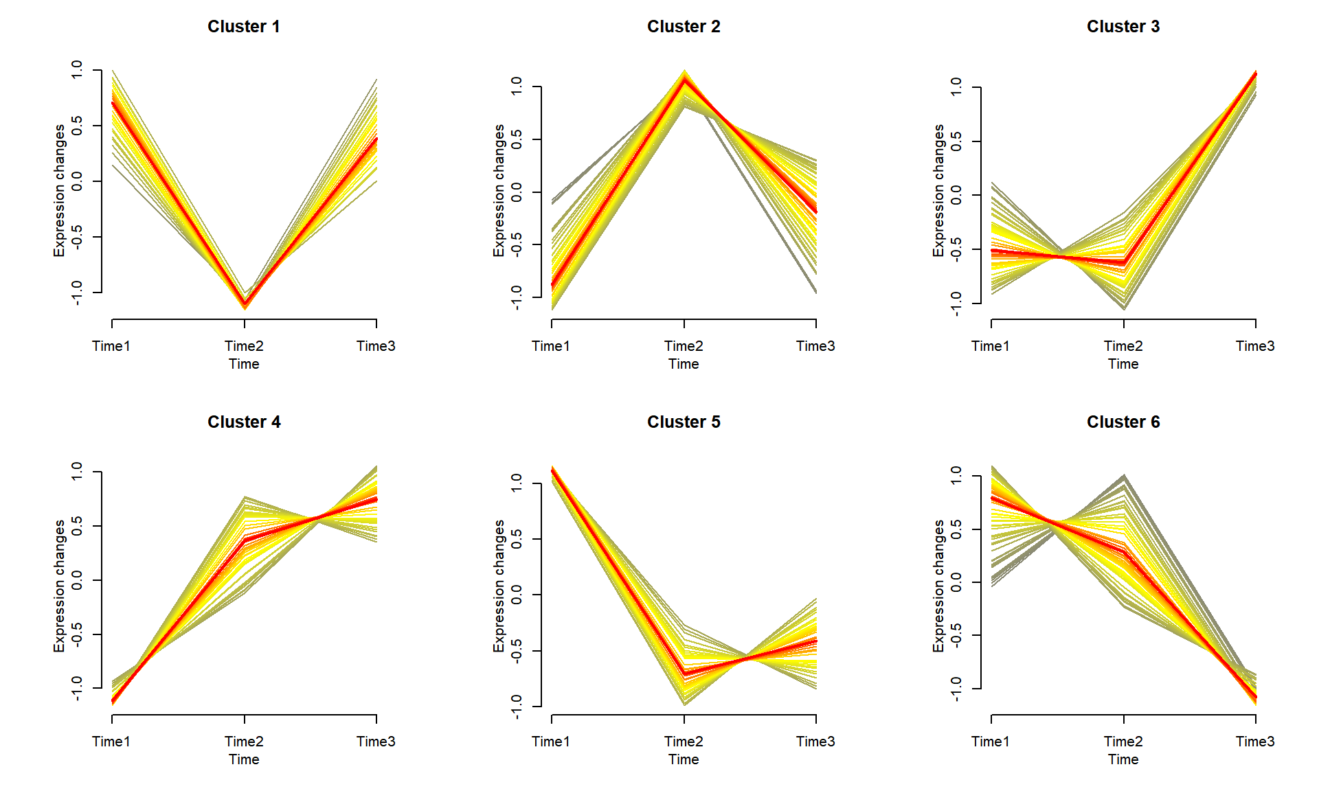
如示例图所示,将基因聚集到不同的组中,每个组在不同时间点上显示出相似的表达模式。每个类群中突出显示了平均表达趋势。