# Install packages
if (!requireNamespace("plot3D", quietly = TRUE)) {
  install.packages("plot3D")
}
if (!requireNamespace("ggplotify", quietly = TRUE)) {
  install.packages("ggplotify")
}

# Load packages
library(plot3D)
library(ggplotify)3D Barplot
Note
Hiplot website
This page is the tutorial for source code version of the Hiplot 3D Barplot plugin. You can also use the Hiplot website to achieve no code ploting. For more information please see the following link:
3D bar charts are used to provide a 3D look and feel for the data. The third dimension is often used for aesthetic reasons, but it does not improve data reading. Still intended to show comparisons between discrete categories.
Setup
System Requirements: Cross-platform (Linux/MacOS/Windows)
Programming language: R
Dependent packages:
plot3D;ggplotify
Data Preparation
The loaded data are efficacy data of different doses of drugs in different treatment regimens.
# Load data
data <- read.table("files/Hiplot/003-barplot-3d-data.txt", header = T)

# convert data vector to a matrix
mat <- matrix(rep(1, nrow(data)), nrow = length(unique(data[, 2])))
rownames(mat) <- unique(data[, 2])
colnames(mat) <- unique(data[, 3])
for (i in 1:nrow(mat)) {
  for (j in seq_len(ncol(mat))) {
    mat[i, j] <- data[, 1][data[, 2] == rownames(mat)[i] &
      data[, 3] == colnames(mat)[j]]
  }
}

# View data
mat
high mid low
Group1 13 25 5
Group2 34 8 25
Group3 21 17 12
Group4 43 10 19Visualization
# 3D Barplot
p <- as.ggplot(function() {
  hist3D(
    x = 1:nrow(mat), y = seq_len(ncol(mat)), z = mat,
    bty = "g", phi = 20,
    theta = -55,
    xlab = colnames(data)[2],
    ylab = colnames(data)[3], zlab = colnames(data)[1],
    main = "3D Bar Plot", colkey = F,
    border = "black", shade = 0.8, axes = T,
    ticktype = "detailed", space = 0.3, d = 2, cex.axis = 0.3,
    colvar = as.numeric(as.factor(data[, 2])), alpha = 1,
    col = c("#E64B35FF","#4DBBD5FF","#00A087FF","#3C5488FF")
  )

  # Use text3D to label x axis
  text3D(
    x = 1:nrow(mat), y = rep(0.5, nrow(mat)), z = rep(3, nrow(mat)),
    labels = rownames(mat),
    add = TRUE, adj = 0, cex = 0.8
  )
  # Use text3D to label y axis
  text3D(
    x = rep(1, ncol(mat)), y = seq_len(ncol(mat)), z = rep(0, ncol(mat)),
    labels = colnames(mat), bty = "g",
    add = TRUE, adj = 1, cex = 0.8
  )
})

p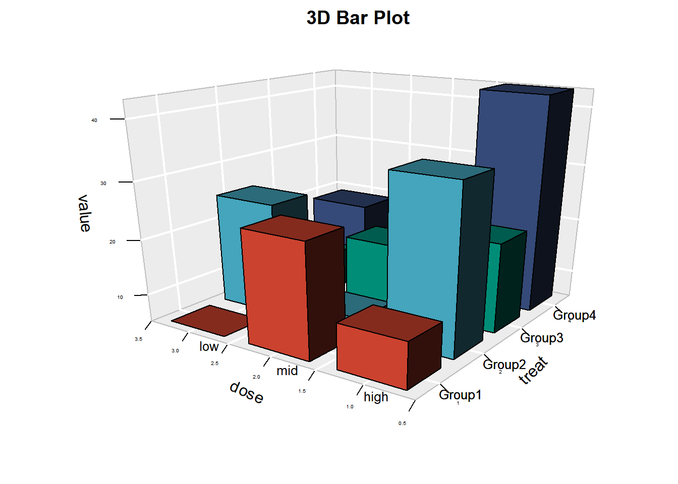
The 3D histogram shows the different therapeutic effects of different treatment groups (groups 1 to 4) with low, medium and high doses. Group 1 had the best effect with medium dose treatment, group 2 had the best effect with high dose treatment, group 3 had no significant difference with dose treatment, and group 4 had the best effect with high dose treatment.
Tip
Special Parameters:
- Phi: The larger the positive value is, the more it tends to observe from the top down. The greater the negative value, the more likely it is to be observed from the bottom of the three-dimensional figure upwards.
- Theta: The Angle at which a three-dimensional figure rotates horizontally.