# Install packages
if (!requireNamespace("ggplot2", quietly = TRUE)) {
  install.packages("ggplot2")
}
if (!requireNamespace("stringr", quietly = TRUE)) {
  install.packages("stringr")
}

# Load packages
library(ggplot2)
library(stringr)Bubble
Note
Hiplot website
This page is the tutorial for source code version of the Hiplot Bubble plugin. You can also use the Hiplot website to achieve no code ploting. For more information please see the following link:
The bubble chart is a statistical chart that shows the third variable by the size of the bubble on the basis of the scatter chart, so that the three variables can be compared and analyzed simultaneously.
Setup
System Requirements: Cross-platform (Linux/MacOS/Windows)
Programming language: R
Dependent packages:
ggplot2;stringr
Data Preparation
The loaded data are GO Term,Gene Ridio, Gene count and P-value.
# Load data
data <- read.delim("files/Hiplot/016-bubble-data.txt", header = T)

# convert data structure
data[, 1] <- str_to_sentence(str_remove(data[, 1], pattern = "\\w+:\\d+\\W"))
topnum <- 7
data <- data[1:topnum, ]
data[, 1] <- factor(data[, 1], level = rev(unique(data[, 1])))

# View data
head(data)
Term Count Ratio PValue
1 Immune response 20 10.471204 9.61e-08
2 Defense response to bacterium 11 5.759162 3.02e-06
3 Cell chemotaxis 8 4.188482 5.14e-06
4 Cell adhesion 17 8.900524 2.73e-05
5 Complement activation 8 4.188482 3.56e-05
6 Extracellular matrix organization 11 5.759162 4.23e-05Visualization
# Bubble
p <- ggplot(data, aes(Ratio, Term)) +
  geom_point(aes(size = Count, colour = -log10(PValue))) +
  scale_colour_gradient(low = "#00438E", high = "#E43535") +
  labs(colour = "-log10 (PValue)", size = "Count", x = "Ratio", y = "Term",
       title = "Bubble Plot") +
  scale_x_continuous(limits = c(0, max(data$Ratio) * 1.2)) +
  guides(color = guide_colorbar(order = 1), size = guide_legend(order = 2)) +
  scale_y_discrete(labels = function(x) {str_wrap(x, width = 65)}) +
  theme_bw() +
  theme(text = element_text(family = "Arial"),
        plot.title = element_text(size = 12,hjust = 0.5),
        axis.title = element_text(size = 12),
        axis.text = element_text(size = 10),
        axis.text.x = element_text(angle = 0, hjust = 0.5,vjust = 1),
        legend.position = "right",
        legend.direction = "vertical",
        legend.title = element_text(size = 10),
        legend.text = element_text(size = 10))

p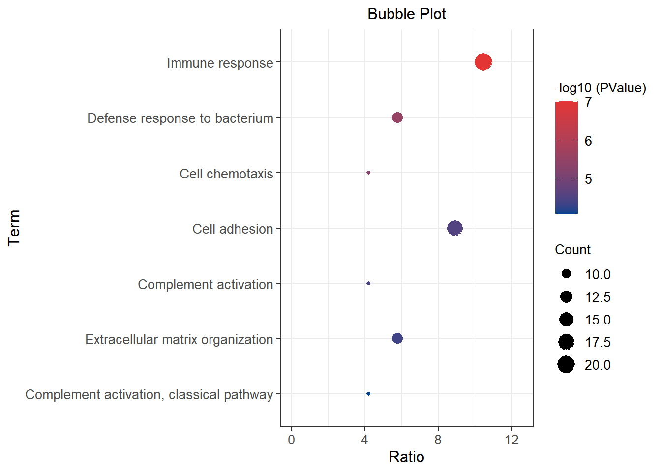
The x-axis represents Gene Ridio, and the y-axis is GO Term; The size of the dot represents the number of genes, and the color of the dot represents the high or low P value.