# Install packages
if (!requireNamespace("ComplexHeatmap", quietly = TRUE)) {
  install_github("jokergoo/ComplexHeatmap")
}

# Load packages
library(ComplexHeatmap)Heatmap
Note
Hiplot website
This page is the tutorial for source code version of the Hiplot Heatmap plugin. You can also use the Hiplot website to achieve no code ploting. For more information please see the following link:
Heat map is an intuitive and visual method for analyzing the distribution of experimental data, which can be used for quality control of experimental data and visualization display of difference data, as well as clustering of data and samples to observe sample quality.
Setup
System Requirements: Cross-platform (Linux/MacOS/Windows)
Programming language: R
Dependent packages:
ComplexHeatmap
Data Preparation
The loaded data are Count (gene name and corresponding gene expression value), sampleInfo (sample name, group and other relevant information, such as age), and gene information (gene name and its pathway, such as tumor pathway and physiological pathway).
# Load data
data_count <- read.delim("files/Hiplot/086-heatmap-data1.txt", header = T)
data_sample <- read.delim("files/Hiplot/086-heatmap-data2.txt", header = T)
data_gene <- read.delim("files/Hiplot/086-heatmap-data3.txt", header = T)

# Convert data structure
data_count <- data_count[!is.na(data_count[, 1]), ]
idx <- duplicated(data_count[, 1])
data_count[idx, 1] <- paste0(data_count[idx, 1], "--dup-", cumsum(idx)[idx])
for (i in 2:ncol(data_count)) {
  data_count[, i] <- as.numeric(data_count[, i])
}
data <- as.matrix(data_count[, -1])
rownames(data) <- data_count[, 1]

## Add annotation information to samples
sample.info <- data_sample[-1]
row.names(sample.info) <- data_sample[, 1]
sample_info_reorder <- as.data.frame(sample.info[match(
  colnames(data), rownames(sample.info)
  ), ])
colnames(sample_info_reorder) <- colnames(sample.info)
rownames(sample_info_reorder) <- colnames(data)

## Add annotation information to genes
gene_info <- data_gene[-1]
rownames(gene_info) <- data_gene[, 1]
gene_info_reorder <- as.data.frame(gene_info[match(
  rownames(data), rownames(gene_info)
  ), ])
colnames(gene_info_reorder) <- colnames(gene_info)
rownames(gene_info_reorder) <- rownames(data)

# View data
head(data)
M1 M2 M3 M4 M5 M6 M7
GBP4 6.599344 5.226266 3.693288 3.938501 4.527193 9.308119 8.987865
BCAT1 5.760380 4.892783 5.448924 3.485413 3.855669 8.662081 8.793320
CMPK2 9.561905 4.549168 3.998655 5.614384 3.904793 9.790770 7.133188
STOX2 8.396409 8.717055 8.039064 7.643060 9.274649 4.417013 4.725270
PADI2 8.419766 8.268430 8.451181 9.200732 8.598207 4.590033 5.368268
SCARNA5 7.653074 5.780393 10.633550 5.913684 8.805605 5.890120 5.527945
M8 M9 M10
GBP4 7.658312 8.666038 7.419708
BCAT1 8.765915 8.097206 8.262942
CMPK2 7.379591 7.938063 6.154118
STOX2 3.542217 4.305187 6.964710
PADI2 4.136667 4.910986 4.080363
SCARNA5 3.822596 4.041078 7.956589Visualization
# Heatmap
## Set annotation_col and annotation_row to add annotations to samples and genes respectively
top_var <- 100
top_var_genes <- rownames(data)[head(
  order(genefilter::rowVars(data), decreasing = TRUE),
  nrow(data) * top_var / 100
)]
## Set annotation_colors
col <- colorRampPalette(c("#0060BF","#FFFFFF","#CA1111"))(50)
annotation_colors <- list()
for(i in colnames(sample_info_reorder)) {
  if (is.numeric(sample_info_reorder[,i])) {
    annotation_colors[[i]] <- col
  } else {
    ref <- c("#323232","#1B6393")
    annotation_colors[[i]] <- ref
    names(annotation_colors[[i]]) <- unique(sample_info_reorder[,i])
  }
}
for(i in colnames(gene_info_reorder)) {
  if (is.numeric(gene_info_reorder[,i])) {
    annotation_colors[[i]] <- col
  } else {
    ref <- c("#323232","#1B6393")
    annotation_colors[[i]] <- ref
    names(annotation_colors[[i]]) <- unique(gene_info_reorder[,i])
  }
}

p <-
  ComplexHeatmap::pheatmap(
    data[row.names(data) %in% top_var_genes,],
    color = col,
    border_color = NA,
    fontsize_row = 6, fontsize_col = 6,
    main = "Heatmap Plot",
    cluster_rows = T, cluster_cols = T,
    scale = "none",
    clustering_method = "ward.D2",
    clustering_distance_cols = "euclidean",
    clustering_distance_rows = "euclidean",
    fontfamily = "Arial",
    display_numbers = F,
    number_color = "black",
    annotation_col = sample_info_reorder,
    annotation_row = gene_info_reorder,
    annotation_colors = annotation_colors
  )

p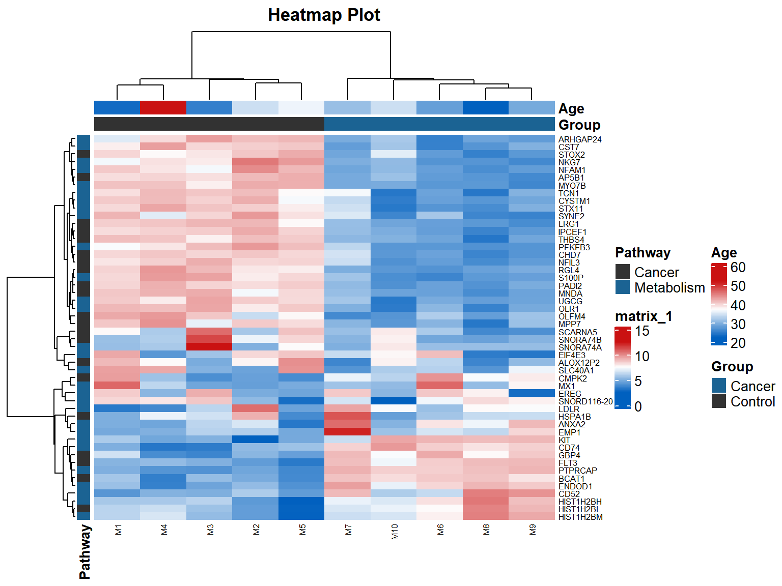
In the example figure, each small grid represents each gene, and the shade of color represents the expression level of this gene. The larger the expression level is, the darker the color will be (red is up-regulated, green is down-regulated).Each row represents the expression of each gene in a different sample, and each column represents the expression of all genes in each sample.The upper tree represents the clustering analysis results of different samples of different groups and ages, and the left tree represents the clustering analysis results of different genes from different samples.