# Install packages
if (!requireNamespace("plotrix", quietly = TRUE)) {
  install.packages("plotrix")
}
if (!requireNamespace("ggplotify", quietly = TRUE)) {
  install.packages("ggplotify")
}

# Load packages
library(plotrix)
library(ggplotify)Fan Plot
Note
Hiplot website
This page is the tutorial for source code version of the Hiplot Fan Plot plugin. You can also use the Hiplot website to achieve no code ploting. For more information please see the following link:
The pie chart is a statistical chart designed to clearly show the percentage of each data group by the size of the pie.
Setup
System Requirements: Cross-platform (Linux/MacOS/Windows)
Programming language: R
Dependent packages:
plotrix;ggplotify
Data Preparation
The loaded data are different groups and their data.
# Load data
data <- read.delim("files/Hiplot/054-fan-data.txt", header = T)

# View data
head(data)
group value
1 Group1 13
2 Group2 34
3 Group3 21
4 Group4 43Visualization
# Fan Plot
p <- as.ggplot(function() {
  fan.plot(data[, 2], main = "", labels = as.character(data[, 1]),
           col = c("#E64B35FF","#4DBBD5FF","#00A087FF","#3C5488FF"))
  })

p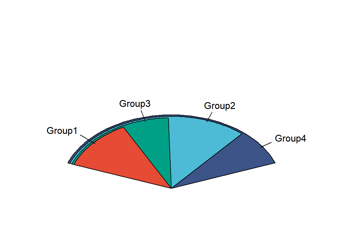
Different colors represent different groups and different areas represent data and proportion.