# Install packages
if (!requireNamespace("GOplot", quietly = TRUE)) {
  install.packages("GOplot")
}
if (!requireNamespace("ggplotify", quietly = TRUE)) {
  install.packages("ggplotify")
}

# Load packages
library(GOplot)
library(ggplotify)GOCircle Plot
Note
Hiplot website
This page is the tutorial for source code version of the Hiplot GOCircle Plot plugin. You can also use the Hiplot website to achieve no code ploting. For more information please see the following link:
The gocircle plot is used to display the circular plot combines gene expression and gene- annotation enrichment data. A subset of terms is displayed like the GOBar plot in combination with a scatter plot of the gene expression data. The whole plot is drawn on a specific coordinate system to achieve the circular layout. The segments are labeled with the term ID.
Setup
System Requirements: Cross-platform (Linux/MacOS/Windows)
Programming language: R
Dependent packages:
GOplot;ggplotify
Data Preparation
The loaded data are the results of GO enrichment with seven columns: category, GO id, GO term, gene count, gene name, logFC, adjust pvalue and zscore.
# Load data
data <- read.delim("files/Hiplot/079-gocircle-data.txt", header = T)

# Convert data structure
colnames(data) <- c("category","ID","term","count","genes","logFC","adj_pval","zscore")
data <- data[!is.na(data$adj_pval),]
data$adj_pval <- as.numeric(data$adj_pval)
data$zscore <- as.numeric(data$zscore)
data$count <- as.numeric(data$count)

# View data
head(data)
category ID term count genes logFC adj_pval
1 BP GO:0007507 heart development 54 DLC1 -0.9707875 2.17e-06
2 BP GO:0007507 heart development 54 NRP2 -1.5153173 2.17e-06
3 BP GO:0007507 heart development 54 NRP1 -1.1412315 2.17e-06
4 BP GO:0007507 heart development 54 EDN1 1.3813006 2.17e-06
5 BP GO:0007507 heart development 54 PDLIM3 -0.8876939 2.17e-06
6 BP GO:0007507 heart development 54 GJA1 -0.8179480 2.17e-06
zscore
1 -0.8164966
2 -0.8164966
3 -0.8164966
4 -0.8164966
5 -0.8164966
6 -0.8164966Visualization
# GOCircle Plot
p <- function () {
  GOCircle(data, title = "GO Enrichment Circleplot",
           nsub = 10, rad1 = 2, rad2 = 3, table.legend = T, label.size = 5,
           zsc.col = c("#FC8D59","#FFFFBF","#99D594")) +
    theme(plot.title = element_text(hjust = 0.5))
}
p <- as.ggplot(p)

p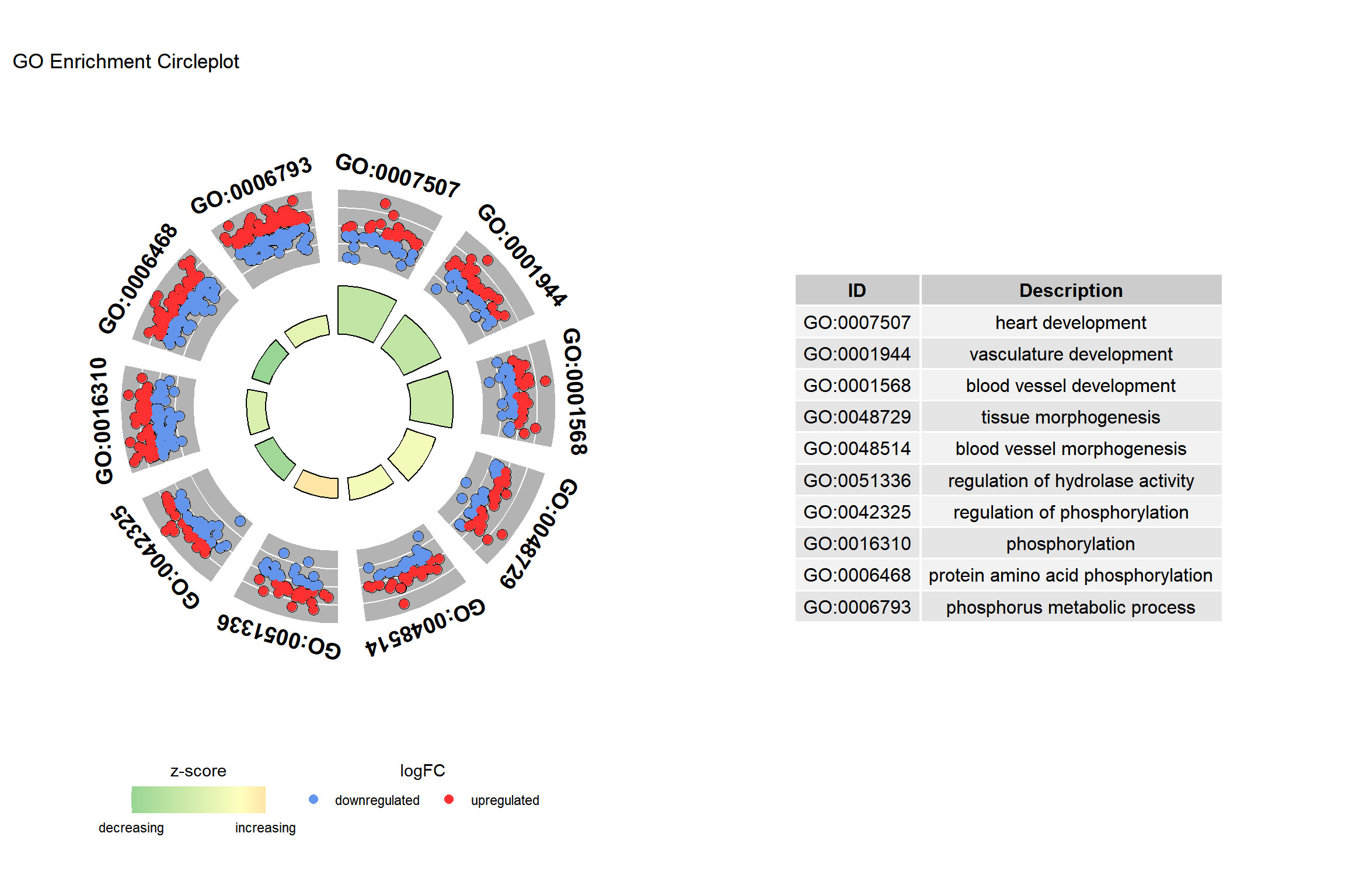
As shown in the example figure, the outer circle shows a scatter plot for each term of the logFC of the assigned genes. Red circles display up-regulation and blue ones down-regulation by default.