# Install packages
if (!requireNamespace("tidyverse", quietly = TRUE)) {
  install.packages("tidyverse")
}
if (!requireNamespace("ggthemes", quietly = TRUE)) {
  install.packages("ggthemes")
}

# Load packages
library(tidyverse)
library(ggthemes)Gantt
Note
Hiplot website
This page is the tutorial for source code version of the Hiplot Gantt plugin. You can also use the Hiplot website to achieve no code ploting. For more information please see the following link:
The Gantt chart is a type of bar chart that illustrates a project schedule.
Setup
System Requirements: Cross-platform (Linux/MacOS/Windows)
Programming language: R
Dependent packages:
tidyverse;ggthemes
Data Preparation
Data were loaded for 4 samples (4 patients), 3 items (3 treatments), and the start and end times of each treatment.
# Load data
data <- read.delim("files/Hiplot/059-gantt-data.txt", header = T)

# Convert data structure
usr_ylab <- colnames(data)[1]
if (!is.numeric(data[, 2])) {
  data[, 2] <- factor(data[, 2], levels = unique(data[, 2]))
}
data_gather <- gather(data, "state", "date", 3:4)
sample <- levels(data_gather$sample)
data_gather$sample <- factor(data_gather$sample,
  levels = rev(unique(data_gather$sample))
)

# View data
head(data_gather)
sample item state date
1 patient1 treat1 start 1
2 patient2 treat1 start 2
3 patient2 treat2 start 5
4 patient2 treat3 start 7
5 patient3 treat3 start 6
6 patient3 treat1 start 3Visualization
# Gantt
p <- ggplot(data_gather, aes(date, sample, color = item)) +
  geom_line(size = 10, alpha = 1) +
  labs(x = "Time", y = "sample", title = "Gantt Plot") +
  theme(axis.ticks = element_blank()) +
  scale_color_manual(values = c("#e04d39","#5bbad6","#1e9f86")) +
  theme_stata() +
  theme(text = element_text(family = "Arial"),
        plot.title = element_text(size = 12,hjust = 0.5),
        axis.title = element_text(size = 12),
        axis.text = element_text(size = 10),
        axis.text.x = element_text(angle = 0, hjust = 0.5, vjust = 1),
        legend.position = "right",
        legend.direction = "vertical",
        legend.title = element_text(size = 10),
        legend.text = element_text(size = 10))

p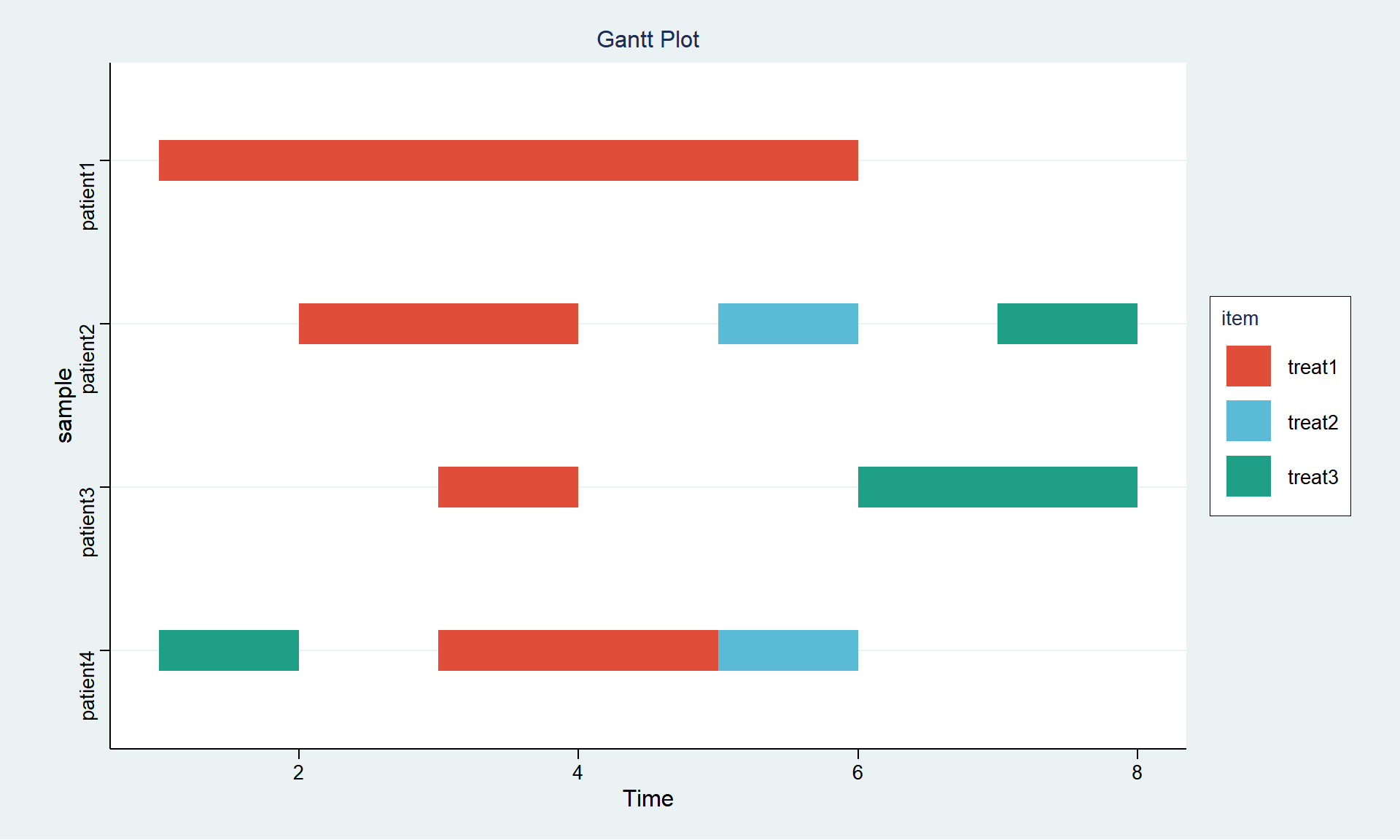
The horizontal axis represents the time schedule, the vertical axis represents 4 patients, and the 3 colors represent 3 treatments. The figure can observe the time schedule of different treatments for each patient.