# Install packages
if (!requireNamespace("ggplot2", quietly = TRUE)) {
  install.packages("ggplot2")
}
if (!requireNamespace("stringr", quietly = TRUE)) {
  install.packages("stringr")
}

# Load packages
library(ggplot2)
library(stringr)Barplot Gradient
Note
Hiplot website
This page is the tutorial for source code version of the Hiplot Barplot Gradient plugin. You can also use the Hiplot website to achieve no code ploting. For more information please see the following link:
It is similar to the bubble chart, but on the basis of the histogram, a color gradient rectangle is used to simultaneously display the visualization of two variables.
Setup
System Requirements: Cross-platform (Linux/MacOS/Windows)
Programming language: R
Dependent packages:
ggplot2;stringr
Data Preparation
The first column is Go Term (Go language code), the second column is the number of genes, and the third column is pvalue.
# Load data
data <- read.delim("files/Hiplot/008-barplot-gradient-data.txt", header = T)

# convert data structure
data[, 1] <- str_to_sentence(str_remove(data[, 1], pattern = "\\w+:\\d+\\W"))
topnum <- 7
data <- data[1:topnum, ]
data[, 1] <- factor(data[, 1], level = rev(unique(data[, 1])))

# View data
head(data)
Term Count PValue
1 Immune response 20 9.61e-08
2 Defense response to bacterium 11 3.02e-06
3 Cell chemotaxis 8 5.14e-06
4 Cell adhesion 17 2.73e-05
5 Complement activation 8 3.56e-05
6 Extracellular matrix organization 11 4.23e-05Visualization
# Barplot Gradient
p <- ggplot(data, aes(x = Term, y = Count, fill = -log10(PValue))) +
  geom_bar(stat = "identity") +
  ggtitle("GO BarPlot") +
  scale_fill_continuous(low = "#00438E", high = "#E43535") +
  scale_x_discrete(labels = function(x) {str_wrap(x, width = 65)}) +
  labs(fill = "-log10 (PValue)", y = "Term", x = "Count") +
  coord_flip() +
  theme_bw() +
  theme(text = element_text(family = "Arial"),
        plot.title = element_text(size = 12,hjust = 0.5),
        axis.title = element_text(size = 12),
        axis.text = element_text(size = 10),
        axis.text.x = element_text(angle = 0, hjust = 0.5),
        legend.position = "right",
        legend.direction = "vertical",
        legend.title = element_text(size = 10),
        legend.text = element_text(size = 10))

p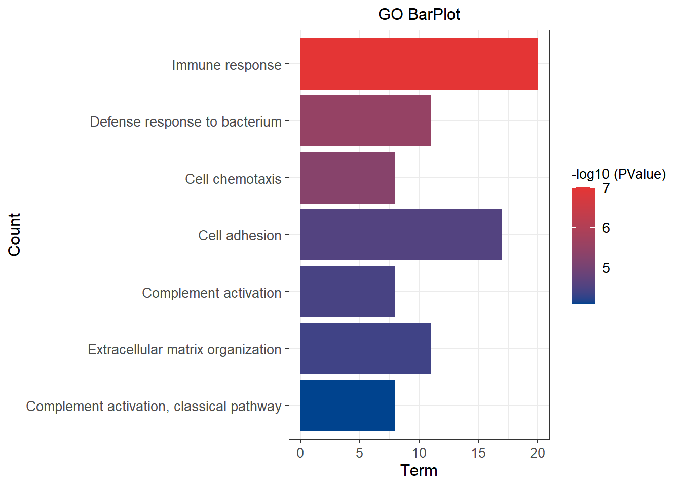
As shown in the figure, blue is a low pvalue color, and red is a high pvalue color. As the pvalue increases, the color changes from blue to red. The abscissa indicates the number of genes.