# Install packages
if (!requireNamespace("ggplot2", quietly = TRUE)) {
  install.packages("ggplot2")
}
if (!requireNamespace("dplyr", quietly = TRUE)) {
  install.packages("dplyr")
}
if (!requireNamespace("ggpubr", quietly = TRUE)) {
  install.packages("ggpubr")
}
if (!requireNamespace("ggthemes", quietly = TRUE)) {
  install.packages("ggthemes")
}

# Load packages
library(ggplot2)
library(dplyr)
library(ggpubr)
library(ggthemes)Half Violin
Note
Hiplot website
This page is the tutorial for source code version of the Hiplot Half Violin plugin. You can also use the Hiplot website to achieve no code ploting. For more information please see the following link:
The half violin plot is a statistical graph used to display the distribution and probability density of data by replacing the left part with the data frequency count graph on the basis of keeping the right part of violin graph.
Setup
System Requirements: Cross-platform (Linux/MacOS/Windows)
Programming language: R
Dependent packages:
ggplot2;dplyr;ggpubr;ggthemes
Data Preparation
The loaded data is data set (gene names and expression levels in different tumors).
# Load data
data <- read.delim("files/Hiplot/085-half-violin-data.txt", header = T)

# Convert data structure
colnames(data) <- c("Value", "Group")
data[, 2] <- factor(data[, 2], levels = unique(data[, 2]))

# View data
head(data)
Value Group
1 12.10228 AML
2 12.61382 AML
3 12.52741 AML
4 12.67990 AML
5 12.64837 AML
6 12.12146 AMLVisualization
# Half Violin
geom_flat_violin <- function(
  mapping = NULL, data = NULL, stat = "ydensity", position = "dodge",
  trim = TRUE, scale = "area", show.legend = NA, inherit.aes = TRUE, ...) {
  ggplot2::layer(data = data, mapping = mapping, stat = stat,
                 geom = geom_flat_violin_proto, position = position,
                 show.legend = show.legend, inherit.aes = inherit.aes,
                 params = list(trim = trim, scale = scale, ...))
}

"%||%" <- function(a, b) {
  if (!is.null(a)) {
    a
  } else {
    b
  }
}

geom_flat_violin_proto <-
  ggproto("geom_flat_violin_proto", Geom,
          setup_data = function(data, params) {
            data$width <- data$width %||%
              params$width %||% (resolution(data$x, FALSE) * 0.9)

            data %>%
              dplyr::group_by(.data = ., group) %>%
              dplyr::mutate(.data = ., ymin = min(y), ymax = max(y), xmin = x,
                            xmax = x + width / 2)
          },

          draw_group = function(data, panel_scales, coord) {
            data <- base::transform(data, xminv = x,
                                    xmaxv = x + violinwidth * (xmax - x))

            newdata <- base::rbind(
              dplyr::arrange(.data = base::transform(data, x = xminv), y),
              dplyr::arrange(.data = base::transform(data, x = xmaxv), -y))

            newdata <- rbind(newdata, newdata[1, ])

            ggplot2:::ggname("geom_flat_violin",
                             GeomPolygon$draw_panel(newdata, panel_scales, coord))
          },

          draw_key = draw_key_polygon,

          default_aes = ggplot2::aes(weight = 1, colour = "grey20", fill = "white",
                                     size = 0.5, alpha = NA, linetype = "solid"),
          required_aes = c("x", "y")
        )

p <- ggplot(data = data, aes(Group, Value, fill = Group)) +
  geom_flat_violin(alpha = 1, scale = "count", trim = FALSE) +
  geom_boxplot(width = 0.05, fill = "white", alpha = 1,
               outlier.colour = NA, position = position_nudge(0.05)) +
  stat_summary(fun = mean, geom = "point", fill = "white", shape = 21, size = 2,
               position = position_nudge(0.05)) +
  geom_dotplot(alpha = 1, binaxis = "y", dotsize = 0.5, stackdir = "down",
               binwidth = 0.1, position = position_nudge(-0.025)) +
  theme(legend.position = "none") +
  xlab(colnames(data)[2]) +
  ylab(colnames(data)[1]) +
  guides(fill = F) +
  ggtitle("Half Violin Plot") +
  scale_fill_manual(values = c("#e04d39","#5bbad6","#1e9f86")) +
  theme_stata() +
  theme(text = element_text(family = "Arial"),
        plot.title = element_text(size = 12,hjust = 0.5),
        axis.title = element_text(size = 12),
        axis.text = element_text(size = 10),
        axis.text.x = element_text(angle = 0, hjust = 0.5,vjust = 1),
        legend.position = "right",
        legend.direction = "vertical",
        legend.title = element_text(size = 10),
        legend.text = element_text(size = 10))

p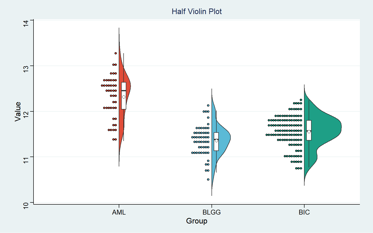
The half violin plot can reflect the data distribution, which is similar to the box diagram. The black horizontal line in the box shows the median gene expression level in each tumor, and the upper and lower edges in the white box represent the upper and lower quartiles in the data set. The distribution of observable numerical points on the left half; The violin graph can also reflect the data density, and the more concentrated the data set, the fatter the graph. The gene expression distribution in the BLGG group is more concentrated, followed by BIC group and AML group.