# Install packages
if (!requireNamespace("GOplot", quietly = TRUE)) {
  install.packages("GOplot")
}
if (!requireNamespace("ggplotify", quietly = TRUE)) {
  install.packages("ggplotify")
}

# Load packages
library(GOplot)
library(ggplotify)GOBubble Plot
Note
Hiplot website
This page is the tutorial for source code version of the Hiplot GOBubble Plot plugin. You can also use the Hiplot website to achieve no code ploting. For more information please see the following link:
The gobubble plot is used to display Z-score coloured bubble plot of terms ordered alternatively by z-score or the negative logarithm of the adjusted p-value.
Setup
System Requirements: Cross-platform (Linux/MacOS/Windows)
Programming language: R
Dependent packages:
GOplot;ggplotify
Data Preparation
The loaded data are the results of GO enrichment with seven columns: category, GO id, GO term, gene count, gene name, logFC, adjust pvalue and zscore.
# Load data
data <- read.delim("files/Hiplot/078-gobubble-data.txt", header = T)

# Convert data structure
colnames(data) <- c("category","ID","term","count","genes","logFC","adj_pval","zscore")
data <- data[data$category %in% c("BP","CC","MF"),]
data <- data[!is.na(data$adj_pval),]
data$adj_pval <- as.numeric(data$adj_pval)
data$zscore <- as.numeric(data$zscore)

# View data
head(data)
category ID term count genes logFC adj_pval
1 BP GO:0007507 heart development 54 DLC1 -0.9707875 2.17e-06
2 BP GO:0007507 heart development 54 NRP2 -1.5153173 2.17e-06
3 BP GO:0007507 heart development 54 NRP1 -1.1412315 2.17e-06
4 BP GO:0007507 heart development 54 EDN1 1.3813006 2.17e-06
5 BP GO:0007507 heart development 54 PDLIM3 -0.8876939 2.17e-06
6 BP GO:0007507 heart development 54 GJA1 -0.8179480 2.17e-06
zscore
1 -0.8164966
2 -0.8164966
3 -0.8164966
4 -0.8164966
5 -0.8164966
6 -0.8164966Visualization
# GOBubble Plot
p <- function () {
  GOBubble(data, display = "single", title = "GO Enrichment Bubbleplot",
           colour = c("#FC8D59","#FFFFBF","#99D594"),
           labels = 0,  ID = T, table.legend = T, table.col = T, bg.col = F) +
  theme(plot.title = element_text(hjust = 0.5))
}
p <- as.ggplot(p)

p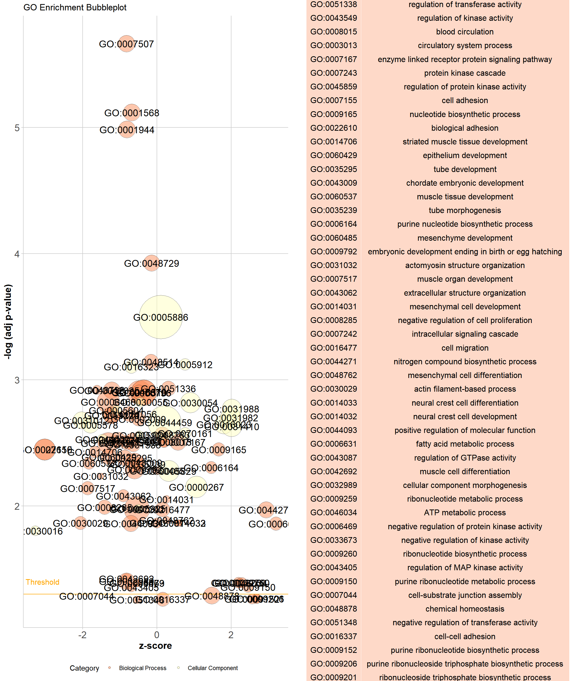
As shown in the example figure, the x- axis of the plot represents the z-score. The negative logarithm of the adjusted p-value (corresponding to the significance of the term) is displayed on the y-axis. The area of the plotted circles is proportional to the number of genes assigned to the term. Each circle is coloured according to its category and labeled alternatively with the ID or term name.