# Install packages
if (!requireNamespace("ggplot2", quietly = TRUE)) {
  install.packages("ggplot2")
}
if (!requireNamespace("RColorBrewer", quietly = TRUE)) {
  install.packages("RColorBrewer")
}

# Load packages
library(ggplot2)
library(RColorBrewer)Hi-C Heatmap
Note
Hiplot website
This page is the tutorial for source code version of the Hiplot Hi-C Heatmap plugin. You can also use the Hiplot website to achieve no code ploting. For more information please see the following link:
The HiC heatmap is used to display the genome-wide chromatin interaction with heatmap on different chromosomes.
Setup
System Requirements: Cross-platform (Linux/MacOS/Windows)
Programming language: R
Dependent packages:
ggplot2;RColorBrewer
Data Preparation
The loaded data have three columns, with the first for one locus bin index, the second for another locus bin index, and the third for the interaction frequency between this two locus.
# Load data
data <- read.delim("files/Hiplot/087-hic-heatmap-data.txt", header = T)

# View data
head(data)
index_bin1 index_bin2 freq
1 135 428 13
2 365 479 38
3 209 340 8
4 216 166 34
5 288 484 5
6 162 479 14Visualization
# Hi-C Heatmap
## Calculate the number of bins
bins_num <- max(data$index_bin1) + 1
## Set the resolution of HiC data
resolution <- 500
res <- resolution * 1000
# Set the separation unit to 50Mb
intervals <- 50
spacing <- intervals * 1000000
## Count the number of breaks
breaks_num <- (res * bins_num) / spacing
## Set breaks
breaks <- c()
for (i in 0:breaks_num) {
  breaks <- c(breaks, i * intervals)
}

p <- ggplot(data = data, aes(x = index_bin1 * res, y = index_bin2 * res)) +
  geom_tile(aes(fill = freq)) +
  scale_fill_gradientn(
    colours = colorRampPalette(rev(brewer.pal(11,"RdYlBu")))(500),
    limits = c(0, max(data$freq) * 1.2)
  ) +
  scale_y_reverse() +
  scale_x_continuous(breaks = breaks * 1000000, labels = paste0(breaks, "Mb")) +
  scale_y_continuous(breaks = breaks * 1000000, labels = paste0(breaks, "Mb")) +
  theme(panel.grid = element_blank(), axis.title = element_blank()) +
  labs(title = paste0("(resolution: ", res / 1000, "Kb)"), x="", y="") +
  theme_bw() +
  theme(plot.title = element_text(hjust = 0.5),
        legend.position = "right", legend.key.size = unit(0.8, "cm"),
        panel.grid = element_blank())

p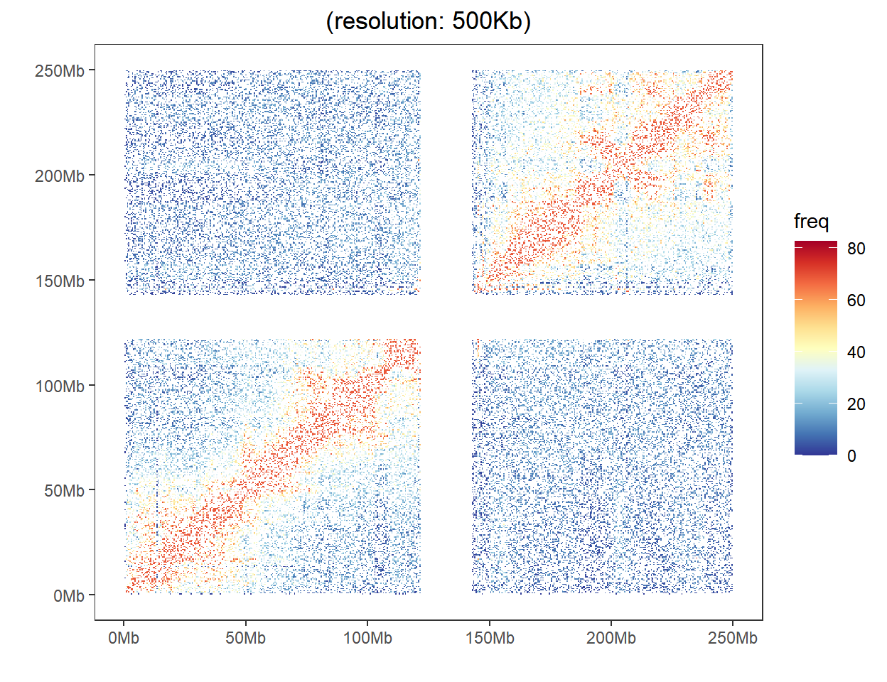
As shown in the example figure, a heat map represent the interaction frequency between any two locus. The color displays their intensity of interaction.