# Install packages
if (!requireNamespace("ggcorrplot", quietly = TRUE)) {
  install.packages("ggcorrplot")
}

# Load packages
library(ggcorrplot)Correlation Heatmap
Note
Hiplot website
This page is the tutorial for source code version of the Hiplot Area plugin. You can also use the Hiplot website to achieve no code ploting. For more information please see the following link:
The correlation heat map is a graph that analyzes the correlation between two or more variables.
Setup
System Requirements: Cross-platform (Linux/MacOS/Windows)
Programming language: R
Dependent packages:
ggcorrplot
Data Preparation
The loaded data are the gene names and the expression of each sample.
# Load data
data <- read.delim("files/Hiplot/030-cor-heatmap-data.txt", header = T)

# convert data structure
data <- data[!is.na(data[, 1]), ]
idx <- duplicated(data[, 1])
data[idx, 1] <- paste0(data[idx, 1], "--dup-", cumsum(idx)[idx])
rownames(data) <- data[, 1]
data <- data[, -1]
str2num_df <- function(x) {
  final <- NULL
  for (i in seq_len(ncol(x))) {
    final <- cbind(final, as.numeric(x[, i]))
  }
  colnames(final) <- colnames(x)
  return(final)
}
tmp <- str2num_df(t(data))
corr <- round(cor(tmp, use = "na.or.complete", method = "pearson"), 3)
p_mat <- round(cor_pmat(tmp, method = "pearson"), 3)

# View data
head(data)
M1 M2 M3 M4 M5 M6 M7 M8
RGL4 8.454808 8.019389 8.990836 9.718631 7.908075 4.147051 4.985084 4.576711
MPP7 8.690520 8.630346 7.080873 9.838476 8.271824 5.179200 5.200868 3.266993
UGCG 8.648366 8.600555 9.431046 7.923021 8.309214 4.902510 5.750804 4.492856
CYSTM1 8.628884 9.238677 8.487243 8.958537 7.357109 4.541605 6.370533 4.246651
ANXA2 4.983769 6.748022 6.220791 4.719403 3.284346 8.089850 10.637472 7.214912
ENDOD1 5.551640 5.406465 4.663785 3.550765 4.103507 8.393991 9.538503 9.069923
M9 M10
RGL4 4.930349 4.293700
MPP7 5.565226 4.300309
UGCG 4.659987 3.306275
CYSTM1 4.745769 3.449627
ANXA2 9.002710 5.123359
ENDOD1 8.639664 7.106392Visualization
# Correlation Heatmap
p <- ggcorrplot(
  corr,
  colors = c("#4477AA", "#FFFFFF", "#BB4444"),
  method = "circle",
  hc.order = T,
  hc.method = "ward.D2",
  outline.col = "white",
  ggtheme = theme_bw(),
  type = "upper",
  lab = F,
  lab_size = 3,
  legend.title = "Correlation"
  ) +
  ggtitle("Cor Heatmap Plot") +
  theme(text = element_text(family = "Arial"),
        plot.title = element_text(size = 12,hjust = 0.5),
        axis.title = element_text(size = 12),
        axis.text = element_text(size = 10),
        axis.text.x = element_text(angle = 45, hjust = 1, vjust = 1),
        legend.position = "right",
        legend.direction = "vertical",
        legend.title = element_text(size = 10),
        legend.text = element_text(size = 10))
p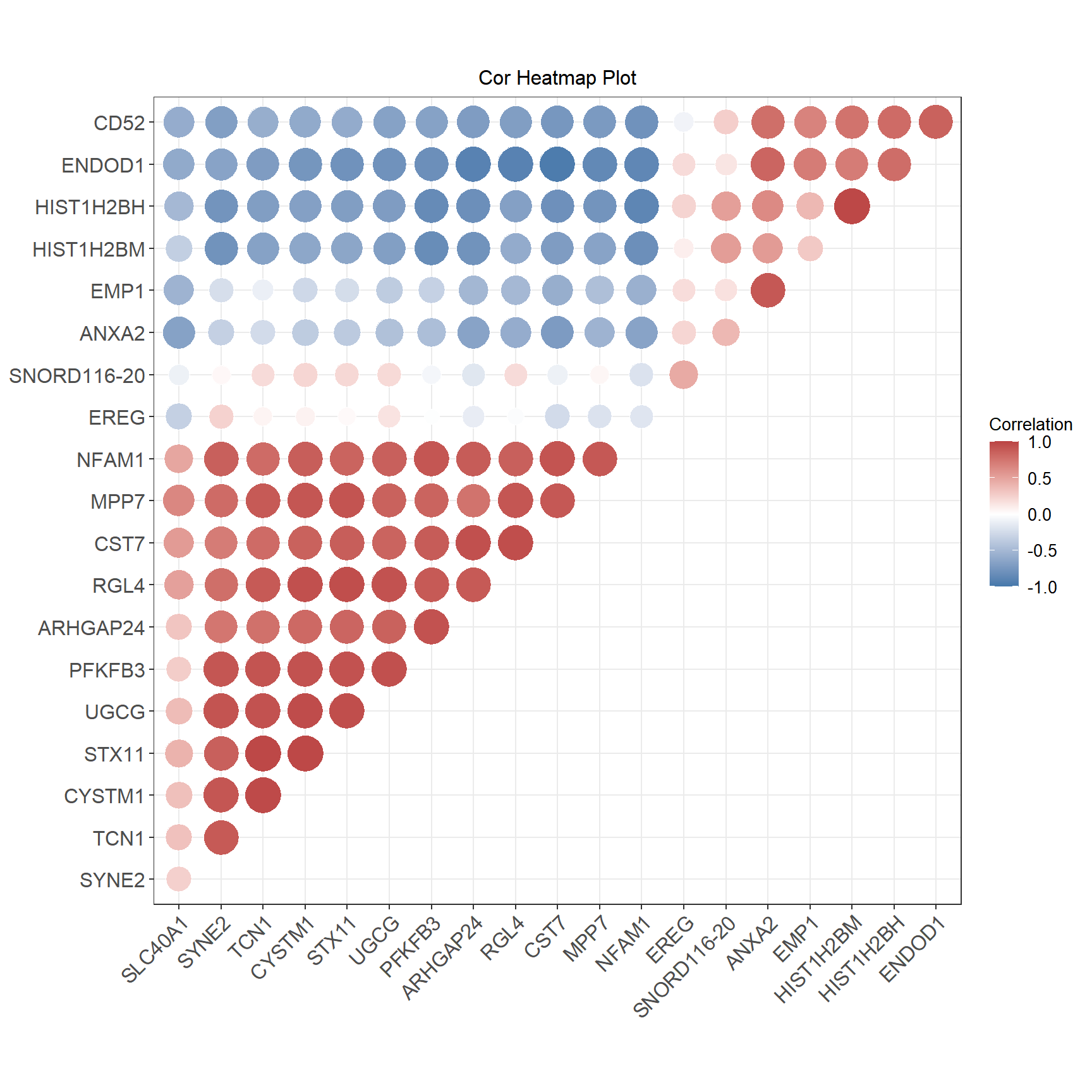
Red indicates positive correlation between two genes, blue indicates negative correlation between two genes, and the number in each cell indicates correlation coefficient.