# Install packages
if (!requireNamespace("ggplot2", quietly = TRUE)) {
  install.packages("ggplot2")
}

# Load packages
library(ggplot2)Interval Bar Chart
Note
Hiplot website
This page is the tutorial for source code version of the Hiplot Interval Bar Chart plugin. You can also use the Hiplot website to achieve no code ploting. For more information please see the following link:
Setup
System Requirements: Cross-platform (Linux/MacOS/Windows)
Programming language: R
Dependent packages:
ggplot2
Data Preparation
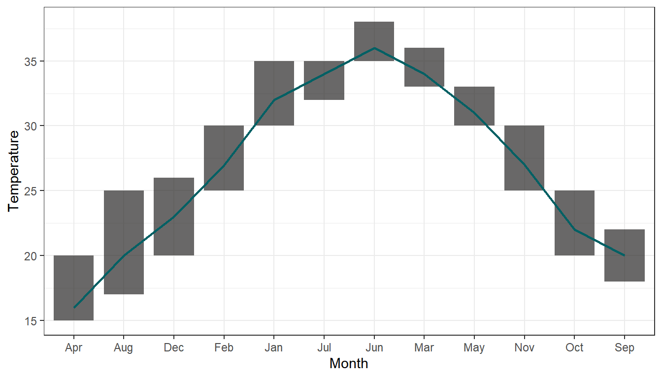
The case data consists of the highest and lowest temperatures for each of the twelve months in a year, along with the corresponding abbreviated month names. Based on the case data, temperature intervals and average temperature lines have been plotted for each month.
# Load data
data <- read.delim("files/Hiplot/090-interval-bar-chart-data.txt", header = T)

# Convert data structure
data$name_num <- match(data[["month"]], unique(data[["month"]]))

# View data
head(data)
month min_temperature max_temperature mean name_num
1 Jan 15 20 16 1
2 Feb 17 25 20 2
3 Mar 20 26 23 3
4 Apr 25 30 27 4
5 May 30 35 32 5
6 Jun 32 35 34 6Visualization
# Interval Bar Chart
p <- ggplot(data, aes(x = month, y = max_temperature)) +
  geom_rect(aes(xmin = name_num - 0.4, xmax = name_num + 0.4,
                ymin = min_temperature, ymax = max_temperature),
            fill = "#282726", alpha = 0.7) +
  geom_line(aes(x = name_num, y = mean), color = "#006064", size = 0.8) +
  labs(x = "Month", y = "Temperature") +
  scale_x_discrete() +
  theme_bw()

p