# Install packages
if (!requireNamespace("ggplot2", quietly = TRUE)) {
  install.packages("ggplot2")
}
if (!requireNamespace("reshape2", quietly = TRUE)) {
  install.packages("reshape2")
}
if (!requireNamespace("ggisoband", quietly = TRUE)) {
  install.packages("ggisoband")
}
if (!requireNamespace("cowplot", quietly = TRUE)) {
  install.packages("cowplot")
}

# Load packages
library(ggplot2)
library(reshape2)
library(ggisoband)
library(cowplot)Contour (Matrix)
Note
Hiplot website
This page is the tutorial for source code version of the Hiplot Contour (Matrix) plugin. You can also use the Hiplot website to achieve no code ploting. For more information please see the following link:
The contour map (matrix) is a graph that displays three-dimensional data in a two-dimensional form
Setup
System Requirements: Cross-platform (Linux/MacOS/Windows)
Programming language: R
Dependent packages:
ggplot2;reshape2;ggisoband;cowplot
Data Preparation
The loaded data is a matrix.
# Load data
data <- read.delim("files/Hiplot/027-contour-matrix-data.txt", header = T)

# convert data structure
data <- as.matrix(data)
colnames(data) <- NULL
data3d <- reshape2::melt(data)
names(data3d) <- c("x", "y", "z")

# View data
head(data3d)
x y z
1 1 1 101
2 2 1 102
3 3 1 103
4 4 1 104
5 5 1 105
6 6 1 105Visualization
# Contour (Matrix)
complex_general_theme <-
  theme(text = element_text(family = "Arial"),
        plot.title = element_text(size = 12,hjust = 0.5),
        axis.title = element_text(size = 12),
        axis.text = element_text(size = 10),
        axis.text.x = element_text(angle = 0, hjust = 0.5,vjust = 1),
        legend.position = "right",
        legend.direction = "vertical",
        legend.title = element_text(size = 10),
        legend.text = element_text(size = 10))

p1 <- ggplot(data3d, aes(x, y, z = z)) +
  geom_isobands(
    alpha = 1,
    aes(color = stat(zmin)), fill = NA
  ) +
  scale_color_viridis_c() +
  coord_cartesian(expand = FALSE) +
  theme_bw() +
  complex_general_theme

p2 <- ggplot(data3d, aes(x, y, z = z)) +
  geom_isobands(
    alpha = 1,
    aes(fill = stat(zmin)), color = NA
  ) +
  scale_fill_viridis_c(guide = "legend") +
  coord_cartesian(expand = FALSE) +
  theme_bw() +
  complex_general_theme

plot_grid(p1, p2, labels = c("A", "B"), label_size = 12)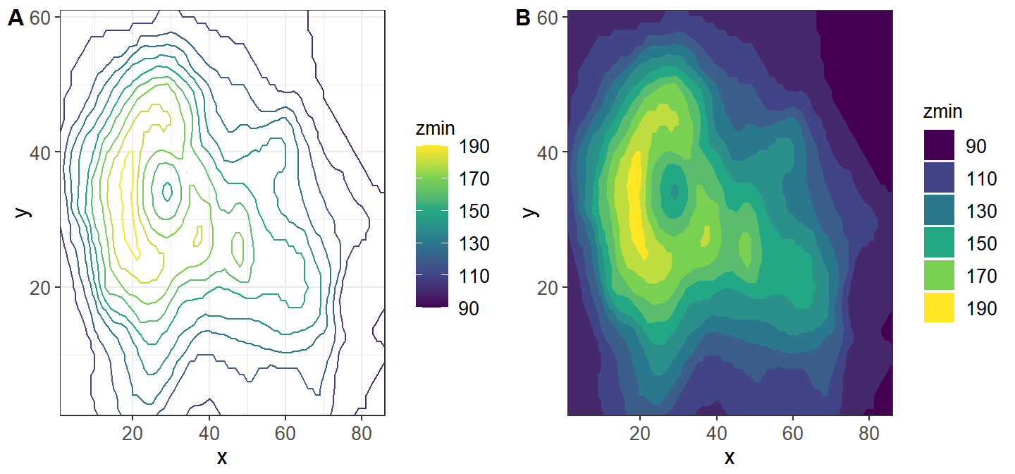
Yellow represents the highest, dark purple represents the lowest, the height scale range is 90-190.