# Install packages
if (!requireNamespace("ggplot2", quietly = TRUE)) {
  install.packages("ggplot2")
}

# Load packages
library(ggplot2)Barcode Plot
Note
Hiplot website
This page is the tutorial for source code version of the Hiplot Barcode Plot plugin. You can also use the Hiplot website to achieve no code ploting. For more information please see the following link:
Barcode Plot is Suitable for displaying the distribution of large amounts of data.
Setup
System Requirements: Cross-platform (Linux/MacOS/Windows)
Programming language: R
Dependent packages:
ggplot2
Data Preparation
The case data represents the sales revenue of a certain product in 500 stores in three regions.
# Load data
data <- read.table("files/Hiplot/002-barcode-plot-data.txt", header = T)
# View data
head(data)
region sales
1 GuangDong 42.54612
2 GuangDong 46.26102
3 GuangDong 46.00448
4 GuangDong 45.05684
5 GuangDong 48.67611
6 GuangDong 56.95071Visualization
# Barcode Plot
p <- ggplot(data, aes(x = sales, y = region)) +
  geom_tile(width = 0.01, height = 0.9, fill = "#606fcc") + # Control the width and height of the Barcode
  theme_bw() +
  labs(title = "Sales report", x = "Sales", y = "Region") +
  theme(text = element_text(family = "Arial"),
        plot.title = element_text(size = 12,hjust = 0.5),
        axis.title = element_text(size = 12),
        axis.text = element_text(size = 10),
        axis.text.x = element_text(angle = 0, hjust = 0.5,vjust = 1),
        legend.position = "right",
        legend.direction = "vertical",
        legend.title = element_text(size = 10),
        legend.text = element_text(size = 10))

p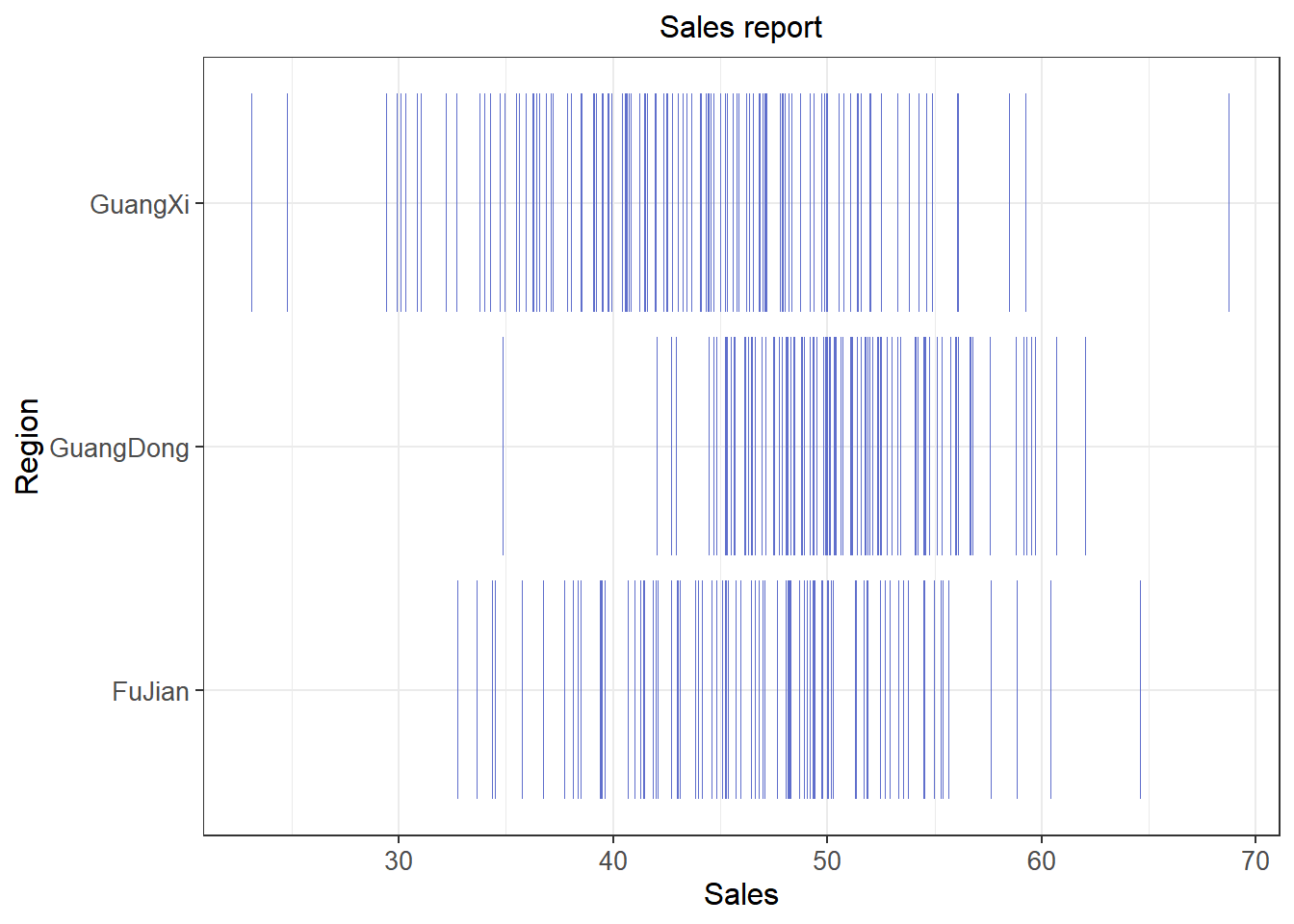
Through the barcode plot, we can observe that the number of stores with sales revenue around 50 is relatively high in Guangdong and Fujian regions. Additionally, the sales revenue among stores in Guangdong shows less variation, indicating a more concentrated distribution.
Tip
Special Parameters:
- width: Width of the bars
- height: Height of the bars
- fill: Color of the bars