# Installing necessary packages
if (!requireNamespace("qqman", quietly = TRUE)) {
  install.packages("qqman")
}
if (!requireNamespace("tidyverse", quietly = TRUE)) {
  install.packages("tidyverse")
}
if (!requireNamespace("aplot", quietly = TRUE)) {
  install.packages("aplot")
}

# Load packages
library(qqman)
library(tidyverse)
library(aplot)Manhattan Plot
Manhattan plot is a graph used to describe the relationship between mutations on chromosomes and traits. It is named Manhattan plot because it resembles the urban landscape of Manhattan, USA. Manhattan plot is generally drawn in the form of scatter plot, but it can also be displayed in bar chart or line chart. It is usually drawn using R package qqman or directly using ggplot2.

Example
The horizontal axis of the Manhattan plot is the chromosome position, and the vertical axis is the P value or any value such as ΔSNP, ED, etc. that can indicate the strength of the association between the mutation site and the trait. The P value will be used as an example below.
Setup
System Requirements: Cross-platform (Linux/MacOS/Windows)
Programming language: R
Dependent packages:
qqman;tidyverse;aplot
Data Preparation
The data uses the gwasResults dataset that comes with qqman.
# View the dataset
head(gwasResults)
SNP CHR BP P
1 rs1 1 1 0.9148060
2 rs2 1 2 0.9370754
3 rs3 1 3 0.2861395
4 rs4 1 4 0.8304476
5 rs5 1 5 0.6417455
6 rs6 1 6 0.5190959Visualization
1. qqman draws Manhattan plot
manhattan and qq are the two most important functions in qqman, responsible for drawing Manhattan graphs and QQ graphs respectively:
Tip
manhattan parameters:
-
x: input data, required format is dataframe -
chr: column name for recording chromosome information, must be a number -
bp: column name for recording base coordinate position information, must be a number -
p: column name for recording P value or other value information, must be a number -
snp: column name for recording SNP name -
col: alternating color setting -
chrlabs: chromosome name on X-axis, default is consistent with the name in dataframe -
suggestiveline: blue threshold line, not drawn when set to FALSE -
genomewideline: red threshold line, not drawn when set to FALSE -
highlight: highlighted SNP name -
logp: when set to TRUE, the vertical axis is -log10(P), when set to FALSE, the vertical axis is P -
annotatePval: set threshold, mark SNPs above the threshold in the figure -
annotateTop: mark only one highest SNP for each chromosome
# Basic manhattan plot
manhattan(gwasResults)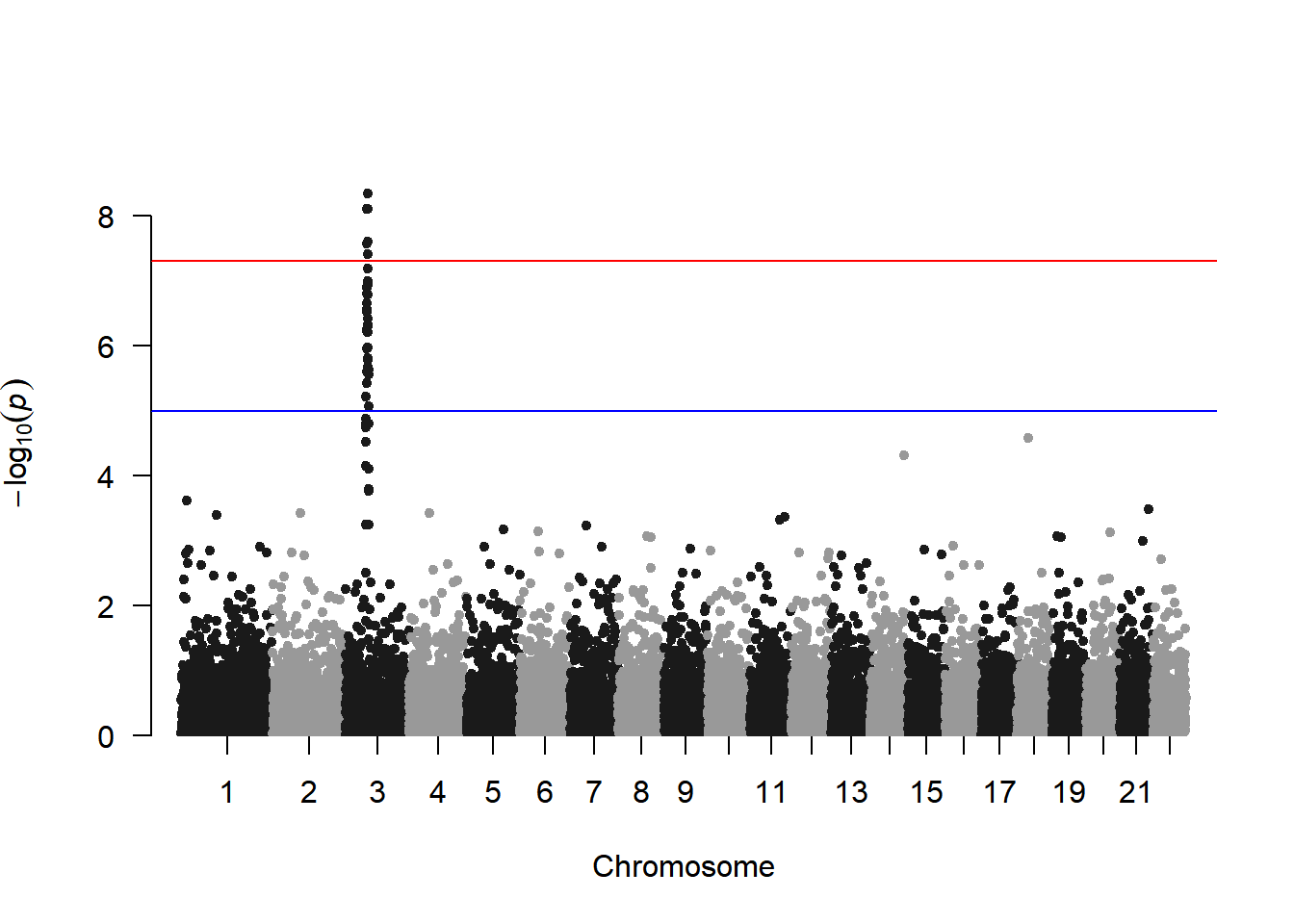
This figure shows the association between all SNPs on the genome and traits, with an obvious peak on chromosome 3, indicating that there is a region on chromosome 3 that may be strongly correlated with the trait.
The color of chromosomes in manhattan can be modified by the col parameter:
# Color settings
manhattan(gwasResults, col = c("#3E7B92","#F0E442","#BF242A"))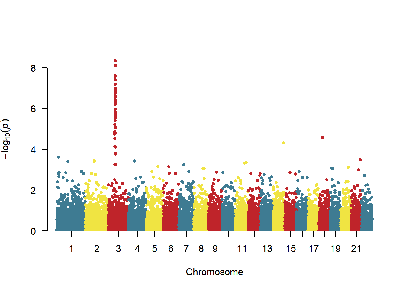
To highlight specific SNPs:
# Highlight settings
manhattan(gwasResults, highlight ="rs3057")
Annotate SNPs above the threshold (one per chromosome):
# Annotation Settings
manhattan(gwasResults, highlight ="rs3057", annotatePval=1e-5)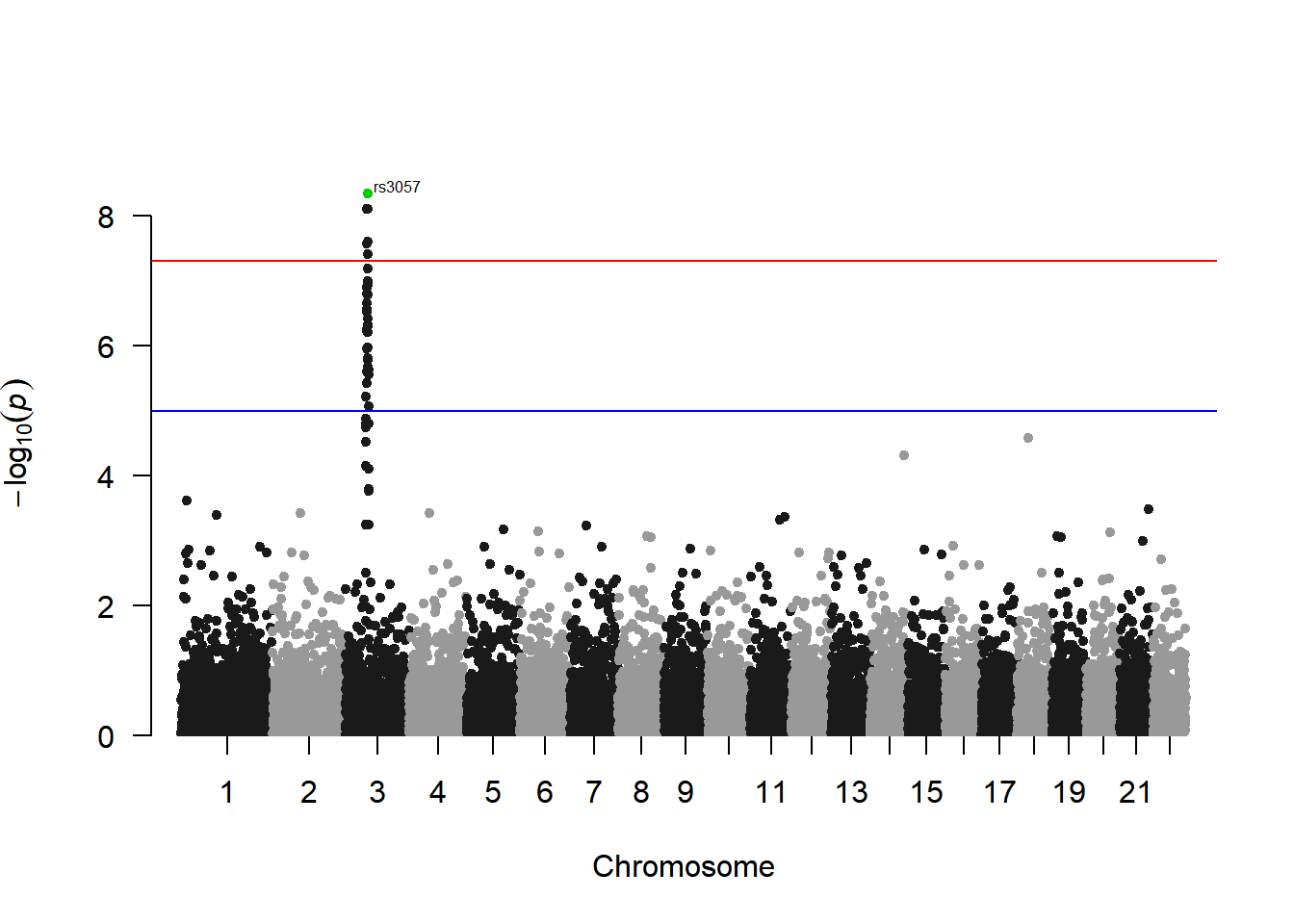
2. ggplot2 draws manhattan plot
Using qqman to draw a Manhattan map can meet most of the needs, but there are still some needs that cannot be met, such as setting the style and color of the threshold line. In this case, ggplot2 can be used for drawing.
# ggplot2 draws manhattan plot
df <- gwasResults
df$CHR <- factor(as.character(df$CHR),levels=unique(df$CHR))
len <-
    df %>%
    group_by(CHR) %>%  # CHR is the column name of chromosome information
    summarise(len=max(BP))  # BP is the column name for the location information
len <-  # Calculate the position of SNP in the graph
    len %>% summarise(pos=cumsum(len)-len)
rownames(len) <- unique(df$CHR)
df$BP <- df$BP+len$pos[match(df$CHR,rownames(len))]
X_axis <-  df %>% group_by(CHR) %>% summarize(center=( max(BP) + min(BP) ) / 2 ) # Calculate the position of chromosomes

# The P value is subjected to multiple corrections below. It is actually not advisable to use a fixed threshold for P in qqman.
bf <- max(df$P[p.adjust(df$P, method = "bonferroni")<0.05])  # Using the Bonferroni method
fdr<- max(df$P[p.adjust(df$P, method = "fdr")<0.05])  # Using the fdr method

col <- c("gray10", "gray60") # Set the chromosome color here
cols <- rep(col ,nrow(X_axis))
line_col1 <- "red" # Threshold line color here
line_col2 <- "blue"
line_type1 <- "dashed" # Here the threshold line type
line_type2 <- "dashed"
ggplot()+
    geom_point(df,mapping=aes(x=BP,y=-log10(P),color=CHR),alpha=0.7,size=1,shape=16)+
    geom_hline(yintercept = -log10(bf),lty=line_type1 ,color= line_col1 )+
    geom_hline(yintercept = -log10(fdr),lty=line_type2 ,color= line_col2)+
    scale_color_manual(values = cols ) +
    theme_bw()+
    theme(panel.grid.major = element_blank(),panel.grid.minor=element_blank(),
          legend.position = 'none')+
    xlab("CHR")+ylab("-log10(P)")+ # Horizontal axis vertical axis title
    scale_x_continuous( limits = c(0, max(df$BP)),label = X_axis$CHR, breaks= X_axis$center ) +
scale_y_continuous(expand = c(0,0)) 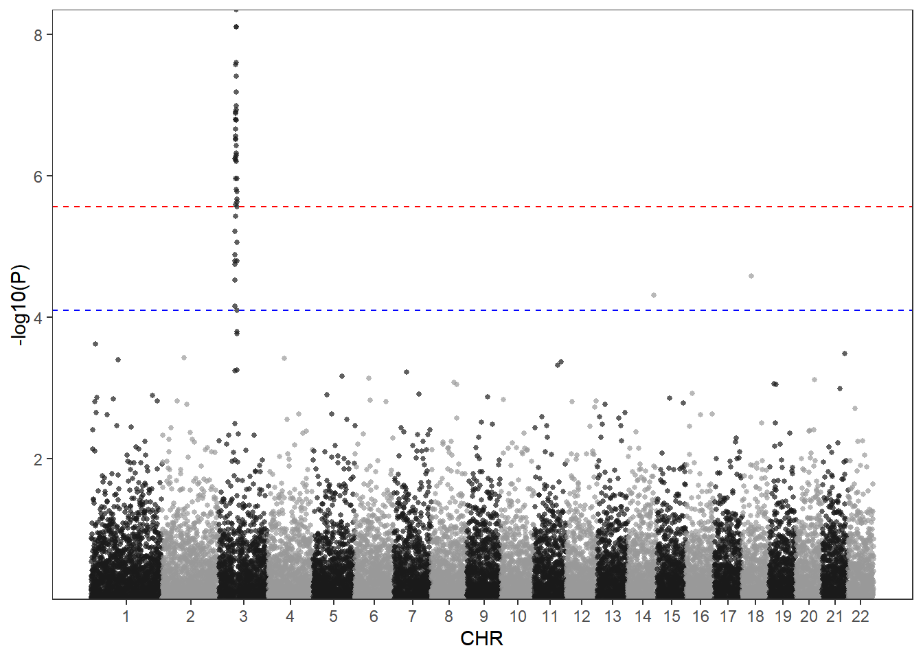
The advantage of using ggplot2 to draw a Manhattan map is that the style of the image can be highly customized. You can notice that I have set several variables above. You only need to modify these variables to customize the color and threshold line style.
col <- c("#3E7B92","#F0E442","#BF242A") # Set the chromosome color here
cols <- rep(col ,nrow(X_axis))
line_col1 <- "#DB5A6A" # Threshold line color here
line_col2 <- "#0050B7"
line_type1 <- "solid" # Here, the threshold line type can be set as follows: ”solid“,“blank”, “solid”, “dashed”, “dotted”, “dotdash”, “longdash”, “twodash”
line_type2 <- "dotdash"
ggplot()+
    geom_point(df,mapping=aes(x=BP,y=-log10(P),color=CHR),alpha=0.7,size=1,shape=16)+
    geom_hline(yintercept = -log10(bf),lty=line_type1 ,color= line_col1 )+
    geom_hline(yintercept = -log10(fdr),lty=line_type2 ,color= line_col2)+
    scale_color_manual(values = cols ) +
    theme_bw()+
    theme(panel.grid.major = element_blank(),panel.grid.minor=element_blank(),
          legend.position = 'none')+
    xlab("CHR")+ylab("-log10(P)")+
    scale_x_continuous( limits = c(0, max(df$BP)),label = X_axis$CHR, breaks= X_axis$center ) +
scale_y_continuous(expand = c(0,0)) 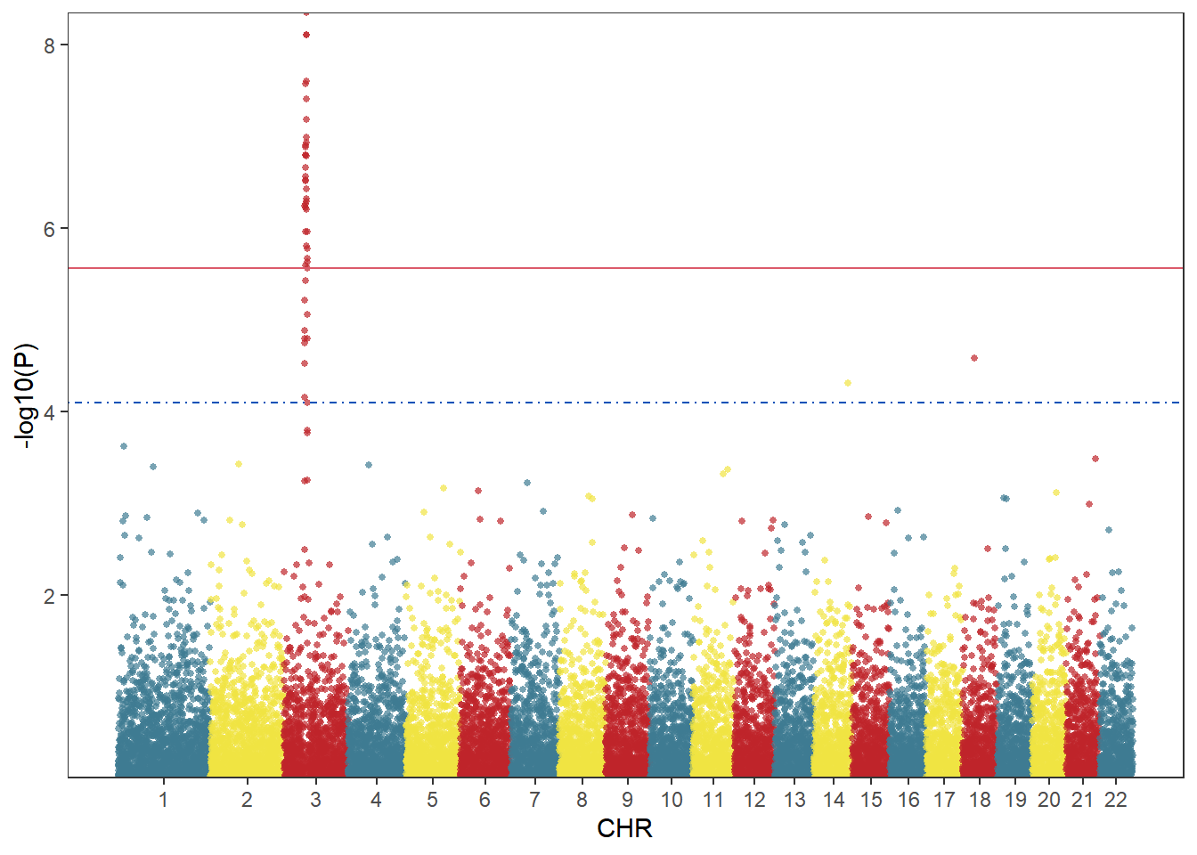
Since ggplot2 plots images one by one, the screened SNPs can be superimposed on the original image using geom_point:
df2 <- df[df$P<bf,]
df3 <- df[df$SNP=="rs3057",]
col <- c("gray10", "gray60") # Set the chromosome color here
cols <- rep(col ,nrow(X_axis))
line_col1 <- "red" # Threshold line color here
line_col2 <- "blue"
line_type1 <- "dashed" # Here the threshold line type
line_type2 <- "dashed"
ggplot()+
    geom_point(df,mapping=aes(x=BP,y=-log10(P),color=CHR),alpha=0.7,size=1,shape=16)+
    geom_point(df2,mapping=aes(x=BP,y=-log10(P)),color="blue",size=1,shape=16)+
    geom_point(df3,mapping=aes(x=BP,y=-log10(P)),color="red",size=3,shape=18)+
    geom_hline(yintercept = -log10(bf),lty=line_type1 ,color= line_col1 )+
    geom_hline(yintercept = -log10(fdr),lty=line_type2 ,color= line_col2)+
    scale_color_manual(values = cols ) +
    theme_bw()+
    theme(panel.grid.major = element_blank(),panel.grid.minor=element_blank(),
          legend.position = 'none')+
    xlab("CHR")+ylab("-log10(P)")+
    scale_x_continuous( limits = c(0, max(df$BP)),label = X_axis$CHR, breaks= X_axis$center ) +
scale_y_continuous(limits = c(0, max(-log10(df$P))+1),expand = c(0,0)) 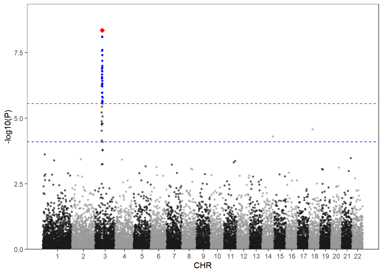
When you have two traits, you may need to display the GWAS results of the two traits at the same time. You can use the following method to draw a two-way Manhattan plot. Here we only use one set of data as an example.
col <- c("gray10", "gray60") # Set the chromosome color here
cols <- rep(col ,nrow(X_axis))
line_col1 <- "red" # Threshold line color here
line_col2 <- "blue"
line_type1 <- "dashed" # Here the threshold line type
line_type2 <- "dashed"
p1 <-
    ggplot()+
    geom_point(df,mapping=aes(x=BP,y=-log10(P),color=CHR),alpha=0.7,size=1,shape=16)+
    geom_hline(yintercept = -log10(bf),lty=line_type1 ,color= line_col1 )+
    geom_hline(yintercept = -log10(fdr),lty=line_type2 ,color= line_col2)+
    scale_color_manual(values = cols ) +
    theme_bw()+
    theme(panel.grid.major = element_blank(),panel.grid.minor=element_blank(),
          axis.text.x = element_text(vjust = -2),
          axis.title.x = element_blank(),
          legend.position = 'none')+
    ylab("-log10(P)")+ # Horizontal axis vertical axis title
    scale_x_continuous( limits = c(0, max(df$BP)),label = X_axis$CHR, breaks= X_axis$center ) +
    scale_y_continuous(expand = c(0,0))
p2 <-
    ggplot()+
    geom_point(df,mapping=aes(x=BP,y=-log10(P),color=CHR),alpha=0.7,size=1,shape=16)+
    geom_hline(yintercept = -log10(bf),lty=line_type1 ,color= line_col1 )+
    geom_hline(yintercept = -log10(fdr),lty=line_type2 ,color= line_col2)+
    scale_color_manual(values = cols ) +
    theme_bw()+
    theme(panel.grid.major = element_blank(),panel.grid.minor=element_blank(),
          axis.text.x = element_blank(),axis.title.x = element_blank(),
          legend.position = 'none')+
    ylab("-log10(P)")+
    scale_x_continuous( limits = c(0, max(df$BP)),label = X_axis$CHR, breaks= X_axis$center ,position = 'top') +
    scale_y_reverse(expand = c(0,0))
p1/p2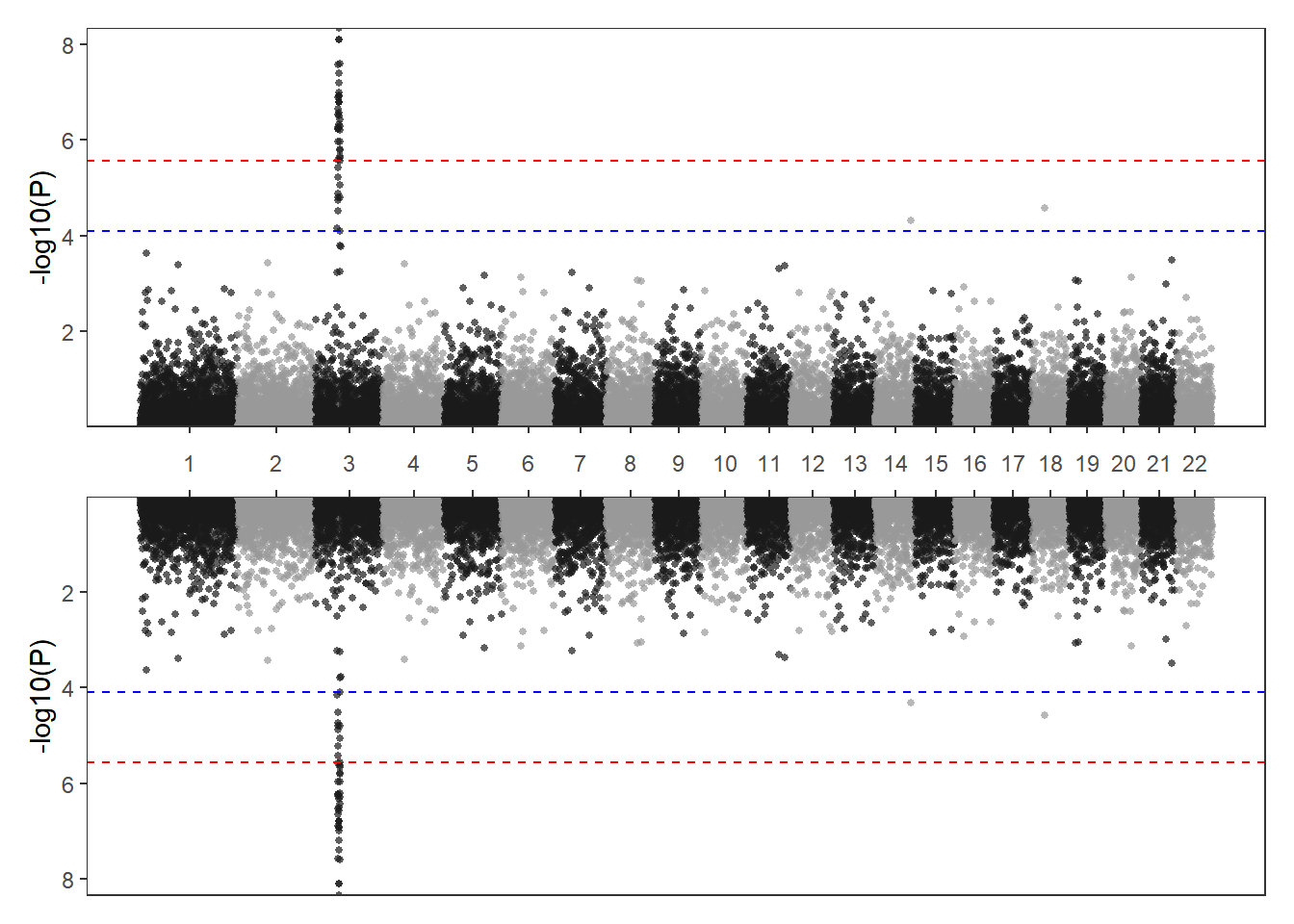
Application
fig-HistApplications} 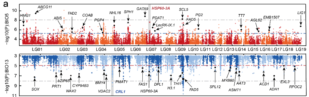
Applications of Manhattan Plot :::
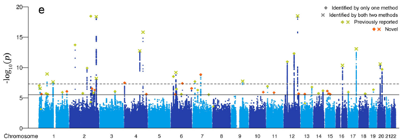
This figure shows the association between SNP loci in poplar trees and temperature (top)/rainfall (bottom) [1]。
Reference
[1] Sang Y, Long Z, Dan X, Feng J, Shi T, Jia C, Zhang X, Lai Q, Yang G, Zhang H, Xu X, Liu H, Jiang Y, Ingvarsson PK, Liu J, Mao K, Wang J. Genomic insights into local adaptation and future climate-induced vulnerability of a keystone forest tree in East Asia. Nat Commun. 2022 Nov 1;13(1):6541. doi: 10.1038/s41467-022-34206-8. PMID: 36319648; PMCID: PMC9626627.