# Installing necessary packages
if (!requireNamespace("tidyverse", quietly = TRUE)) {
  install.packages("tidyverse")
}
if (!requireNamespace("readxl", quietly = TRUE)) {
  install.packages("readxl")
}
if (!requireNamespace("ggrepel", quietly = TRUE)) {
  install.packages("ggrepel")
}

# Load packages
library(tidyverse)
library(readxl)
library(ggrepel)Volcano Plot
The volcano plot is used to compare the two groups and obtain the up-regulation/down-regulation between the two groups. The screening basis is the p value and FC value, which are converted to -logP value and log2(FC) value. The imported data can be the OTU table or ASV table of the microbiome, the table of transcriptome gene expression, or the features table of metabolomics and other multi-omics data.
Example
Setup
System Requirements: Cross-platform (Linux/MacOS/Windows)
Programming language: R
Dependent packages:
tidyverse;readxl;ggrepel
Data Preparation
We import the volcano plot example data from omicshare.
# Load excel data
data <- read_excel("files/volcano.eg.xlsx")

# Rename column names (handle special characters)
data <- data %>%
  rename(log2FC = "log2 Ratio(WT0/LOG)", Pvalue = "Pvalue")
# Handle the case where the p-value is 0 (avoid calculating -Inf)
data <- data %>%
  mutate(log10P = -log10(Pvalue + 1e-300)) # Make sure to handle the case where P=0
# Convert to numeric type and handle values that fail to convert (such as invalid characters)
data <- data %>%
  mutate(
    log2FC = as.numeric(log2FC) # Values that fail the conversion become NA
  )

# Find the original value that caused the conversion to fail
data %>%
  filter(is.na(log2FC)) %>%
  select(log2FC) # View the raw log2FC values for these lines
# A tibble: 0 × 1
# ℹ 1 variable: log2FC <dbl># Repair the data as needed (e.g. replace or remove outliers)
# Example: Replace "Inf" with an actual value or filter out
data <- data %>%
mutate(
log2FC = ifelse(log2FC == "Inf", 100, log2FC), # Adjust according to needs
log2FC = as.numeric(log2FC)
) %>%
filter(!is.na(log2FC)) # Delete the rows that cannot be repaired
# Defining significance (satisfying both P value < 0.05 and |log2FC| > 1)
# Define significance categories (upregulated, downregulated, not significant)
data <- data %>%
mutate(
significant = case_when(
Pvalue < 0.05 & log2FC > 2 ~ "Upregulated", # Up (red)
Pvalue < 0.05 & log2FC < -2 ~ "Downregulated", # Down (green)
TRUE ~ "Not significant" # Not significant (grey)
)
)
# View data structure
head(data, 5)# A tibble: 5 × 10
GeneID LOG_count WT0_count LOG_rpkm WT0_rpkm log2FC Pvalue FDR
<chr> <dbl> <dbl> <dbl> <dbl> <dbl> <dbl> <dbl>
1 Unigene0000003 17243 17525 932. 942. 0.0168 5.15e-1 6.73e-1
2 Unigene0000004 65 101 4.12 6.37 0.629 6.64e-3 1.79e-2
3 Unigene0000005 909 984 36.9 39.7 0.108 1.26e-1 2.25e-1
4 Unigene0000006 1376 1082 74.7 58.5 -0.353 1.17e-8 6.86e-8
5 Unigene0000007 121 73 15.7 9.42 -0.736 7.42e-4 2.45e-3
# ℹ 2 more variables: significant <chr>, log10P <dbl>Visualization
1. Basic volcano plot
# Basic volcano plot
p <-
  ggplot(data, aes(x = log2FC, y = -log10(Pvalue))) + # Plot preliminary volcano
  # Plot scatter points, colored by significant categories
  geom_point(aes(color = significant), alpha = 0.6, size = 1.5) +
  # Set color mapping (up: red, down: green, no significant: gray)
  scale_color_manual(
    values = c("Upregulated" = "red", "Downregulated" = "green", "Not significant" = "gray"),
    name = "Significance" # Legend Title
    ) +
  # Adding a filter threshold line
  geom_vline(xintercept = c(-2, 2), linetype = "dashed", color = "green", linewidth = 0.5) + # log2FC threshold line
  geom_hline(yintercept = -log10(0.05), linetype = "dashed", color = "blue", linewidth = 0.5) + # p-value threshold line
  # Adjust axes and titles
  labs(x = "log2(Fold Change)", y = "-log10(P-value)",
       title = "Volcano Plot with Thresholds") +
  theme_minimal() +
  theme(plot.title = element_text(hjust = 0.5, face = "bold"), # Title centered bold
        legend.position = "right") # Legend position

p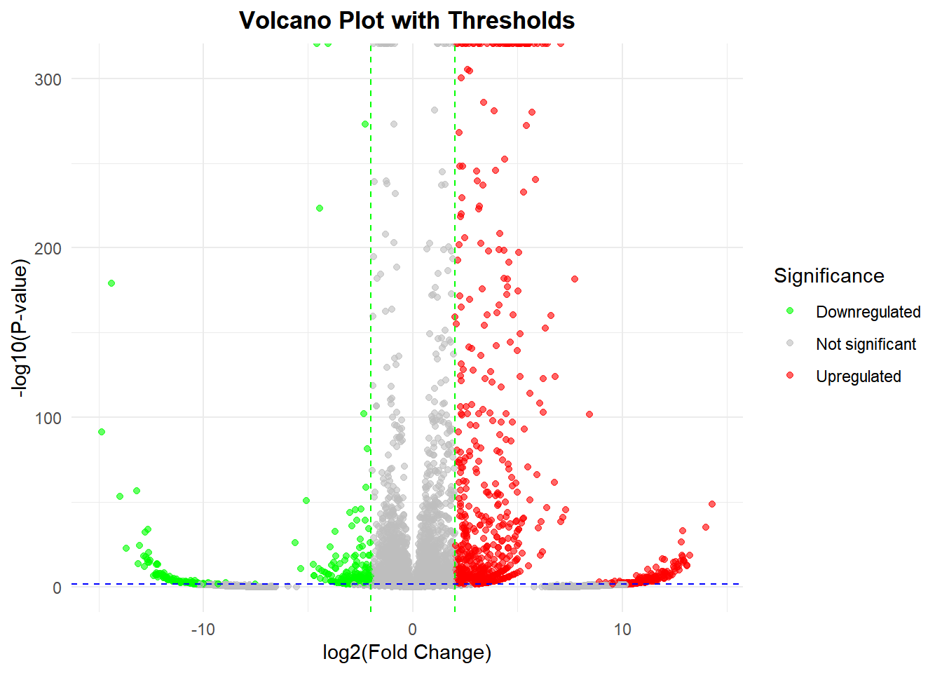
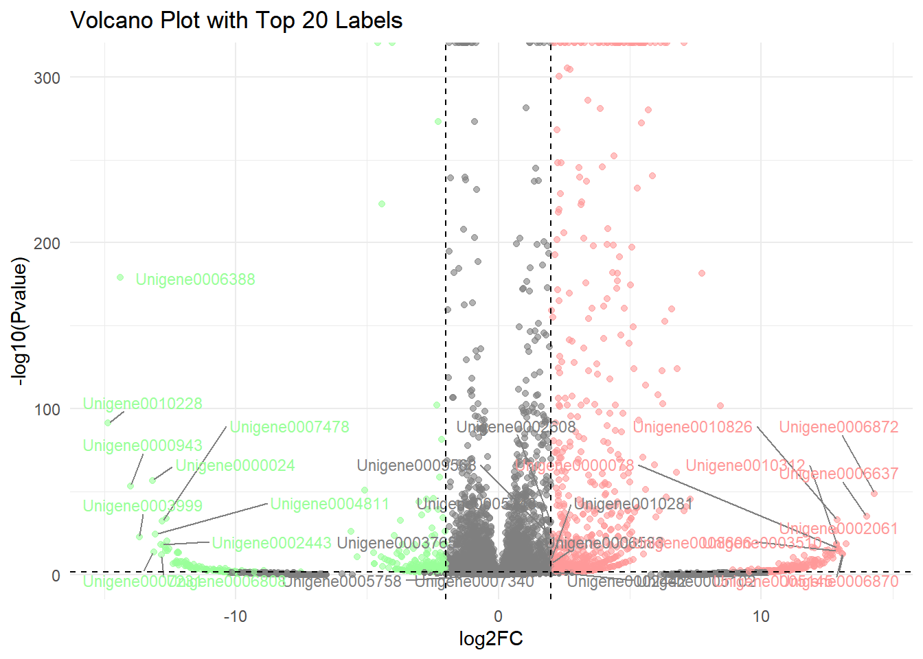
2. Labeled volcano plot
# Add Label
# Step 1: Screening genes to be annotated
label_data <- data %>%
  filter(Pvalue < 0.05) %>% # Screening of significant genes
  group_by(significant) %>% # Group by up and down
  top_n(10, abs(log2FC)) %>% # Take the 10 with the largest absolute values of log2FC
  ungroup()
# Step 2: Define label colors (light red and light green)
label_colors <- c(
  "Upregulated" = "#FF9999",
  "Downregulated" = "#99FF99"
  )
# Step 3: Draw a labeled volcano plot
p <-
  ggplot(data, aes(x = log2FC, y = -log10(Pvalue))) +
  geom_point(aes(color = significant), alpha = 0.6, size = 1.5) +
  # Add gene tags (only target genes are marked)
  geom_text_repel(
    data = label_data,
    aes(label = GeneID, color = significant), # Assume that the gene name column is named OTU ID
    size = 3,
    box.padding = 0.5, # Label padding
    max.overlaps = 50, # Maximum overlap allowed
    segment.color = "grey50", # Connection line color
    show.legend = FALSE
    ) +
  # Set color mapping (original color + label color)
  scale_color_manual(
    values = c("Upregulated" = "red", "Downregulated" = "green", "Not significant" = "gray"),
    guide = guide_legend(override.aes = list(
      color = c("red", "green", "gray"), # Legend color remains original
      label = "" # No text is displayed in the legend
      ))) +
  # Control label color (light red and light green)
  scale_color_manual(
    values = label_colors,
    guide = "none" # Hide additional legend
    ) +
  # Keep the original threshold line and title
  geom_vline(xintercept = c(-2, 2), linetype = "dashed", color = "black") +
  geom_hline(yintercept = -log10(0.05), linetype = "dashed", color = "black") +
  labs(title = "Volcano Plot with Top 20 Labels") +
  theme_minimal()

p