# Install packages
if (!requireNamespace("ggplot2", quietly = TRUE)) {
  install.packages("ggplot2")
}
if (!requireNamespace("ggisoband", quietly = TRUE)) {
  install.packages("ggisoband")
}

# Load packages
library(ggplot2)
library(ggisoband)Contour (XY)
Note
Hiplot website
This page is the tutorial for source code version of the Hiplot Contour (XY) plugin. You can also use the Hiplot website to achieve no code ploting. For more information please see the following link:
Contour plot (XY) is a data processing method that reflects data density through contour line.
Setup
System Requirements: Cross-platform (Linux/MacOS/Windows)
Programming language: R
Dependent packages:
ggplot2;ggisoband
Data Preparation
The loaded data are two variables.
# Load data
data <- read.delim("files/Hiplot/028-contour-xy-data.txt", header = T)

# convert data structure
colnames(data) <- c("xvalue", "yvalue")

# View data
head(data)
xvalue yvalue
1 2.620 110
2 2.875 110
3 2.320 93
4 3.215 110
5 3.440 175
6 3.460 105Visualization
# Contour (XY)
p <- ggplot(data, aes(xvalue, yvalue)) +
  geom_density_bands(
    alpha = 1,
    aes(fill = stat(density)), color = "gray40", size = 0.2
    ) +
  geom_point(alpha = 1, shape = 21, fill = "white") +
  scale_fill_viridis_c(guide = "legend") +
  ylab("value2") +
  xlab("value1") +
  ggtitle("Contour-XY Plot") +
  theme_bw() +
  theme(text = element_text(family = "Arial"),
        plot.title = element_text(size = 12,hjust = 0.5),
        axis.title = element_text(size = 12),
        axis.text = element_text(size = 10),
        axis.text.x = element_text(angle = 0, hjust = 0.5,vjust = 1),
        legend.position = "right",
        legend.direction = "vertical",
        legend.title = element_text(size = 10),
        legend.text = element_text(size = 10))

p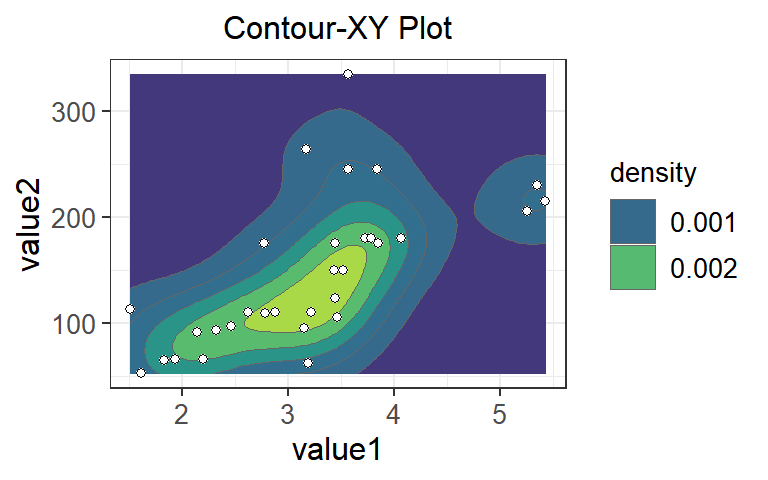
Just as contour lines in geography represent different heights, different contour lines in contour maps represent different densities. The closer to the center, the smaller contour loop is, and the higher the regional data density is. For example, the data density of yellow area is the highest, while that of blue area is the lowest.