# Install packages
if (!requireNamespace("ggplot2", quietly = TRUE)) {
  install.packages("ggplot2")
}
if (!requireNamespace("ggthemes", quietly = TRUE)) {
  install.packages("ggthemes")
}

# Load packages
library(ggplot2)
library(ggthemes)Barplot
Note
Hiplot website
This page is the tutorial for source code version of the Hiplot Barplot plugin. You can also use the Hiplot website to achieve no code ploting. For more information please see the following link:
Bar charts are used to display category data with rectangular bars whose height or length is proportional to the value they represent. Bar charts can be drawn vertically or horizontally. The bar chart shows the comparison between the discrete categories. One axis of the chart shows the specific categories to be compared, and the other axis represents the measurements. Some bar charts show bars that can also show the values of multiple measurement variables.
Setup
System Requirements: Cross-platform (Linux/MacOS/Windows)
Programming language: R
Dependent packages:
ggplot2;ggthemes
Data Preparation
The loaded data are efficacy data of different doses of drugs in different treatment regimens.
# Load data
data <- read.table("files/Hiplot/010-barplot-data.txt", header = T)

# convert data structure
data[, 2] <- factor(data[, 2], levels = unique(data[, 2]))
data[, 3] <- factor(data[, 3], levels = unique(data[, 3]))

# View data
head(data)
value treat dose
1 13 Group1 high
2 34 Group2 high
3 21 Group3 high
4 43 Group4 high
5 25 Group1 mid
6 8 Group2 midVisualization
# Barplot
p <- ggplot(data, aes(x = dose, y = value, fill = treat)) +
  geom_bar(position = position_dodge(0.9), stat = "identity") +
  ggtitle("Bar Plot") +
  geom_text(aes(label = value), position = position_dodge(0.9), vjust = 1.5, color = "white", size = 3.5) +
  scale_fill_manual(values = c("#e04d39","#5bbad6","#1e9f86","#3c5488ff")) +
  theme_stata() +
  theme(text = element_text(family = "Arial"),
        plot.title = element_text(size = 12,hjust = 0.5),
        axis.title = element_text(size = 12),
        axis.text = element_text(size = 10),
        axis.text.x = element_text(angle = 0, hjust = 0.5,vjust = 1),
        legend.position = "right",
        legend.direction = "vertical",
        legend.title = element_text(size = 10),
        legend.text = element_text(size = 10))

p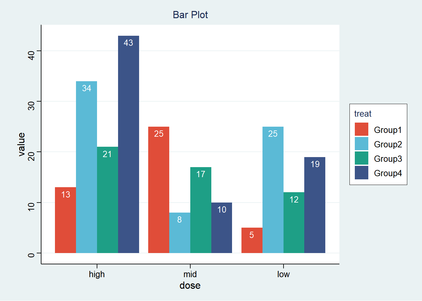
The bar chart shows the different effects of low, medium, and high doses in different treatment groups (groups 1 to 4). Group 1 had the best effect with medium dose treatment, group 2 had the best effect with high dose treatment, group 3 had no significant difference with dose treatment, and group 4 had the best effect with high dose treatment.