# Install packages
if (!requireNamespace("ggplot2", quietly = TRUE)) {
  install.packages("ggplot2")
}

# Load packages
library(ggplot2)Donut
Note
Hiplot website
This page is the tutorial for source code version of the Hiplot Donut plugin. You can also use the Hiplot website to achieve no code ploting. For more information please see the following link:
The donut is a variant of the pie chart, with a blank center allowing for additional information about the data as a whole to be included. Doughnut charts are similar to pie charts in that their aim is to illustrate proportions.
Setup
System Requirements: Cross-platform (Linux/MacOS/Windows)
Programming language: R
Dependent packages:
ggplot2
Data Preparation
The loaded data are different groups and their data.
# Load data
data <- read.delim("files/Hiplot/045-donut-data.txt", header = T)

# convert data structure
data$fraction <- data[, 2] / sum(data[, 2])
data$ymax <- cumsum(data$fraction)
data$ymin <- c(0, head(data$ymax, n = -1))
data$labelPosition <- (data$ymax + data$ymin) / 2
data$label <- paste0(data[, 1], "\n",
  "(", data[, 2], ", ", sprintf("%2.2f%%", 100 * data[, 2] / sum(data[, 2])), ")",
  sep = ""
)

# View data
head(data)
group value fraction ymax ymin labelPosition label
1 Group1 13 0.1171171 0.1171171 0.0000000 0.05855856 Group1\n(13, 11.71%)
2 Group2 34 0.3063063 0.4234234 0.1171171 0.27027027 Group2\n(34, 30.63%)
3 Group3 21 0.1891892 0.6126126 0.4234234 0.51801802 Group3\n(21, 18.92%)
4 Group4 43 0.3873874 1.0000000 0.6126126 0.80630631 Group4\n(43, 38.74%)Visualization
# Donut
p <- ggplot(data, aes_(ymax = as.name("ymax"), ymin = as.name("ymin"),
                       xmax = 4, xmin = 3, fill = as.name(colnames(data)[1]))) +
  geom_rect() +
  geom_text(x = 5 + (4 - 5) / 3,
            aes(y = labelPosition, label = label), size = 4) +
  coord_polar(theta = "y") +
  xlim(c(2, 5)) +
  scale_fill_manual(values = c("#00468BCC","#ED0000CC","#42B540CC","#0099B4CC")) +
  ggtitle("Donut Plot") +
  theme_void() +
  theme(plot.title = element_text(hjust = 0.5),
        legend.position = "none")

p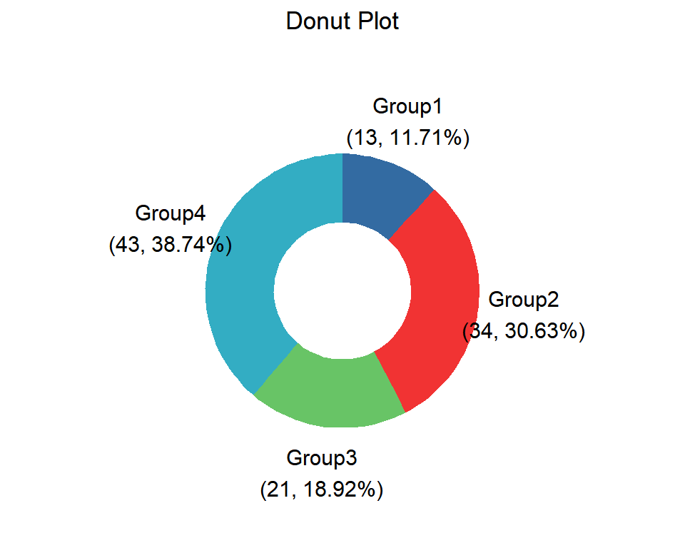
Different colors represent different groups and different areas represent data and proportion.