# Install packages
if (!requireNamespace("ggpubr", quietly = TRUE)) {
  install.packages("ggpubr")
}

# Load packages
library(ggpubr)Dotchart
Note
Hiplot website
This page is the tutorial for source code version of the Hiplot Dotchart plugin. You can also use the Hiplot website to achieve no code ploting. For more information please see the following link:
Sliding bead chart is a graph of beads sliding on a column. It is the superposition of bar chart and scatter chart.
Setup
System Requirements: Cross-platform (Linux/MacOS/Windows)
Programming language: R
Dependent packages:
ggpubr
Data Preparation
The loaded data are gene names and their corresponding gene expression values and groups.
# Load data
data <- read.delim("files/Hiplot/046-dotchart-data.txt", header = T)

# View data
head(data)
Name Value Group
1 BMP2 18.7 Group1
2 XIST 14.3 Group1
3 C19orf38 16.4 Group1
4 PDZD3 17.3 Group1
5 MAPRE2 15.2 Group1
6 IRF4 10.4 Group1Visualization
# Dotchart
p <- ggdotchart(data, x = "Name", y = "Value", group = "Group", color = "Group",
                rotate = T, sorting = "descending",
                y.text.col = F, add = "segments", dot.size = 2) +
  xlab("Name") +
  ylab("Value") +
  ggtitle("DotChart Plot") +
  scale_color_manual(values = c("#e04d39","#5bbad6","#1e9f86")) +
  theme_classic() +
  theme(text = element_text(family = "Arial"),
        plot.title = element_text(size = 12,hjust = 0.5),
        axis.title = element_text(size = 12),
        axis.text = element_text(size = 10),
        axis.text.x = element_text(angle = 0, hjust = 0.5,vjust = 1),
        legend.position = "right",
        legend.direction = "vertical",
        legend.title = element_text(size = 10),
        legend.text = element_text(size = 10))

p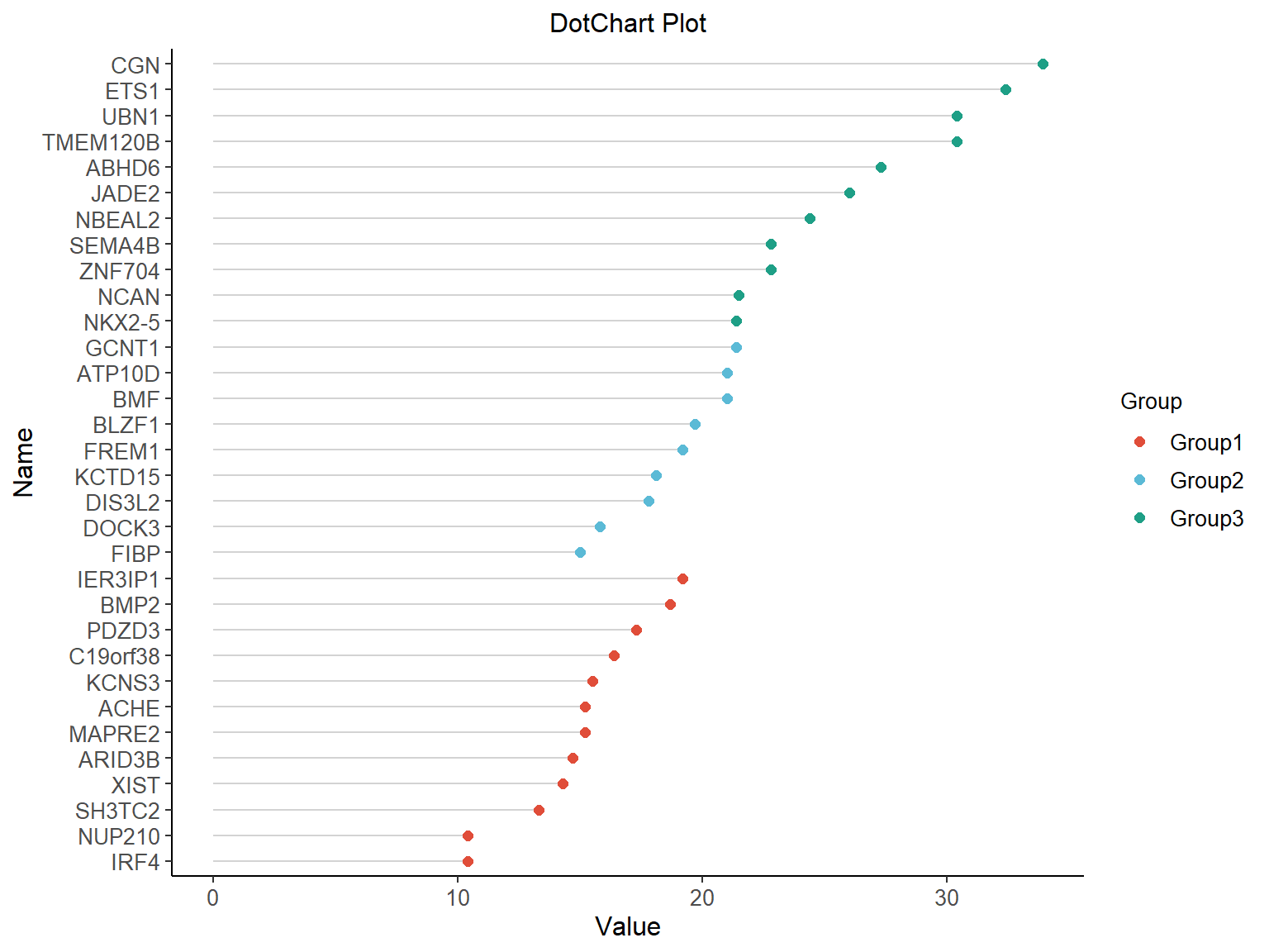
Each color represents a different grouping, so that the differences in gene expression values can be intuitively understood.