# 安装包
if (!requireNamespace("ggplot2", quietly = TRUE)) {
  install.packages("ggplot2")
}

# 加载包
library(ggplot2)帕累托图
注记
Hiplot 网站
本页面为 Hiplot Pareto Chart 插件的源码版本教程,您也可以使用 Hiplot 网站实现无代码绘图,更多信息请查看以下链接:
环境配置
系统: Cross-platform (Linux/MacOS/Windows)
编程语言: R
依赖包:
ggplot2
数据准备
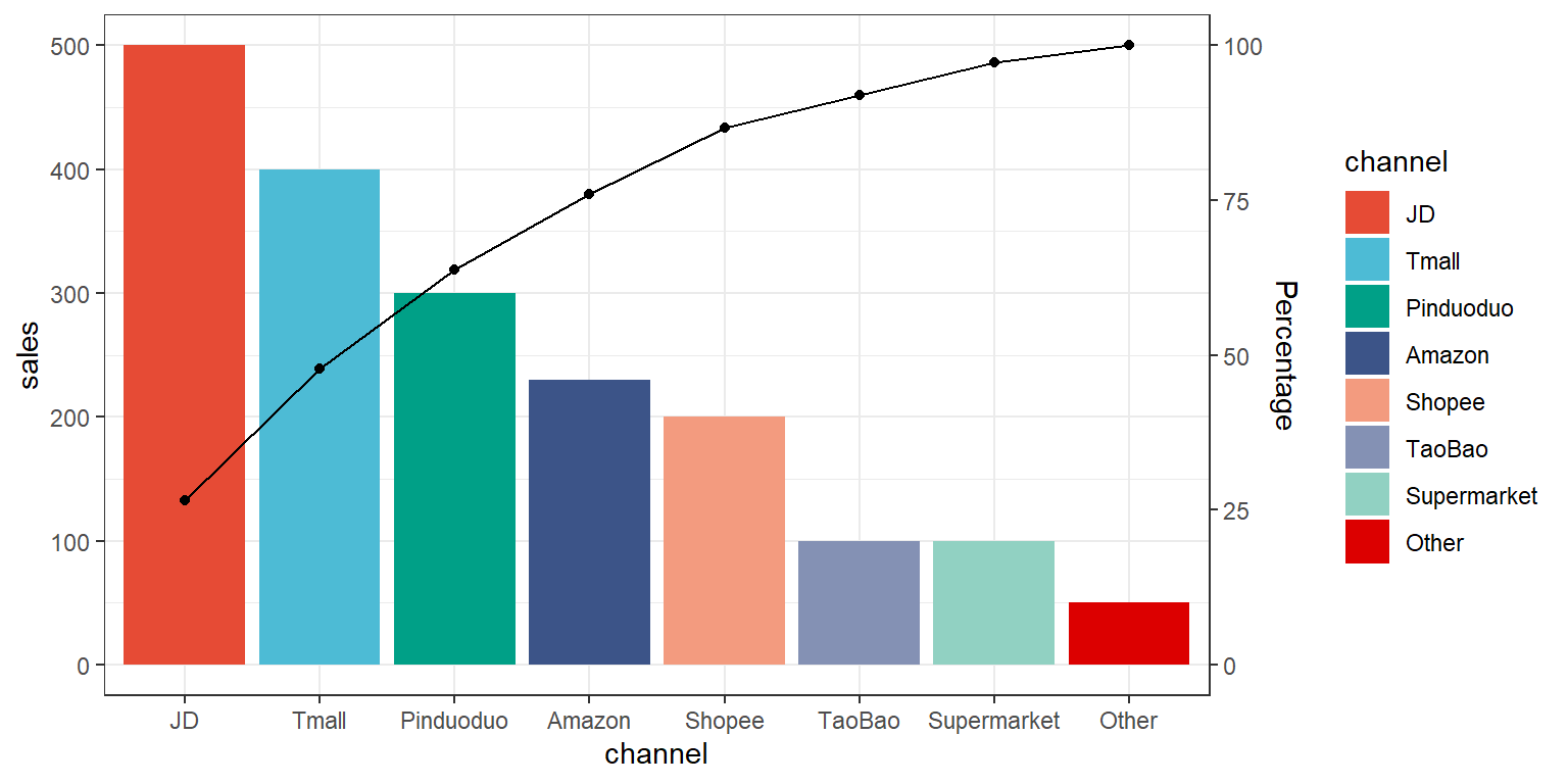
案例数据为某商品在多个平台的销量数据,插件会为销量数据自动降序排列绘制条形图,同时计算累积销量绘制累积折线图。
# 加载数据
data <- read.delim("files/Hiplot/133-pareto-chart-data.txt", header = T)

# 整理数据格式
data <- data[order(-data[["sales"]]), ]
data[["channel"]] <- factor(data[["channel"]], levels = data[["channel"]])
## 计算百分比
data$accumulating <- cumsum(data[["sales"]])
max_y <- max(data[["sales"]])
cal_num <- sum(data[["sales"]]) / max_y
data$accumulating <- data$accumulating / cal_num

# 查看数据
head(data)
channel sales accumulating
2 JD 500 132.9787
5 Tmall 400 239.3617
4 Pinduoduo 300 319.1489
3 Amazon 230 380.3191
6 Shopee 200 433.5106
1 TaoBao 100 460.1064可视化
# 帕累托图
p <- ggplot(data, aes(x = channel, y = sales, fill = channel)) +
  geom_bar(stat = "identity") +
  geom_line(aes(y = accumulating), group = 1) +
  geom_point(aes(y = accumulating), show.legend = FALSE) +
  scale_y_continuous(sec.axis = sec_axis(trans = ~ . / max_y * 100, name = "Percentage")) +
  scale_fill_manual(values = c("#E64B35FF","#4DBBD5FF","#00A087FF","#3C5488FF",
                               "#F39B7FFF","#8491B4FF","#91D1C2FF","#DC0000FF")) +
  theme_bw()

p