# 安装包
if (!requireNamespace("ggplot2", quietly = TRUE)) {
  install.packages("ggplot2")
}
if (!requireNamespace("dplyr", quietly = TRUE)) {
  install.packages("dplyr")
}

# 加载包
library(ggplot2)
library(dplyr)饼图
注记
Hiplot 网站
本页面为 Hiplot Pie 插件的源码版本教程,您也可以使用 Hiplot 网站实现无代码绘图,更多信息请查看以下链接:
饼图是通过将一个圆形切分成多个切片以显示每一部分所占总体比例的统计图表。
环境配置
系统: Cross-platform (Linux/MacOS/Windows)
编程语言: R
依赖包:
ggplot2;dplyr
数据准备
载入数据为不同分组及其数据。
# 加载数据
data <- read.delim("files/Hiplot/141-pie-data.txt", header = T)

# 整理数据格式
colnames(data) <- c("Group", "Value")
data <- data %>%
  arrange(desc(Group)) %>%
  mutate(prop = Value / sum(data$Value) * 100) %>%
  mutate(ypos = Value / length(unique(Group)) +
           c(0, cumsum(Value)[-length(Value)]) + 5)

# 查看数据
head(data)
Group Value prop ypos
1 Group4 43 38.73874 15.75
2 Group3 21 18.91892 53.25
3 Group2 34 30.63063 77.50
4 Group1 13 11.71171 106.25可视化
# 饼图
p <- ggplot(data, aes(x = "", y = Value, fill = Group)) +
  geom_col(width = 1) +
  geom_bar(stat = "identity", width = 1, color = "white") +
  geom_text(aes(y = ypos,
                label = sprintf("%s\n(n=%s, %s%%)", Group, Value,
                                round(Value / sum(data$Value) * 100, 2))),
            color = "white", fontface = "bold") +
  coord_polar(theta = "y", start = 0, direction = -1) +
  guides(fill = guide_legend(title = "Group")) +
  scale_fill_discrete(
    breaks = data$Group,
    labels = paste(data$Group," (", round(data$Value / sum(data$Value) * 100, 2),
                   "%)", sep = "")) +
  scale_fill_manual(values = c("#00468BFF","#ED0000FF","#42B540FF","#0099B4FF")) +
  ggtitle("Pie Plot") +
  theme_minimal() +
  theme(
    axis.title.x = element_blank(),
    axis.title.y = element_blank(),
    axis.text.x = element_blank(),
    axis.text.y = element_blank(),
    panel.border = element_blank(),
    panel.grid = element_blank(),
    axis.ticks = element_blank(),
    plot.title = element_text(size = 14, face = "bold",
                              hjust = 0.5, vjust = -1),
    legend.position = "none"
  )


p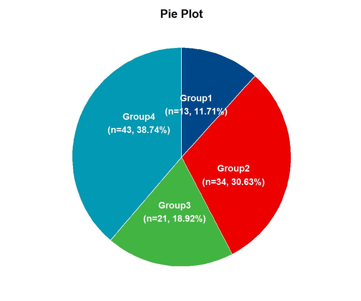
在一个圆图中,每个切片的弧长(其中心角和中心角所对应区域的弧长)与所表示的数量成正比。该饼图展示了 1~4 组分别的样本数量及样本数量所对应的占比。一组样本数量 13,占比 11.71%,二组样本数量 34,占比 30.63%,三组样本数量 21,占比 18.92%,四组样本数量 43,占比38.74%。