# 安装包
if (!requireNamespace("apyramid", quietly = TRUE)) {
  install.packages("apyramid")
}
if (!requireNamespace("ggplot2", quietly = TRUE)) {
  install.packages("ggplot2")
}

# 加载包
library(apyramid)
library(ggplot2)金字塔图 2
注记
Hiplot 网站
本页面为 Hiplot Pyramid Chart 2 插件的源码版本教程,您也可以使用 Hiplot 网站实现无代码绘图,更多信息请查看以下链接:
金字塔图是一种将数据分布于中轴两侧类似金字塔的图形。
环境配置
系统: Cross-platform (Linux/MacOS/Windows)
编程语言: R
依赖包:
apyramid;ggplot2
数据准备
载入数据为年龄段,性别分类及前两种变量组合后的人口数目。
# 加载数据
data <- read.delim("files/Hiplot/145-pyramid-chart2-data.txt", header = T)

# 整理数据格式
x <- as.integer(data[,"age"])
data$age_group <- cut(x, breaks = pretty(x), right = TRUE, include.lowest = TRUE)

# 查看数据
head(data)
case_id date_of_onset date_of_hospitalisation date_of_outcome outcome Gender
1 1 2013/2/19 <NA> 2013/3/4 Death Male
2 2 2013/2/27 2013/3/3 2013/3/10 Death Male
3 3 2013/3/9 2013/3/19 2013/4/9 Death Female
4 4 2013/3/19 2013/3/27 <NA> <NA> Female
5 5 2013/3/19 2013/3/30 2013/5/15 Recover Female
6 6 2013/3/21 2013/3/28 2013/4/26 Death Female
age province age_group
1 87 Shanghai (80,100]
2 27 Shanghai (20,40]
3 35 Anhui (20,40]
4 45 Jiangsu (40,60]
5 48 Jiangsu (40,60]
6 32 Jiangsu (20,40]可视化
# 金字塔图2
p <- age_pyramid(data, "age_group", split_by = "Gender") +
  scale_fill_manual(values = c("#BC3C29FF","#0072B5FF")) +
  xlab("Age group") +
  ylab("Gender") +
  theme_classic() +
  theme(text = element_text(family = "Arial"),
      plot.title = element_text(size = 12,hjust = 0.5),
      axis.title = element_text(size = 12),
      axis.text = element_text(size = 10),
      axis.text.x = element_text(angle = 0, hjust = 0.5,vjust = 1),
      legend.position = "right",
      legend.direction = "vertical",
      legend.title = element_text(size = 10),
      legend.text = element_text(size = 10))

p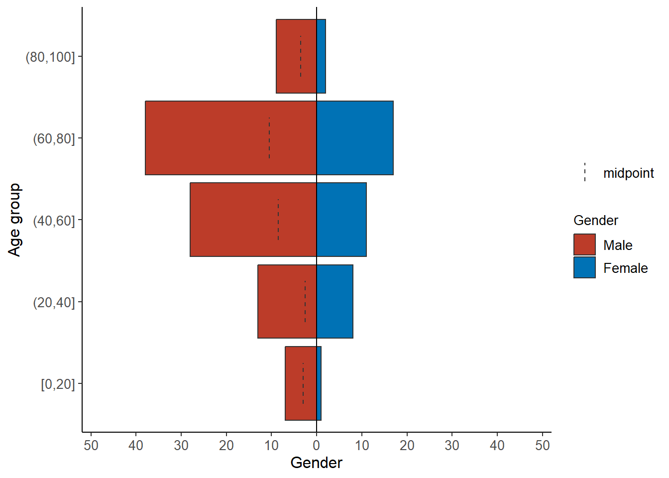
图示将年龄段按照顺序从下到上依次显示在中轴线上,左侧表示男性人数,右侧表示女性人数,x 轴表示人口数量,该图可以很明显看出男女在不同年龄段的人数占比情况以及相同性别中不同年龄组的占比情况。