# 安装包
if (!requireNamespace("survminer", quietly = TRUE)) {
  install.packages("survminer")
}
if (!requireNamespace("fastStat", quietly = TRUE)) {
  install_github("yikeshu0611/fastStat")
}
if (!requireNamespace("cutoff", quietly = TRUE)) {
  install.packages("cutoff")
}
if (!requireNamespace("ggplot2", quietly = TRUE)) {
  install.packages("ggplot2")
}
if (!requireNamespace("cowplot", quietly = TRUE)) {
  install.packages("cowplot")
}

# 加载包
library(survminer)
library(fastStat)
library(cutoff)
library(ggplot2)
library(cowplot)风险因子分析
注记
Hiplot 网站
本页面为 Hiplot Risk Factor Analysis 插件的源码版本教程,您也可以使用 Hiplot 网站实现无代码绘图,更多信息请查看以下链接:
环境配置
系统: Cross-platform (Linux/MacOS/Windows)
编程语言: R
依赖包:
survminer;fastStat;cutoff;ggplot2;cowplot
数据准备
# 加载数据
data <- read.delim("files/Hiplot/155-risk-plot-data.txt", header = T)

# 整理数据格式
data <- data[order(data[, "riskscore"], decreasing = F), ]
cutoff_point <- median(x = data$riskscore, na.rm = TRUE)
data$Group <- ifelse(data$riskscore > cutoff_point, "High", "Low")
cut.position <- (1:nrow(data))[data$riskscore == cutoff_point]
if (length(cut.position) == 0) {
  cut.position <- which.min(abs(data$riskscore - cutoff_point))
} else if (length(cut.position) > 1) {
  cut.position <- cut.position[length(cut.position)]
}
## 生成画 A B 图所需data.frame
data2 <- data[, c("time", "event", "riskscore", "Group")]

# 查看数据
head(data)
time event riskscore TAGLN2 PDPN TIMP1 EMP3 Group
1 1014 0 0.8206424 1.0612565 0.04879016 0.1484200 0.1906204 Low
2 246 1 1.0582599 1.2584610 0.20701417 0.3506569 0.2546422 Low
3 2283 0 1.1693457 1.2697605 0.00000000 0.2231436 0.3364722 Low
4 1757 0 1.2274565 1.7209793 0.00000000 0.5822156 0.2231436 Low
5 3107 1 1.2806984 0.5933268 0.37156356 0.1043600 0.5709795 Low
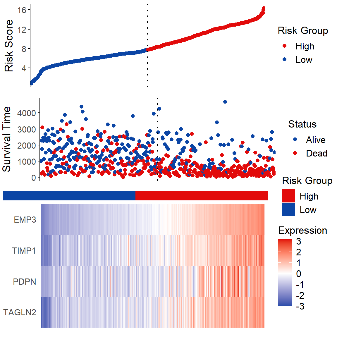
6 332 1 1.2891095 1.2892326 0.09531018 0.2070142 0.3987761 Low可视化
# 风险因子分析
## Figure A
fA <- ggplot(data = data2, aes(x = 1:nrow(data2), y = data2$riskscore,
                               color = Group)) +
  geom_point(size = 2) +
  scale_color_manual(name = "Risk Group",
                     values = c("Low" = "#0B45A5", "High" = "#E20B0B")) +
  geom_vline(xintercept = cut.position, linetype = "dotted", size = 1) +
  theme(panel.grid = element_blank(), panel.background = element_blank(),
        axis.ticks.x = element_blank(), axis.line.x = element_blank(),
        axis.text.x = element_blank(), axis.title.x = element_blank(),
        axis.title.y = element_text(size = 14, vjust = 1, angle = 90),
        axis.text.y = element_text(size = 11),
        axis.line.y = element_line(size = 0.5, colour = "black"),
        axis.ticks.y = element_line(size = 0.5, colour = "black"),
        legend.title = element_text(size = 13),
        legend.text = element_text(size = 12)) +
  coord_trans() +
  ylab("Risk Score") +
  scale_x_continuous(expand = c(0, 3))
## Figure B
fB <- ggplot(data = data2, aes(x = 1:nrow(data2), y = data2[, "time"],
             color = factor(ifelse(data2[, "event"] == 1, "Dead", "Alive")))) +
  geom_point(size = 2) +
  scale_color_manual(name = "Status", values = c("Alive" = "#0B45A5", "Dead" = "#E20B0B")) +
  geom_vline(xintercept = cut.position, linetype = "dotted", size = 1) +
  theme(panel.grid = element_blank(), panel.background = element_blank(),
        axis.ticks.x = element_blank(), axis.line.x = element_blank(),
        axis.text.x = element_blank(), axis.title.x = element_blank(),
        axis.title.y = element_text(size = 14, vjust = 2, angle = 90),
        axis.text.y = element_text(size = 11),
        axis.ticks.y = element_line(size = 0.5),
        axis.line.y = element_line(size = 0.5, colour = "black"),
        legend.title = element_text(size = 13),
        legend.text = element_text(size = 12)) +
  ylab("Survival Time") +
  coord_trans() +
  scale_x_continuous(expand = c(0, 3))
## middle
middle <- ggplot(data2, aes(x = 1:nrow(data2), y = 1)) +
  geom_tile(aes(fill = data2$Group)) +
  scale_fill_manual(name = "Risk Group", values = c("Low" = "#0B45A5", "High" = "#E20B0B")) +
  theme(panel.grid = element_blank(), panel.background = element_blank(),
        axis.line = element_blank(), axis.ticks = element_blank(),
        axis.text = element_blank(), axis.title = element_blank(),
        plot.margin = unit(c(0.15, 0, -0.3, 0), "cm"),
        legend.title = element_text(size = 13),
        legend.text = element_text(size = 12)) +
  scale_x_continuous(expand = c(0, 3)) +
  xlab("")
## Figure C
heatmap_genes <- c("TAGLN2", "PDPN", "TIMP1", "EMP3")
data3 <- data[, heatmap_genes]
if (length(heatmap_genes) == 1) {
  data3 <- data.frame(data3)
  colnames(data3) <- heatmap_genes
}
# 归一化
for (i in 1:ncol(data3)) {
  data3[, i] <- (data3[, i] - mean(data3[, i], na.rm = TRUE)) /
  sd(data3[, i], na.rm = TRUE)
}
data4 <- cbind(id = 1:nrow(data3), data3)
data5 <- reshape2::melt(data4, id.vars = "id")
fC <- ggplot(data5, aes(x = id, y = variable, fill = value)) +
  geom_raster() +
  theme(panel.grid = element_blank(), panel.background = element_blank(),
        axis.line = element_blank(), axis.ticks = element_blank(),
        axis.text.x = element_blank(), axis.title = element_blank(),
        plot.background = element_blank()) +
  scale_fill_gradient2(name = "Expression", low = "#0B45A5", mid = "#FFFFFF",
                       high = "#E20B0B") +
  theme(axis.text = element_text(size = 11)) +
  theme(legend.title = element_text(size = 13),
        legend.text = element_text(size = 12)) +
  scale_x_continuous(expand = c(0, 3))

p <- plot_grid(fA, fB, middle, fC, ncol = 1, rel_heights = c(0.1, 0.1, 0.01, 0.15))

p