# 安装包
if (!requireNamespace("ggplot2", quietly = TRUE)) {
  install.packages("ggplot2")
}
if (!requireNamespace("dplyr", quietly = TRUE)) {
  install.packages("dplyr")
}
if (!requireNamespace("tidyr", quietly = TRUE)) {
  install.packages("tidyr")
}
if (!requireNamespace("stringr", quietly = TRUE)) {
  install.packages("stringr")
}

# 加载包
library(ggplot2)
library(dplyr)
library(tidyr)
library(stringr)饼图矩阵
注记
Hiplot 网站
本页面为 Hiplot Pie Matrix 插件的源码版本教程,您也可以使用 Hiplot 网站实现无代码绘图,更多信息请查看以下链接:
环境配置
系统: Cross-platform (Linux/MacOS/Windows)
编程语言: R
依赖包:
ggplot2;dplyr;tidyr;stringr
数据准备
# 加载数据
data <- read.delim("files/Hiplot/140-pie-matrix-data.txt", header = T)

# 整理数据格式
data[,"genre"] <- factor(data[,"genre"], levels = unique(data[,"genre"]))
data[,"mpaa"] <- factor(data[,"mpaa"], levels = unique(data[,"mpaa"]))
data[,"status"] <- factor(data[,"status"], levels = unique(data[,"status"]))
col <- c("#E64B35FF","#4DBBD5FF")
df <- matrix(NA, nrow = length(unique(data[,"mpaa"])),
             ncol = length(unique(data[,"genre"])))
row.names(df) <- unique(data[,"mpaa"])
colnames(df) <- unique(data[,"genre"])
for (i in 1:nrow(df)) {
    for (j in 1:ncol(df)) {
      for (k in unique(data[,"status"])) {
        if (is.na(df[i, j])) {
          df[i, j] <- sum(data[,"genre"] == unique(data[,"genre"])[j] &
            data[,"mpaa"] == unique(data[,"mpaa"])[i] &
            data[,"status"] == k)
        } else {
          df[i, j] <- paste0(df[i, j], ",",
            sum(data[,"genre"] == unique(data[,"genre"])[j] &
              data[,"mpaa"] == unique(data[,"mpaa"])[i] &
              data[,"status"] == k))
        }
      }
    }
}
df <- as.matrix(df)

# 查看数据
head(data)
title year length budget rating
1 Shawshank Redemption, The 1994 142 25 9.1
2 Lord of the Rings: The Return of the King, The 2003 251 94 9.0
3 Lord of the Rings: The Fellowship of the Ring, The 2001 208 93 8.8
4 Lord of the Rings: The Two Towers, The 2002 223 94 8.8
5 Pulp Fiction 1994 168 8 8.8
6 Schindler's List 1993 195 25 8.8
votes mpaa genre status
1 149494 R Drama yes
2 103631 PG-13 Action yes
3 157608 PG-13 Action yes
4 114797 PG-13 Action yes
5 132745 R Drama yes
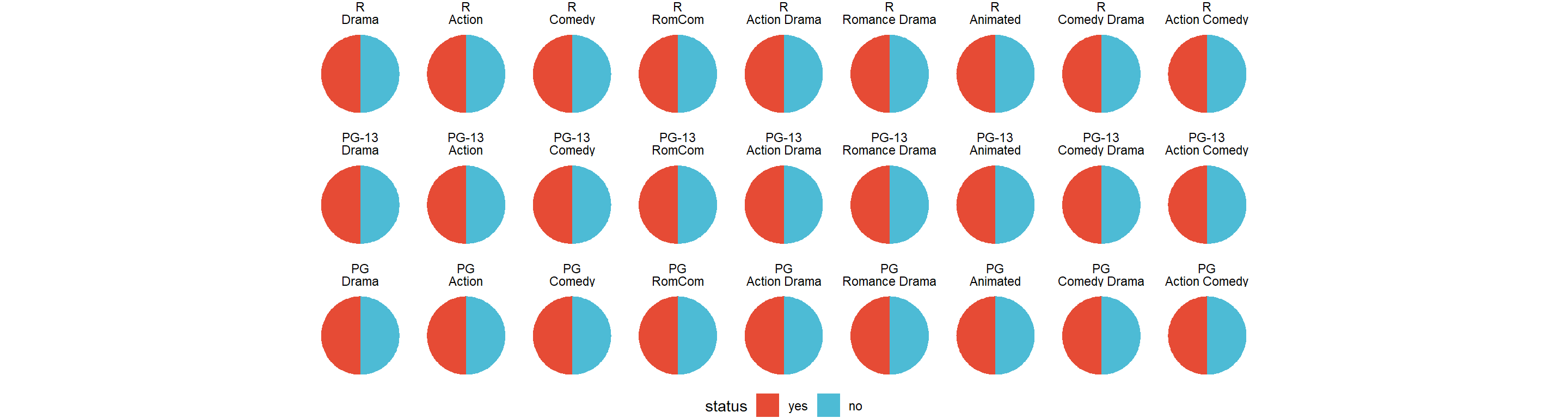
6 97667 R Drama yes可视化
# 饼图矩阵
p <- df %>% as.table() %>%
  as.data.frame() %>%
  mutate(Freq = str_split(Freq,",")) %>%
  unnest(Freq) %>%
  mutate(Freq = as.integer(Freq)) %>%
  # 将值转换为百分比(每个图表加起来为 1)
  group_by(Var1, Var2) %>%
  mutate(Freq = ifelse(is.na(Freq), NA, Freq / sum(Freq)),
         color = row_number()) %>%
  ungroup() %>%
  # Plot
  ggplot(aes("", Freq, fill=factor(color, labels = unique(data[,"status"])))) +
  geom_bar(width = 2, stat = "identity") +
  coord_polar("y") +
  facet_wrap(~Var1+Var2, ncol = ncol(df)) +
  scale_fill_manual(values = col) +
  theme_void() +
  theme(axis.text = element_blank(), axis.ticks = element_blank(),
        panel.grid = element_blank(), axis.title = element_blank(),
        legend.position = "bottom", legend.direction = "horizontal") +
  guides(fill = guide_legend(nrow = 1, title = "status"))

p