# 安装包
if (!requireNamespace("ggplot2", quietly = TRUE)) {
  install.packages("ggplot2")
}
if (!requireNamespace("dplyr", quietly = TRUE)) {
  install.packages("dplyr")
}
if (!requireNamespace("tidyr", quietly = TRUE)) {
  install.packages("tidyr")
}
if (!requireNamespace("scales", quietly = TRUE)) {
  install.packages("scales")
}

# 加载包
library(ggplot2)
library(dplyr)
library(tidyr)
library(scales)百分比堆叠条形图
注记
Hiplot 网站
本页面为 Hiplot Percentsge Stacked Bar Chart 插件的源码版本教程,您也可以使用 Hiplot 网站实现无代码绘图,更多信息请查看以下链接:
https://hiplot.cn/basic/stacked-percentage-bar-chart?lang=zh_cn
环境配置
系统: Cross-platform (Linux/MacOS/Windows)
编程语言: R
依赖包:
ggplot2;dplyr;tidyr;scales
数据准备
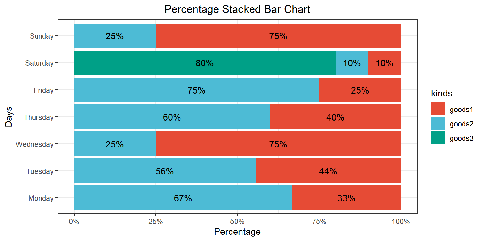
案例数据为某商场中三种商品在一星期内的销量,销量数据会被自动计算为百分比的形式进行绘图。
# 加载数据
data <- read.delim("files/Hiplot/167-stacked-percentage-bar-chart-data.txt", header = T)

# 整理数据格式
data$total <- rowSums(data[, -1])
data_long <- gather(data, kinds, value, -days, -total)
data_long <- data_long %>%
  group_by(days) %>%
  mutate(percent = value / total * 100)
data_long[["days"]] <- factor(data_long[["days"]], levels = data[["days"]])

# 查看数据
head(data)
days goods1 goods2 goods3 total
1 Monday 150 300 0 450
2 Tuesday 200 250 0 450
3 Wednesday 300 100 0 400
4 Thursday 200 300 0 500
5 Friday 100 300 0 400
6 Saturday 50 50 400 500可视化
# 百分比堆叠条形图
p <- ggplot(data_long, aes(x = percent, y = days, fill = kinds)) +
  geom_bar(stat = "identity", position = "stack") +
  geom_text(aes(label = ifelse(percent != 0, paste0(round(percent), "%"), "")),
            position = position_stack(vjust = 0.5)) +
  labs(title = "Percentage Stacked Bar Chart", x = "Percentage", y = "Days") +
  scale_x_continuous(labels = percent_format(scale = 1)) +
  theme_bw() +
  theme(plot.title = element_text(hjust = 0.5)) +
  scale_fill_manual(values = c("#E64B35FF","#4DBBD5FF","#00A087FF"))

p