# Install packages
if (!requireNamespace("ggplot2", quietly = TRUE)) {
  install.packages("ggplot2")
}
if (!requireNamespace("dplyr", quietly = TRUE)) {
  install.packages("dplyr")
}

# Load packages
library(ggplot2)
library(dplyr)Pie
Note
Hiplot website
This page is the tutorial for source code version of the Hiplot Pie plugin. You can also use the Hiplot website to achieve no code ploting. For more information please see the following link:
The pie chart is a statistical chart that shows the proportion of each part by dividing a circle into sections.
Setup
System Requirements: Cross-platform (Linux/MacOS/Windows)
Programming language: R
Dependent packages:
ggplot2;dplyr
Data Preparation
The loaded data are different groups and their data.
# Load data
data <- read.delim("files/Hiplot/141-pie-data.txt", header = T)

# Convert data structure
colnames(data) <- c("Group", "Value")
data <- data %>%
  arrange(desc(Group)) %>%
  mutate(prop = Value / sum(data$Value) * 100) %>%
  mutate(ypos = Value / length(unique(Group)) +
           c(0, cumsum(Value)[-length(Value)]) + 5)

# View data
head(data)
Group Value prop ypos
1 Group4 43 38.73874 15.75
2 Group3 21 18.91892 53.25
3 Group2 34 30.63063 77.50
4 Group1 13 11.71171 106.25Visualization
# Pie
p <- ggplot(data, aes(x = "", y = Value, fill = Group)) +
  geom_col(width = 1) +
  geom_bar(stat = "identity", width = 1, color = "white") +
  geom_text(aes(y = ypos,
                label = sprintf("%s\n(n=%s, %s%%)", Group, Value,
                                round(Value / sum(data$Value) * 100, 2))),
            color = "white", fontface = "bold") +
  coord_polar(theta = "y", start = 0, direction = -1) +
  guides(fill = guide_legend(title = "Group")) +
  scale_fill_discrete(
    breaks = data$Group,
    labels = paste(data$Group," (", round(data$Value / sum(data$Value) * 100, 2),
                   "%)", sep = "")) +
  scale_fill_manual(values = c("#00468BFF","#ED0000FF","#42B540FF","#0099B4FF")) +
  ggtitle("Pie Plot") +
  theme_minimal() +
  theme(
    axis.title.x = element_blank(),
    axis.title.y = element_blank(),
    axis.text.x = element_blank(),
    axis.text.y = element_blank(),
    panel.border = element_blank(),
    panel.grid = element_blank(),
    axis.ticks = element_blank(),
    plot.title = element_text(size = 14, face = "bold",
                              hjust = 0.5, vjust = -1),
    legend.position = "none"
  )


p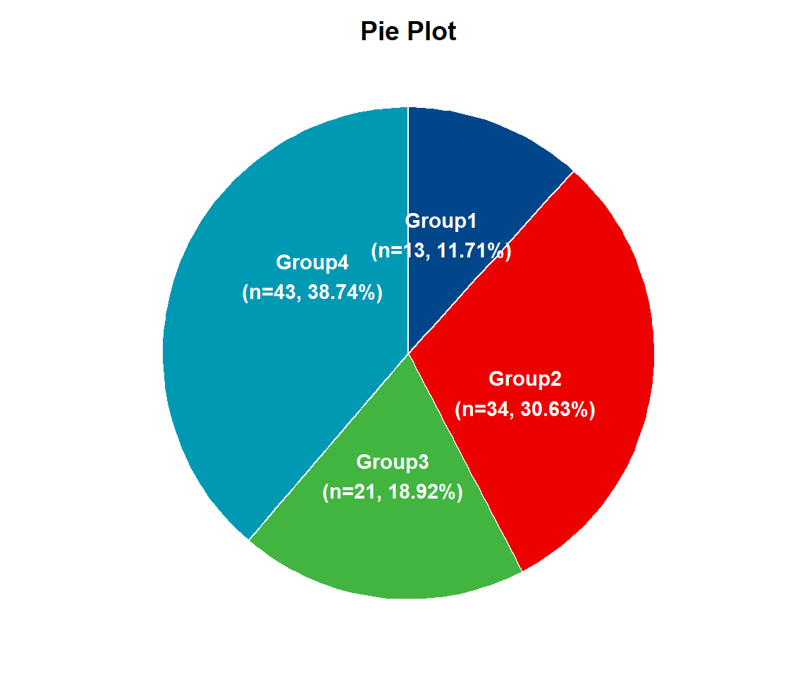
In a circle graph, the arc length of each slice (the arc length of its center Angle and the region corresponding to its center Angle) is proportional to the number represented. The pie chart shows the number of samples for the 1 to 4 components and the corresponding proportions. The number of samples in one group is 13, accounting for 11.71%; the number of samples in two groups is 34, accounting for 30.63%; the number of samples in three groups is 21, accounting for 18.92%; and the number of samples in four groups is 43, accounting for 38.74%.