# Install packages
if (!requireNamespace("apyramid", quietly = TRUE)) {
  install.packages("apyramid")
}
if (!requireNamespace("ggplot2", quietly = TRUE)) {
  install.packages("ggplot2")
}

# Load packages
library(apyramid)
library(ggplot2)Pyramid Chart 2
Note
Hiplot website
This page is the tutorial for source code version of the Hiplot Pyramid Chart 2 plugin. You can also use the Hiplot website to achieve no code ploting. For more information please see the following link:
The pyramid chart is a pyramid-like figure that distributes data on both sides of a central axis.
Setup
System Requirements: Cross-platform (Linux/MacOS/Windows)
Programming language: R
Dependent packages:
apyramid;ggplot2
Data Preparation
The loaded data are age, gender, and the number of people after the combination of the first two variables .
# Load data
data <- read.delim("files/Hiplot/145-pyramid-chart2-data.txt", header = T)

# Convert data structure
x <- as.integer(data[,"age"])
data$age_group <- cut(x, breaks = pretty(x), right = TRUE, include.lowest = TRUE)

# View data
head(data)
case_id date_of_onset date_of_hospitalisation date_of_outcome outcome Gender
1 1 2013/2/19 <NA> 2013/3/4 Death Male
2 2 2013/2/27 2013/3/3 2013/3/10 Death Male
3 3 2013/3/9 2013/3/19 2013/4/9 Death Female
4 4 2013/3/19 2013/3/27 <NA> <NA> Female
5 5 2013/3/19 2013/3/30 2013/5/15 Recover Female
6 6 2013/3/21 2013/3/28 2013/4/26 Death Female
age province age_group
1 87 Shanghai (80,100]
2 27 Shanghai (20,40]
3 35 Anhui (20,40]
4 45 Jiangsu (40,60]
5 48 Jiangsu (40,60]
6 32 Jiangsu (20,40]Visualization
# Pyramid Chart 2
p <- age_pyramid(data, "age_group", split_by = "Gender") +
  scale_fill_manual(values = c("#BC3C29FF","#0072B5FF")) +
  xlab("Age group") +
  ylab("Gender") +
  theme_classic() +
  theme(text = element_text(family = "Arial"),
      plot.title = element_text(size = 12,hjust = 0.5),
      axis.title = element_text(size = 12),
      axis.text = element_text(size = 10),
      axis.text.x = element_text(angle = 0, hjust = 0.5,vjust = 1),
      legend.position = "right",
      legend.direction = "vertical",
      legend.title = element_text(size = 10),
      legend.text = element_text(size = 10))

p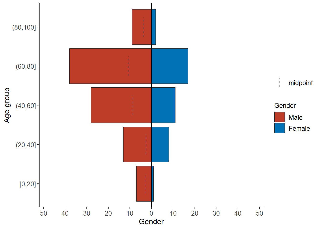
The graph shows the age groups from bottom to top in order on the central axis, the left side represents the number of men, the right side represents the number of women, and the X-axis represents the number of people. The graph clearly shows the proportion of men and women in different age groups and the proportion of different age groups in the same gender.