# Install packages
if (!requireNamespace("Rtsne", quietly = TRUE)) {
  install.packages("Rtsne")
}
if (!requireNamespace("ggpubr", quietly = TRUE)) {
  install.packages("ggpubr")
}

# Load packages
library(Rtsne)
library(ggpubr)tSNE
Note
Hiplot website
This page is the tutorial for source code version of the Hiplot tSNE plugin. You can also use the Hiplot website to achieve no code ploting. For more information please see the following link:
T-sne is a nonlinear dimensionality reduction algorithm suitable for high-dimensional data reduction to two or three dimensions and visualization. The algorithm can make the t distribution of points with greater similarity closer in the lower dimensional space. For low similarity points, the t distribution is farther away in the low dimensional space.
Setup
System Requirements: Cross-platform (Linux/MacOS/Windows)
Programming language: R
Dependent packages:
Rtsne;ggpubr
Data Preparation
The loaded data are the data set (gene name and corresponding gene expression value) and sample information (sample name and grouping).
# Load data
data1 <- read.delim("files/Hiplot/175-tsne-data1.txt", header = T)
data2 <- read.delim("files/Hiplot/175-tsne-data2.txt", header = T)

# convert data structure
sample.info <- data2
rownames(data1) <- data1[, 1]
data1 <- as.matrix(data1[, -1])
## tsne
set.seed(123)
tsne_info <- Rtsne(t(data1), perplexity = 1, theta = 0.1, check_duplicates = FALSE)
colnames(tsne_info$Y) <- c("tSNE_1", "tSNE_2")
# handle data
tsne_data <- data.frame(
  sample = colnames(data1),
  tsne_info$Y
)
colorBy <- sample.info[match(colnames(data1), sample.info[, 1]), "group"]
colorBy <- factor(colorBy, level = colorBy[!duplicated(colorBy)])
tsne_data$colorBy = colorBy
shapeBy <- NULL

# View data
head(data1)
M1 M2 M3 M8 M9 M10
GBP4 6.599344 5.226266 3.693288 7.658312 8.666038 7.419708
BCAT1 5.760380 4.892783 5.448924 8.765915 8.097206 8.262942
CMPK2 9.561905 4.549168 3.998655 7.379591 7.938063 6.154118
STOX2 8.396409 8.717055 8.039064 3.542217 4.305187 6.964710
PADI2 8.419766 8.268430 8.451181 4.136667 4.910986 4.080363
SCARNA5 7.653074 5.780393 10.633550 3.822596 4.041078 7.956589head(data2) sample group
1 M1 G1
2 M2 G1
3 M3 G1
4 M8 G2
5 M9 G2
6 M10 G2Visualization
# tsne
p <- ggscatter(data = tsne_data, x = "tSNE_1", y = "tSNE_2", size = 2,
               palette = "lancet", color = "colorBy") +
  labs(color = "group") +
  ggtitle("tSNE Plot1") +
  theme_bw() +
  theme(text = element_text(family = "Arial"),
        plot.title = element_text(size = 12,hjust = 0.5),
        axis.title = element_text(size = 12),
        axis.text = element_text(size = 10),
        axis.text.x = element_text(angle = 0, hjust = 0.5,vjust = 1),
        legend.position = "right",
        legend.direction = "vertical",
        legend.title = element_text(size = 10),
        legend.text = element_text(size = 10))

p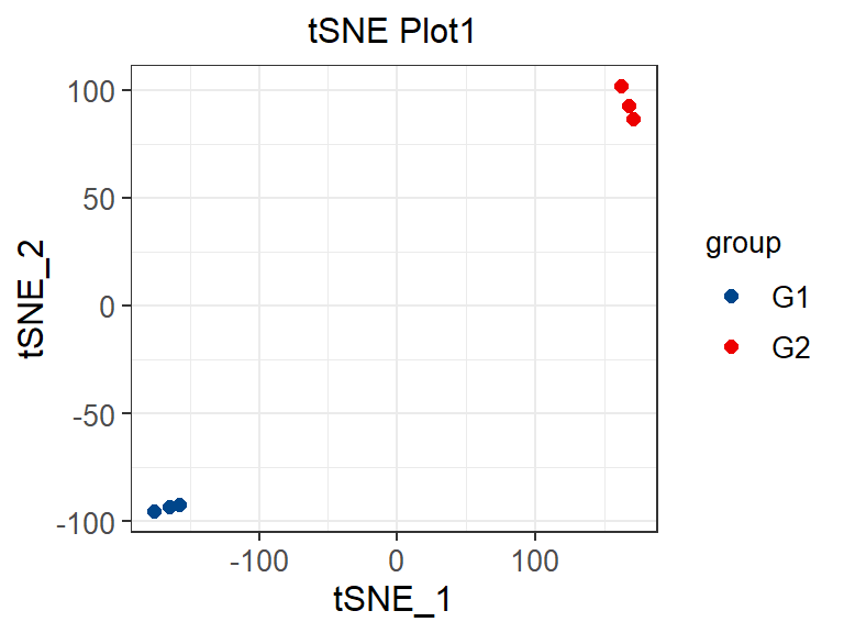
Different colors represent different samples, which is the same as PCA (principal component analysis) graphic interpretation. The difference lies in the visualization effect. For dissimilar points in T-SNE, a small distance will generate a large gradient to repel them.