# Install packages
if (!requireNamespace("ggplot2", quietly = TRUE)) {
  install.packages("ggplot2")
}
if (!requireNamespace("ggthemes", quietly = TRUE)) {
  install.packages("ggthemes")
}

# Load packages
library(ggplot2)
library(ggthemes)Ribbon
Note
Hiplot website
This page is the tutorial for source code version of the Hiplot Ribbon plugin. You can also use the Hiplot website to achieve no code ploting. For more information please see the following link:
The ribbon diagram is a pattern similar to a ribbon.
Setup
System Requirements: Cross-platform (Linux/MacOS/Windows)
Programming language: R
Dependent packages:
ggplot2;ggthemes
Data Preparation
The loaded data are the X-axis values and their corresponding Y-axis values and groups.
# Load data
data <- read.delim("files/Hiplot/153-ribbon-data.txt", header = T)

# Convert data structure
colnames(data) <- c("group", "xvalue", "yvalue1", "yvalue2")
data$yvalue <- (data$yvalue1 + data$yvalue2) / 2

# View data
head(data)
group xvalue yvalue1 yvalue2 yvalue
1 Group1 1900 -0.279 -0.063 -0.171
2 Group1 1901 -0.271 -0.053 -0.162
3 Group1 1902 -0.285 -0.069 -0.177
4 Group1 1903 -0.303 -0.095 -0.199
5 Group1 1904 -0.328 -0.118 -0.223
6 Group1 1905 -0.348 -0.134 -0.241Visualization
# Ribbon
p <- ggplot(data, aes(xvalue, yvalue, fill = group)) +
  geom_ribbon(alpha = 0.2, aes(ymin = yvalue1, ymax = yvalue2)) +
  geom_line(aes(y = yvalue, color = group), lwd = 1) +
  geom_line(aes(y = yvalue1, color = group), linetype = "dotted") +
  geom_line(aes(y = yvalue2, color = group), linetype = "dotted") +
  ylab("y axis value") +
  xlab("x axis value") +
  ggtitle("Ribbon Plot") +
  scale_fill_manual(values = c("#e04d39","#5bbad6")) +
  scale_color_manual(values = c("#e04d39","#5bbad6")) +
  theme_stata() +
  theme(text = element_text(family = "Arial"),
        plot.title = element_text(size = 12,hjust = 0.5),
        axis.title = element_text(size = 12),
        axis.text = element_text(size = 10),
        axis.text.x = element_text(angle = 0, hjust = 0.5,vjust = 1),
        legend.position = "right",
        legend.direction = "vertical",
        legend.title = element_text(size = 10),
        legend.text = element_text(size = 10))

p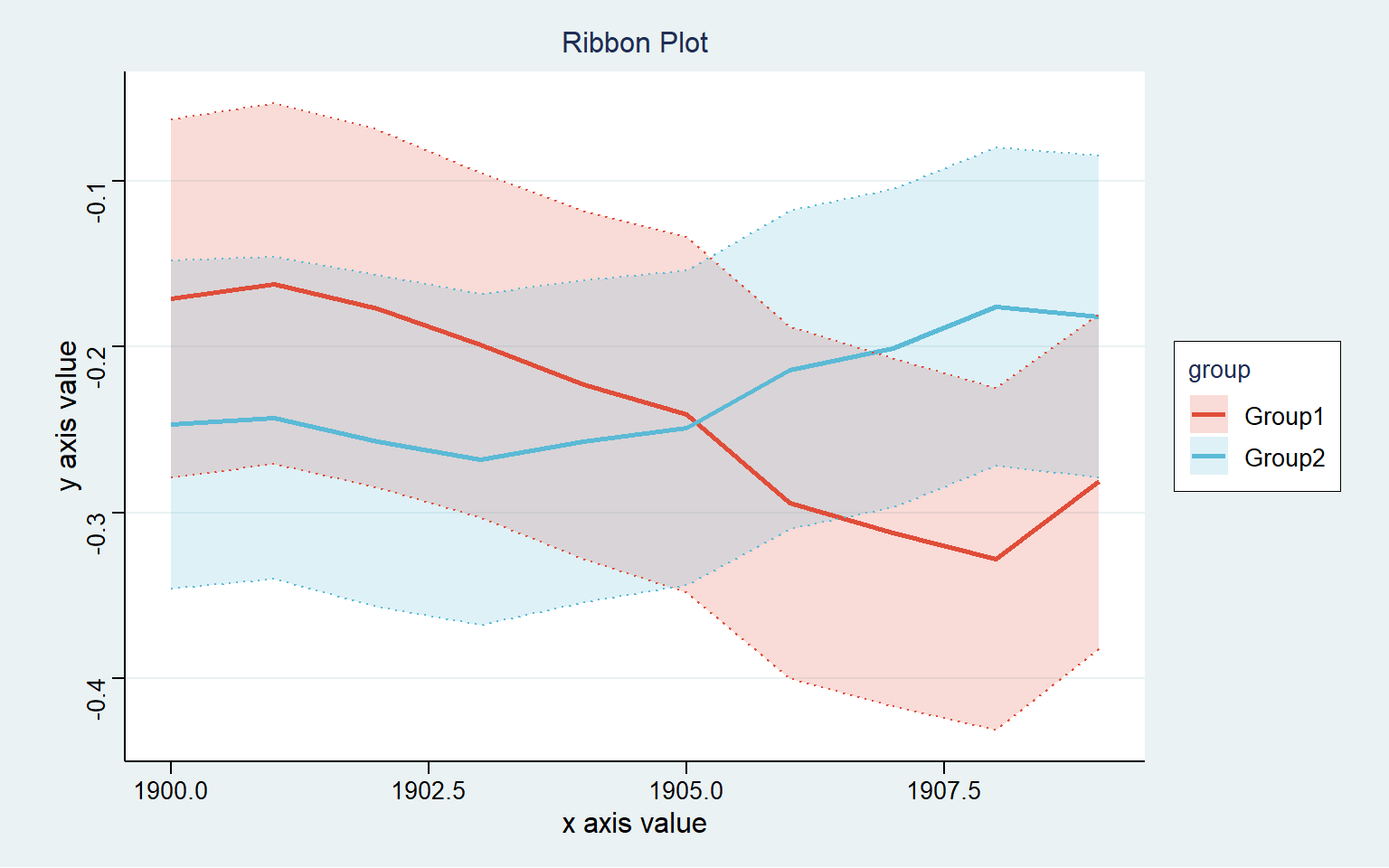
Each color represents a different grouping, through which broken lines can be seen the change of each group of data over time.