# Install packages
if (!requireNamespace("ggplot2", quietly = TRUE)) {
  install.packages("ggplot2")
}

# Load packages
library(ggplot2)Rose Chart
Note
Hiplot website
This page is the tutorial for source code version of the Hiplot Rose Chart plugin. You can also use the Hiplot website to achieve no code ploting. For more information please see the following link:
The rose chart is a column chart drawn in polar coordinates. The radius of the arc is used to indicate the size of the data.
Setup
System Requirements: Cross-platform (Linux/MacOS/Windows)
Programming language: R
Dependent packages:
ggplot2
Data Preparation
The loaded data is divided into three columns, the first column is the sample name, the second column is the grouping, and the third column is the value corresponding to the sample.
# Load data
data <- read.delim("files/Hiplot/157-rose-chart-data.txt", header = T)

# Convert data structure
data[, 2] <- factor(data[, 2], levels = unique(data[, 2]))

# View data
head(data)
Sample Group Freq
1 Brain Upregulated 142
2 Colon Upregulated 270
3 Kidney Upregulated 108
4 Pancreas Upregulated 194
5 Skin Upregulated 189
6 Testis Upregulated 97Visualization
# Rose Chart
p <- ggplot(data, aes(x = Sample, y = Freq)) +
  geom_col(aes(fill = Group), width = 0.9, size = 0, alpha = 0.8) +
  coord_polar() +
  ggtitle("Rose Chart") +
  scale_fill_manual(values = c("#E64B35FF", "#4DBBD5FF")) +
  theme_bw() +
  theme(aspect.ratio = 1,
        axis.text.x = element_text(colour = "black"),
        axis.text.y = element_text(colour = "black"),
        legend.title = element_blank(),
        legend.position = "bottom",
        plot.title = element_text(hjust = 0.5))

p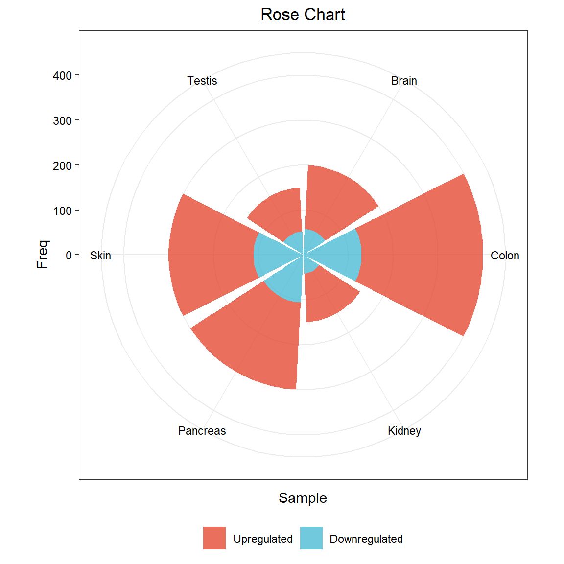
The case data is the distribution of up- and down-regulated genes in different organs after using scRNA-Seq to sequence different human organs.