# Install packages
if (!requireNamespace("pROC", quietly = TRUE)) {
  install.packages("pROC")
}
if (!requireNamespace("ggplotify", quietly = TRUE)) {
  install.packages("ggplotify")
}

# Load packages
library(pROC)
library(ggplotify)ROC
Note
Hiplot website
This page is the tutorial for source code version of the Hiplot ROC plugin. You can also use the Hiplot website to achieve no code ploting. For more information please see the following link:
Receiver operating characteristic curve (ROC curve) is used to describe the diagnostic ability of binary classifier system when its recognition threshold changes.
Setup
System Requirements: Cross-platform (Linux/MacOS/Windows)
Programming language: R
Dependent packages:
pROC;ggplotify
Data Preparation
The loaded data are the outcomes of one column of dichotomous variables and three columns of different variables (diagnostic indicators) and their values.
# Load data
data <- read.delim("files/Hiplot/156-roc-data.txt", header = T)

# Convert data structure
name_val <- colnames(data)[2:ncol(data)]
num_value <- ncol(data) - 1

# View data
head(data)
outcome value.Am value.GG value.EL
1 Good 3 0.33 17.30
2 Good 2 0.11 12.71
3 Good 4 0.28 9.44
4 Good 2 0.07 11.07
5 Good 1 0.10 19.46
6 Good 4 0.32 10.83Visualization
# ROC
col <- c("#00468BFF","#ED0000FF","#42B540FF")
p <- as.ggplot(function() {
  for (i in 1:num_value) {
    if (i == 1) {
      roc_data <- roc(data[, 1], data[, i + 1],
        percent = T, plot = T, grid = T, lty = i, quiet = T,
        print.auc = F, col = col[i], smooth = F,
        main = "ROC Plot"
      )
      text(30, 50, "AUC", font = 2, col = "darkgray")
      text(30, 50 - 10 * i,
        paste(name_val[i], ":", sprintf("%0.4f", as.numeric(roc_data$auc))),
        col = col[i]
      )
    } else {
      roc_data <- roc(data[, 1], data[, i + 1],
        percent = T, plot = T, grid = T, add = T, lty = i, quiet = T,
        print.auc = F, col = col[i]
      )
      text(30, 50 - 10 * i,
        paste(name_val[i], ":", sprintf("%0.4f", as.numeric(roc_data$auc))),
        col = col[i]
      )
    }
  }
    })

p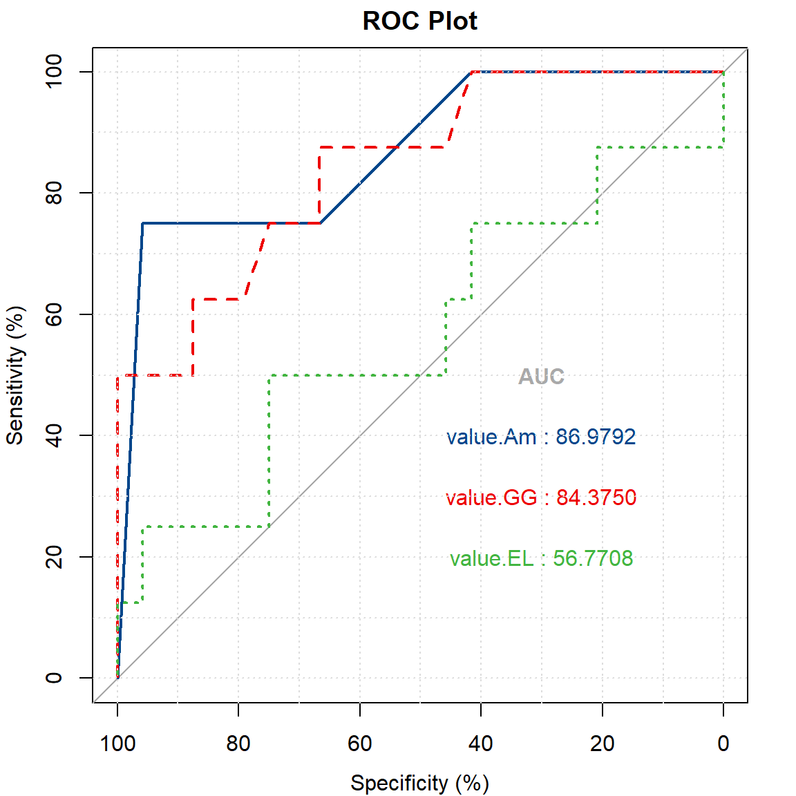
There is no functional relationship between specificity on the horizontal axis and sensitivity on the vertical axis.The closer the curve is to the upper left corner, the better the predictive ability of the diagnostic index is.Each color represented a variable (diagnostic indicator), and the blue and red curves were significantly better predictors than the green curves.AUC is the area under ROC curve.AUC=1 indicates that there is at least one threshold on the curve that leads to a perfect prediction.0.5<AUC<1, better than random guess, appropriate selection of threshold value, can have predictive value. AUC=0.5, like random guesses, the model has no predictive value. If AUC<0.5, the possible reason is that the dichotomy variable such as (0,1) is reversed with the ending setting, and the result assignment can be reversed.In this diagram, it can be considered that Am variable has the best predictive ability as shown in value-Am(86.9792)>value-GG(84.3750)>value-EL(56.7708).