# Install packages
if (!requireNamespace("survminer", quietly = TRUE)) {
  install.packages("survminer")
}
if (!requireNamespace("survival", quietly = TRUE)) {
  install.packages("survival")
}
if (!requireNamespace("ggplotify", quietly = TRUE)) {
  install.packages("ggplotify")
}

# Load packages
library(survminer)
library(survival)
library(ggplotify)Survival Analysis
Note
Hiplot website
This page is the tutorial for source code version of the Hiplot Survival Analysis plugin. You can also use the Hiplot website to achieve no code ploting. For more information please see the following link:
The survivorship curve is a graph showing the number or proportion of individuals surviving to each age for a given species or group (e.g. males or females).
Setup
System Requirements: Cross-platform (Linux/MacOS/Windows)
Programming language: R
Dependent packages:
survminer;survival;ggplotify
Data Preparation
The loaded data are point-in-time, status and groups.
# Load data
data <- read.delim("files/Hiplot/169-survival-data.txt", header = T)

# convert data structure
colnames(data) <- c("Time", "Status", "Group")
data[,1] <- as.numeric(data[,1])
fit <- survfit(Surv(Time, Status == 1) ~ Group, data = data)
data <- data[data[,1] < 1100,]

# View data
head(data)
Time Status Group
1 306 1 G1
2 455 1 G1
3 1010 0 G1
4 210 1 G1
5 883 1 G1
6 1022 0 G1Visualization
# Survival Analysis
p <- ggsurvplot(
  fit, data = data, risk.table = T, pval = T, conf.int = T, fun = "pct",
  size = 0.5, xlab = "Time", ylab = "Survival probability",
  ggtheme = theme_bw(), risk.table.y.text.col = TRUE,
  risk.table.height = 0.25, risk.table.y.text = T,
  ncensor.plot = T, ncensor.plot.height = 0.25,
  conf.int.style = "ribbon", surv.median.line = "hv",
  palette = c("#00468BFF", "#ED0000FF"),
  xlim = c(0, 1100), ylim = c(0, 100),
  break.x.by = 150)

p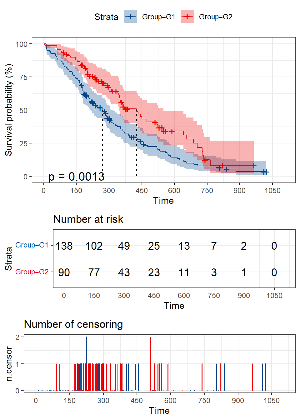
The horizontal axis represents time and the vertical axis represents the probability of survival. The blue curve represents the survivolship curve of G1 group and the red curve represents the survivolship curve of G2 group. After logrank test, p value =0.0013<0.05 indicates that difference in survival status between the two groups could not be explained by sampling error, and the grouping factor is the reason for the difference in survival rate between the two curves. This graph shows that overall survival is better in G2 than in G1.