# Install packages
if (!requireNamespace("ggplot2", quietly = TRUE)) {
  install.packages("ggplot2")
}

# Load packages
library(ggplot2)Scatter
Note
Hiplot website
This page is the tutorial for source code version of the Hiplot Scatter plugin. You can also use the Hiplot website to achieve no code ploting. For more information please see the following link:
Two groups of data are used to form multiple coordinate points. By observing the distribution of coordinate points, it can judge whether there is correlation between variables or summarize the data processing mode of coordinate point distribution.
Setup
System Requirements: Cross-platform (Linux/MacOS/Windows)
Programming language: R
Dependent packages:
ggplot2
Data Preparation
The loaded data are the horizontal axis values and their corresponding vertical axis values and groups.
# Load data
data <- read.delim("files/Hiplot/161-scatter-data.txt", header = T)

# View data
head(data)
Value1 Value2 Group
1 1 1 treat1
2 2 4 treat1
3 3 9 treat1
4 4 16 treat1
5 5 25 treat1
6 6 36 treat1Visualization
# Scatter
p <- ggplot(data, aes(x = Value1, y = Value2)) +
  geom_point(size = 1, alpha = 1, aes(color = Group, shape = Group)) +
  ggtitle("Scatter Plot") +
  scale_color_manual(values = c("#00468BFF", "#ED0000FF")) +
  theme_bw() +
  theme(text = element_text(family = "Arial"),
        plot.title = element_text(size = 12,hjust = 0.5),
        axis.title = element_text(size = 12),
        axis.text = element_text(size = 10),
        axis.text.x = element_text(angle = 0, hjust = 0.5,vjust = 1),
        legend.position = "right",
        legend.direction = "vertical",
        legend.title = element_text(size = 10),
        legend.text = element_text(size = 10))

p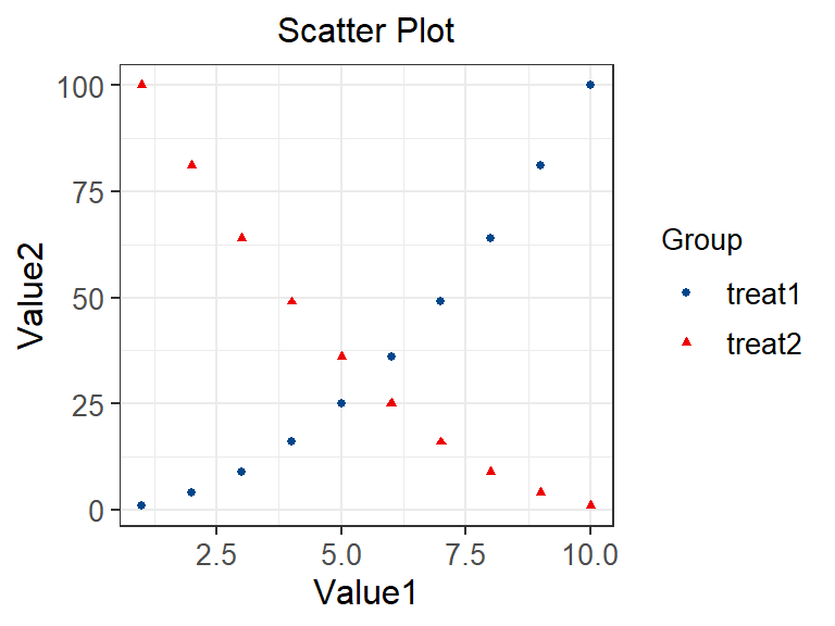
Value1 represents the horizontal axis and Value2 represents the vertical axis. The diagram shows that Value1 and Value2 in treatment plan 1 are positively correlated: that is, when Value1 becomes larger, Value2 will become larger; In treatment plan 2, two variables are negatively correlated: that is, when Value1 becomes larger, Value2 becomes smaller.